
Associated with the Minimalist movement of the 1970’s, Robert Mangold (b. 1937) developed a distinct reductive vocabulary, exploring the nuances that lie in austere geometric forms and monochromatic colors on canvases and works on paper. The artist was influenced by prehistoric cave paintings and Renaissance frescos in which images are drawn directly onto the wall, and aimed to integrate paint and surface in a way that stressed their flatness and directness.
Printmaking became an essential practice for Mangold, allowing him to experiment and engage in visual ideas that could be translated across different scales and media. Mangold made his first published prints in 1968 and has since produced over 200 print editions with leading print workshops and publishers. Printmaking’s potential for serial imagery made it a natural fit for the artist, allowing him to further examine ongoing themes of fragmentation, unity, and variability. The delicacy of the line acheivable with etching and the subtleties of tone and density inherent in the aquatint technique aligned particularly with Mangold’s Minimalist tendencies. In 1988, the artist wrote, “The works on paper are where the ideas are worked out and most of the important decisions are made, the momentum from them carry me into the painting.”
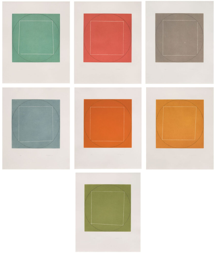
Seven Aquatints was Mangold’s first set of intaglio prints. Printed at San Francisco’s Crown Point Press and published by Parasol Press in New York, the portfolio represents Mangold’s precise ability to configure line and color as formal and conceptual equivalents. Paralleling much of his work in painting, the series reflects his explorations of geometry, seriality, and the relationship between interior and exterior forms. The simple arrangement of a perfect outer circle and a flawed interior circle combined with the shifting muted color palette create a palpable tension, articulating the elements that make Mangold’s work so subtly seductive. As the artist stated, “I think all my works are about things fitting together or not really fitting together, with the exterior structure either dictating the terms of the interior structure or setting up a framework the interior structure plays off.” The series alludes to the lush, muted tones often found in Renaissance art and suggests references to Leonardo da Vinci’s iconic drawing The Proportions of Man (c. 1490), which depicts an outstretched figure within a circle and a square. This portfolio of seven aquatints is an exceptional example of Mangold’s mastery over form – constructing subtle configurations that probe the direct and oblique aspects of the aesthetic experience.
The exceedingly rare complete set of 7 aquatints.
Courtesy of Susan Sheehan Gallery.