
Stuff | Printmaking at Kip Gresham Editions
· blog
This is the first of an intermittent series of reflections on printmaking. It is designed to bring collectors closer to the thoughts, materials and physical processes that are embedded in the finished pieces.
Stuff
One of the things about printmaking is that it uses lots of stuff, all kinds of different materials each of which has many varieties. The artist and the printer have to think about the particular characteristics of each material in the development phase of a print because the wrong choice will
lead to an inevitable struggle against unpredictable forces. The right choice will allow the natural performance of the material to contribute effortlessly. There are endless combinations of medium, substrate and pigmentation. The great moments come when the right choices have been made. It takes years of experimentation and the visiting of many cul-de-sacs to settle on a range of ingredients that work technically, creatively and emotionally. The ingredients will be different with each artist and each image.
‘Stuff’ is also what the makers call the pulp that has been prepared for making into paper.
‘Size’ is the substance added to the sheet to harden it. It is either mixed into the stuff or applied to the formed sheet.
The paper isn’t just something to make the image on, even white paper has a range of surfaces and colours. The sizing of the sheet, the blankets used to make it, the length and type of fibre all exert a marked influence on the ink that sits on and is absorbed into the surface. Soft toned sheets or off- white ones, add a gentle and subtle harmonising quality that is barely perceptible but it’s there affecting everything that sits on it. The colour of the paper is just that, a colour in the image.
With mould made papers the grain direction, which governs the strength of the construction, is greater across the grain so it is more stable on that axis. Not all work requires a really stable sheet but in some instances where thick deposits of pigment or many layers are applied on top of one another and a significant contraction can occur, this is a very important consideration. The grain is invisible to the naked eye but is nevertheless a controlling factor.
The sizing affects the hold-out, that is the clarity of each mark. Hard sizing means that the pigment sits on the surface and soft sizing or none at all (waterleaf) encourages absorption into the fibres. The feel of the image, its crispness or softness, can make it more or less engaging. The relative roughness or smoothness of the surface can also determine what is possible or desirable.
Here are four screenprinted examples showing how the colour of the paper can contribute significantly to the image. They all have a velvet surface with quite gentle sizing, neither rough nor smooth and capable of allowing the ink to both absorb and sit up. They are all 100% cotton fibre.
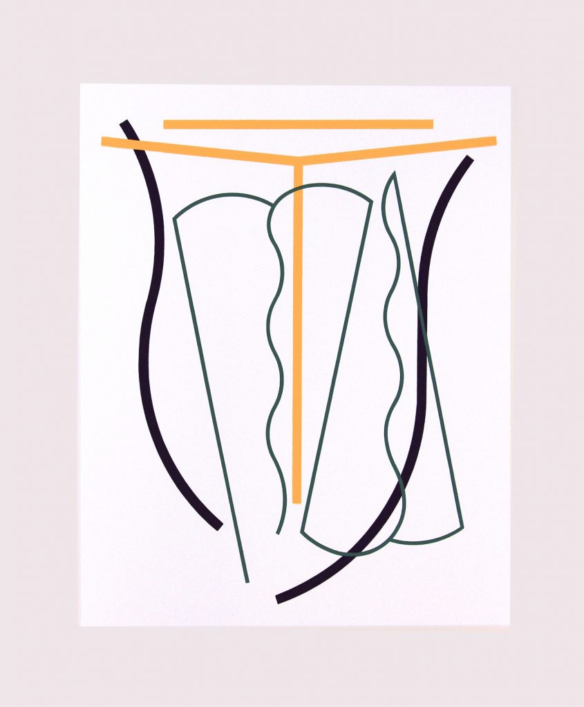
Counterpoint, 2020, by Nigel Hall RA uses a Somerset Soft White. The foundation of the image is white and this gets its definition from the surrounding paper which is slightly darker in tone and marginally yellower. In some respects this is an inversion of the convention of a dark image on a pale sheet.
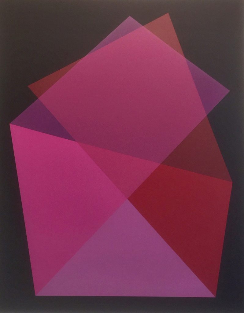
Barn (Red), 2019, by Willard Boepple was printed on a Somerset Velvet white sheet that had been printed twice with a fluid black ink to sink into the surface. The image was then built up from a succession of transparent whites overprinted with colour. The sealing of the surface with the printed black put a tension into the sheet making it very stable and allowing for the edge to edge registration of the colour.
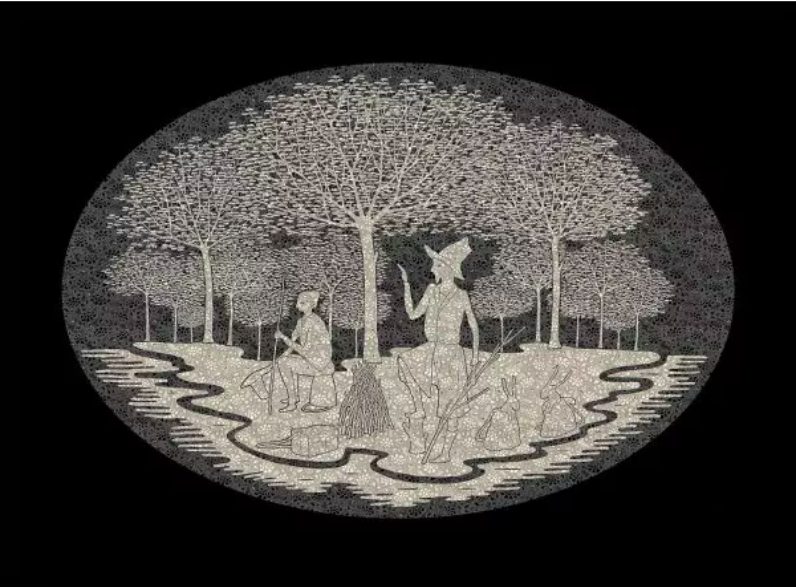
Journeys Without Maps, (West), 2015, by Stephen Chambers RA, was printed on Somerset Black. This is an extraordinary paper which is both heavily pigmented but still very absorbent and receptive. The image was built with transparent white, opaque ivory and then a full black.
The absorption of the transparent colour and the sit-up of the opaques injects a distance and a lacy-ness between the layers which is quite magical. Stability was essential because the negative elements of
the pattern had to align perfectly with the positive ones.
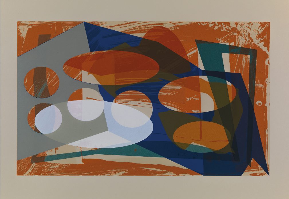
Floating Flats, Number 15,2020, is from a series of monoprints (unique images) by Jeff Lowe. It is printed on a French BFK Rives Grey paper. The refinement of the substrate is evident in the ease with which it accepts the orange / tan background drawing, the contrast that it provides for the semi transparent white and the opacity of the grey. The sizing and the surface of the Rives is a little softer than the Somerset papers.
All these examples reflect choices made at the outset of the projects. What you cannot see on the screen is the subtle touch of the ink on the paper and the variety of finishes from matt to satin.
Printmaking
View more prints at Kip Gresham Editions.