
Layers | Printmaking at Kip Gresham Editions
· blog
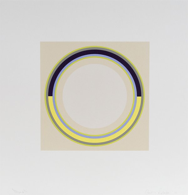
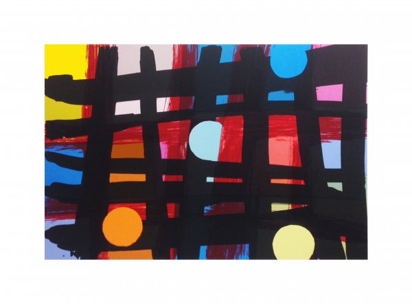
This is the second in a series of reflections on printmaking. It is designed to bring collectors closer to the prints that they own or admire. Most colour prints are made in layers or separations, frequently over twenty. Each one is a discreet thought printed from a separate plate, block or screen. In this respect printmaking is like history, one damned thing after another. Carol Robertson’s ‘Maya’ 2014 shows the way in which carefully considered layering may work as it masters the combination of transparent and semi-opaque pigment.
The information in each separation is conditioned by the preceding or subsequent layers. When brought together they form the finished image. Not all the colours sit on top of one another and there are plenty of prints where the colours sit apart and float on a ground simply talking to one another across space. Sometimes the colours abut one another to form a unified surface. Bob Edgson’s ‘Signifier’ 2021 or John McLean’s Sheet 5 from ‘Merry go Round’ 2016 are good examples of these phenomena.
When an artist is planning a layered print they must consider the negative spaces as much as the positive marks. That is, the areas in which there is no drawing are as important as the ones where there is drawing, a texture or shapes. The reason for this is that the colour and shapes are both additive and subtractive. That which is left out is as important as that which is included. Mali Morris’ ‘Staith’ 2018 reflects the business of presence and absence whilst weaving together a series of actions.
Many people are familiar with the idea of layering on a digital platform such as Photoshop. This is similar to the way in which printmakers approach image making but it has some critical differences. For example, the layers in an autographic image carry the hand of the artist or their creative handwriting which is unique and there is no digital equivalent for this. The layers of ink in an original print can be totally transparent and of a very high saturation whereas the layers in a digital image must, by definition, lose saturation to become transparent. That having been said, it is not uncommon for artists to import their hand made images into an application to manipulate them in new ways or use the precision of a digital file for its own qualities. Stephen Chambers’ ‘The Art of Rhetoric’ and ‘The Art of War’ 2012 are prime examples of a seamless fusion of digital and analogue techniques. The digital world offers the artist new tools and just like a pencil or a paintbrush the tools require sensitive and appropriate handling.
Skilled printmakers become adept at forecasting the way in which the layers and colours will respond to one another. It is easier to understand this process by making an analogy, that of the composer’s score. A really experienced musician can ‘hear’ the combined sounds and recognise the relative loudness or softness of each instrument whilst sensing the harmonies and dissonances. They can also feel the space that is provided for the voice of a solo instrument allowing it to be heard. Naturally, unforeseen collisions will occur and these tend to emerge and may be rectified in rehearsal.
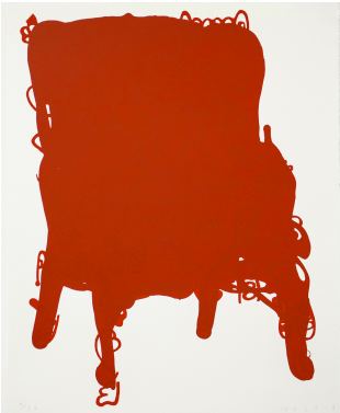
The same is true of printmaking. The unexpected reveals itself in the proofing process in which everything is explored and often tested to destruction. The aim is to bring the disparate elements together in such a way that they look and feel as if they could only be arranged the way they are, presenting themselves as a self-assured thing and not an assemblage of vaguely connected things. Gina Medcalf’s ‘ Shepreth’ 2017 or Humphrey Ocean’s ‘Red Chair’ 2018 are fine examples.
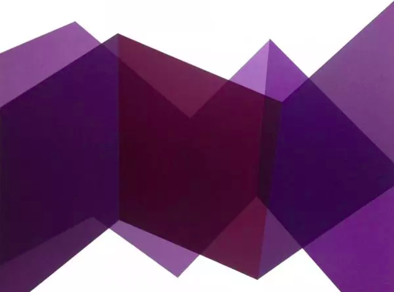
Willard Boepple’s 29.11.17 shows the way in which two key shapes can be broken and then overprinted in successive layers to create new dimensions. There are many layers at work here, all transparent.
Printmaking
View more prints at Kip Gresham Editions.