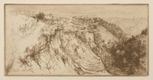
Richard Diebenkorn and the Print World: A Revolution in Ink, Light, and Geometry
A Life Between Coasts: Who Was Richard Diebenkorn?
Richard Diebenkorn was born in Portland, Oregon, in 1922, and grew up in San Francisco – a city whose particular quality of light, its cool luminosity filtered through marine air, would eventually become the animating subject of his most celebrated work. He studied at Stanford University and the California School of Fine Arts, where he encountered the work of the Abstract Expressionists and felt, like many of his generation, the full force of that encounter. For a period in the late 1940s and early 1950s, he painted in a mode that owed clear debts to de Kooning and Kline – vigorous, gestural, committed to the energy of the painted surface.
Then, in a move that surprised almost everyone around him, he stopped. In 1955 he turned back toward the figure, producing the work for which he would first become widely known: representational paintings of extraordinary quietude – interiors, figures by windows, the northern California landscape rendered with a stillness that felt almost defiant in the era of Abstract Expressionism’s dominance. This period, known as his figurative phase, produced some of the twentieth century’s most quietly powerful paintings, and it taught him something that would run through everything he made afterward: that structure and feeling were not in competition, but in constant, productive conversation.
The third and final reinvention came in 1967, when he moved to Santa Monica and began the Ocean Park series – over one hundred and forty large-scale paintings named for the neighbourhood where his studio stood. These canvases, with their vast planes of layered, luminous colour divided by searching pencil lines and architectural geometries, brought him international recognition and secured his place as one of the defining figures of postwar American art. He continued to paint, draw, and make prints until his death in Berkeley in 1993. He was seventy years old, and he was still, by every account, getting better.
How Richard Diebenkorn Came to Printmaking
Richard Diebenkorn did not arrive at printmaking as a young man with ink under his fingernails and ambition in his chest. He came to it sideways, the way he came to most things: obliquely, thoughtfully, with the quiet confidence of an artist who had already reinvented himself at least once. Best known in the wider art world for his monumental Ocean Park paintings — those vast, luminous meditations on the California coast – Diebenkorn’s relationship with printmaking is one of the medium’s great underexplored stories. He brought to it not the habits of a trained printmaker but the sensibility of a painter who refused to be told what a print could or could not be.
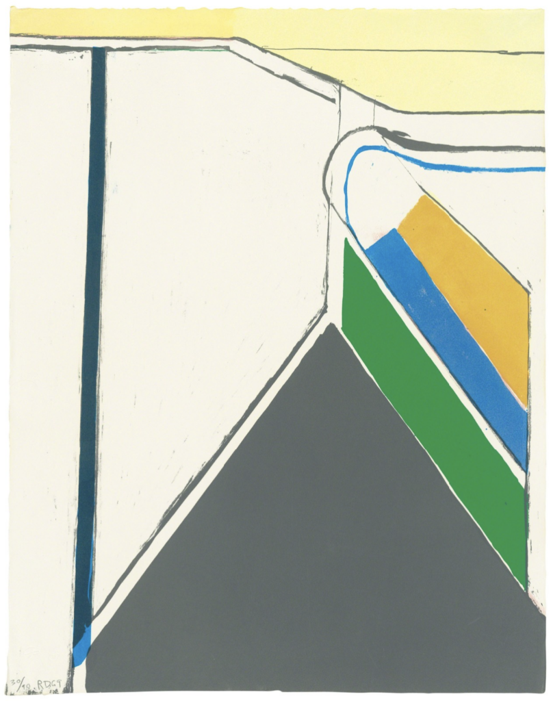
Untitled (Ocean Park), 1969, Richard Diebenkorn
The Etching Needle as a Drawing Instrument: Returning to First Principles
When Diebenkorn began making prints in earnest in the 1960s, he treated the etching needle the way he treated charcoal and pencil: as a direct extension of hand and mind. His earliest intaglio works reveal a draughtsman of extraordinary economy. Lines are placed with an assurance that conceals the enormous hesitation and revision that occurred before the plate was touched. There is a famous paradox in Diebenkorn’s drawing practice – the seemingly spontaneous line was, in fact, the product of long, deliberate looking – and this paradox transferred perfectly to the print. The resistance of the copper plate, the physical pressure required to incise a mark, gave his line a new quality of weight and intentionality that even his drawings sometimes lacked. In etching, every mark costs something. Diebenkorn was willing to pay.
Diebenkorn Understood That Printmaking Was Not Painting, and Refused to Pretend Otherwise
One of the recurring temptations for painters who enter the print world is to fight the medium’s fundamental nature – to try to replicate the freedom of the brush, the ease of layering paint. Diebenkorn resisted this with admirable discipline. He understood, intuitively, that printmaking is a medium of indirection. You do not see your mark the moment you make it. You work in negative, you reverse your image, you collaborate with acid and press and paper in ways that no painter has to accommodate. Rather than fighting this indirection, he embraced it as a formal quality in its own right. His prints have a certain withheld quality, a sense of information just beneath the surface, that is entirely native to intaglio. They could only have been made as prints, never as paintings first and prints second.

The Ocean Park Series Did Something to Printmaking That No One Had Quite Done Before
When the Ocean Park paintings began in 1967, they changed the conversation around abstraction. But it is less well understood that Diebenkorn was simultaneously developing a print practice that ran alongside and in dialogue with those canvases. His aquatints and etchings from this period took the central formal problem of Ocean Park – how to articulate light through layered geometry – and translated it into the vocabulary of tonal gradation and bitten line that printmaking uniquely enables. Aquatint, a process that allows the printmaker to achieve atmospheric washes of tone, became for Diebenkorn what glazing had been for the Old Masters: a means of building luminosity through patient, cumulative layers. His prints glow from within in a manner that defies the opacity of ink on paper.
Diebenkorn Made Collaboration a Creative Act, Not a Technical Convenience
Diebenkorn’s partnerships with master printers – most notably his years of work with Kathan Brown at Crown Point Press in San Francisco – became a model for how serious artists and skilled craftspeople could operate as genuine co-creators. He was not the kind of artist who delivered sketches and expected others to execute them. He was present, engaged, and deeply curious about what the press and the plate would do that he could not predict or fully control. This willingness to be surprised, to follow the medium rather than dominate it, produced prints of a formal complexity that his paintings do not always match. Brown has spoken at length about Diebenkorn’s patience with the process — his ability to pull a proof, study it for long silent minutes, and return to the plate with a single precise adjustment. He treated proof-pulling as thinking made visible.
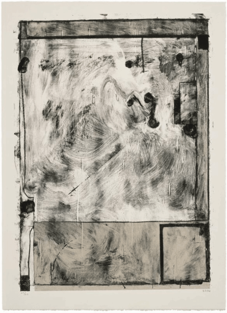
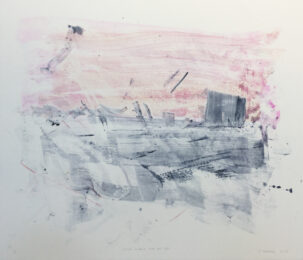
Scrabbling, 1985, Richard Diebenkorn
Diebenkorn’s Late Prints: The Most Underrated Works of His Career
In the final decade of his life, Diebenkorn’s print output accelerated rather than slowed. The works he produced in the late 1980s and early 1990s – dense, layered etchings and aquatints that revisited the compressed geometries of Ocean Park but with a new willingness to embrace darkness, ambiguity, and the unpredictable chemistry of acid on metal – are among the finest achievements in late twentieth-century American printmaking. They are also among the least discussed, overshadowed by the continuing critical romance with the paintings. This is an injustice. These prints are not supplementary to his legacy. They are central to it. They show an artist pushing hard against his own established language, using the relative intimacy and speed of the print studio to take risks he could not afford on a six-foot canvas.
Why His Legacy Still Matters: Geometry With a Pulse
What Richard Diebenkorn ultimately brought to the print world was a demonstration that abstraction could be emotionally warm – that geometry need not be cold, that structure need not be arid. In a landscape of mid-century American printmaking often dominated by the rhetoric of hard-edge formalism on one side and the wilder gestures of abstract expressionism on the other, Diebenkorn occupied a deeply personal middle ground. His prints breathe. They hold light the way a specific room at a specific time of day holds light. They are, in the deepest sense, felt as well as thought. For any artist working in intaglio today, his body of print work remains both a technical resource and a moral argument: that the medium deserves the full weight of an artist’s attention, and that when it receives it, it gives back in kind.Share
Which Richard Diebenkorn Prints Should Collectors Look For?
Diebenkorn’s printed work spans roughly three decades and encompasses a range of techniques – etching, aquatint, lithography, and screenprint – that each captured a different facet of his visual intelligence. For collectors approaching this body of work for the first time, understanding the distinctions between periods and techniques is essential to making informed decisions, both aesthetically and financially.
The Early Etchings (1960s)
Diebenkorn’s first serious engagement with printmaking produced a group of etchings characterised by the same spare, searching line quality that distinguished his drawings of the same period. These works are relatively rare at auction – they were produced in small numbers and are closely held by institutions and private collections – but when they surface, they offer a fascinating window into an artist in the process of discovering what the medium could do for him. For collectors interested in the full arc of his development, these early works are invaluable; for those focused purely on his mature visual language, the later aquatints may be a more direct entry point.
The Ocean Park Prints (Late 1960s–1970s)
The prints Diebenkorn made in dialogue with the Ocean Park paintings – primarily aquatints and etchings produced with Kathan Brown at Crown Point Press – are the works most collectors are seeking when they come to Diebenkorn’s printed output. Works such as the Untitled aquatints from this period distil the essential qualities of the paintings into a smaller, more intimate format: the layered washes of tone, the ruling pencil lines made permanent in bitten metal, the extraordinary sense of light held within opacity. These are the prints that have entered institutional collections worldwide, and they command prices that reflect their status. Fine impressions in good condition from this period represent a serious investment, but also a serious acquisition — works that repay daily looking over decades.
Crown Point Press Collaborations (1970s–1980s)
Diebenkorn’s ongoing relationship with Crown Point Press produced some of the most technically ambitious prints in his catalogue. Works like Scrabbling (1985) – the title itself a word he used to describe his working process – show a printmaker at the height of his command over intaglio’s possibilities: multiple acid bites layered over each other, tonal complexity that approaches the richness of a small painting, and yet a fundamental graphic clarity that could only have been achieved in print. These mid-to-late career works have the advantage of being more available than the early etchings while carrying the full weight of his mature vision. For collectors with the means, they represent exceptional value relative to comparable works on paper.
The Late Aquatints (Late 1980s–Early 1990s)
The final prints Diebenkorn made – dense, layered, often darker in palette than his earlier work – are in the process of being reassessed by both scholars and the market. Long overlooked in favour of the brighter, more immediately seductive Ocean Park works, these late aquatints are beginning to attract the serious attention they deserve. They are among his most formally adventurous prints, and they carry a weight of accumulated technique and hard-won visual intelligence that makes them, in the view of many specialists, his most profound contribution to the medium. Current prices do not yet fully reflect this assessment, which makes the present moment – before a broader critical consensus consolidates – a particularly interesting time to look carefully at this period.

![Nūr Jahān [H10-2] by Damien Hirst at Dellasposa](https://www.printed-editions.com/wp-content/uploads/2022/04/Nr_Jahn_H10-2_by_Damien_Hirst_From_Dellasposa_Gallery-260x260.jpg)