The Trembling Line: What Made Willem de Kooning Prints Unlike Anything Else
A Life Built on Arrival: Who Was Willem de Kooning?
Willem de Kooning arrived in America the way he would later arrive at a canvas: without a clear plan, but with an absolute readiness to commit. Born in Rotterdam in 1904, he came of age during a period of violent artistic transformation in Europe, training at the Rotterdam Academy of Fine Arts and Applied Sciences while Cubism and De Stijl were dismantling centuries of pictorial assumption around him. In 1926, aged twenty-two, he stowed away on a British freighter bound for America. He landed in Virginia and made his way to New York, a city that would define him and that he would, in turn, help to define.
His early years in New York were genuinely difficult – odd jobs, commercial illustration, the slow, grinding work of finding a visual language that was entirely his own. By the 1940s he had found it, and found his people: the loose, combative, brilliant circle of painters – Pollock, Kline, Motherwell, de Kooning himself – who would become known as the Abstract Expressionists, or simply the New York School. De Kooning’s role within that movement was never that of a follower. He was one of its shaping forces – the artist who refused to let abstraction entirely consume the figure, who kept dragging the human body back into the frame even as everything around him argued for its erasure. His Women series of the early 1950s – raw, monumental, confrontational – remains among the most debated bodies of work in twentieth-century American painting.
He continued to paint, and eventually to print, through the 1960s, 70s, and 80s, his work shifting in register as age and, eventually, Alzheimer’s disease reshaped his relationship to the canvas and the plate. He died in East Hampton, New York, in 1997, at the age of ninety-two – still, in the minds of many, the last figure who could genuinely be called the centre of American art.
The Painter Who Arrived at Print Like a Storm
Willem de Kooning came to printmaking late, reluctantly, and explosively. Known first and foremost as the volcanic heart of Abstract Expressionism – a painter whose canvases seemed to sweat and wrestle with themselves – he didn’t seriously engage with printmaking until the 1960s, and didn’t fully surrender to it until the 1970s and 80s. That delay turned out to be a gift. By the time de Kooning committed to the medium, he brought with him five decades of hard-won painterly instinct, and the collision between that instinct and the rigid discipline of printmaking produced something genuinely unprecedented: works that refused to behave like prints at all.
Willem de Kooning came to printmaking late, reluctantly, and explosively. Known first and foremost as the volcanic heart of Abstract Expressionism – a painter whose canvases seemed to sweat and wrestle with themselves – he didn’t seriously engage with printmaking until the 1960s, and didn’t fully surrender to it until the 1970s and 80s. That delay turned out to be a gift. By the time de Kooning committed to the medium, he brought with him five decades of hard-won painterly instinct, and the collision between that instinct and the rigid discipline of printmaking produced something genuinely unprecedented: works that refused to behave like prints at all.
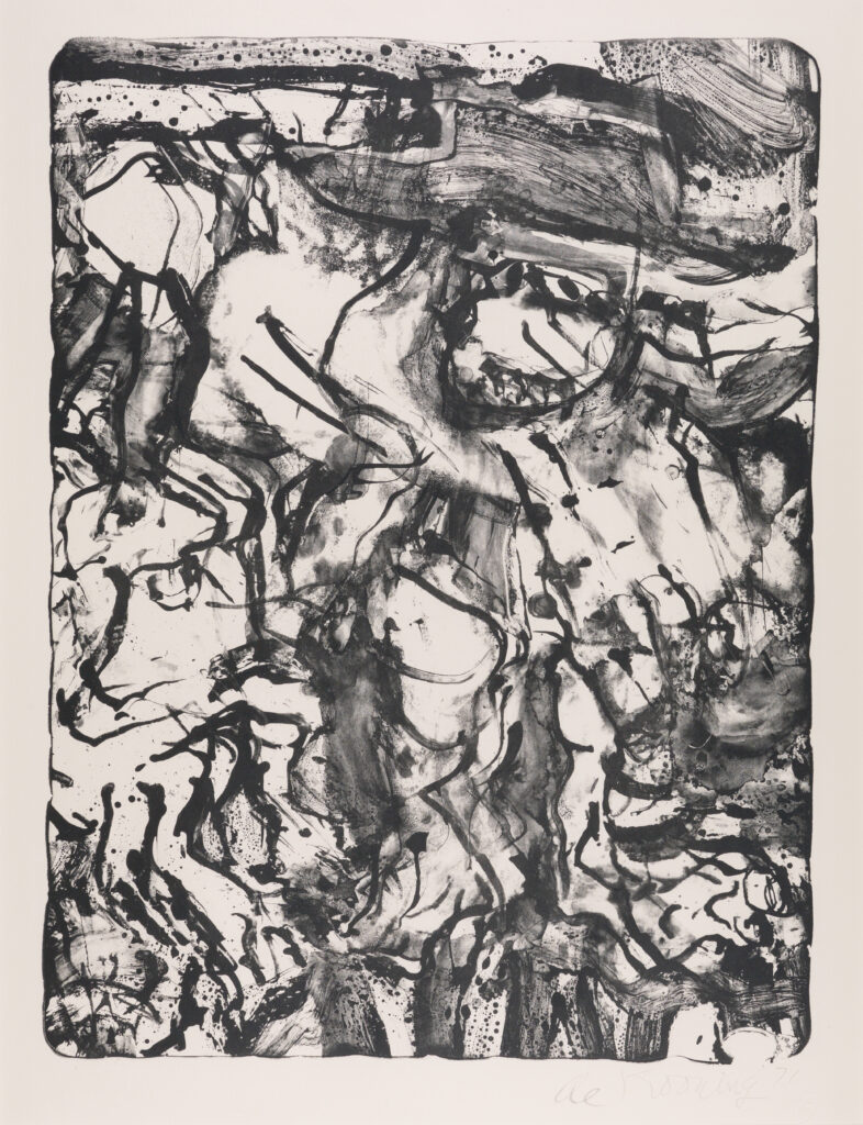
The Preacher (1971), Willem de Kooning
How de Kooning’s Line Transformed Printmaking
What immediately separates de Kooning’s prints from virtually every other major artist working in the medium is the quality of the line. Printmaking, particularly lithography and etching, rewards control – the patient, deliberate mark, the planned composition, the edition-ready image that can be reproduced with fidelity. De Kooning treated all of this as a provocation. His lines slash, loop, double back, and dissolve. They carry the same improvisatory urgency as his brushwork, but compressed into a scratched or drawn mark on stone or plate. This wasn’t technical recklessness – it was a philosophical stance. For de Kooning, the trembling, uncertain line was not a flaw but the very location of truth. Where other printmakers sought mastery over the medium, he sought conversation with it.
De Kooning’s Lithographic Process: A Physical Encounter
His lithographic work, produced in close collaboration with master printers – most notably at the Irwin Hollander workshop in New York and later with the printer Emiliano Sorini – reads less like a controlled graphic process and more like a physical encounter. De Kooning would work directly on the stone or plate with a kind of full-body engagement, smearing, wiping, and redrawing in ways that pushed lithography to its structural limits. The resulting images carry a density and layering that tricks the eye into seeing paint, into sensing thickness and impasto where there is none. This is one of the rarest achievements in print history: a flat medium made to feel three-dimensional not through trickery but through sheer gestural force.

The Figure That Wouldn’t Quite Disappear
Throughout his prints, as in his paintings, de Kooning maintained a productive obsession with the human figure – particularly the female form – without ever resolving it into legibility. His women in print form are simultaneously present and dissolving, their anatomies suggested through arcs and slashes rather than contours, their flesh implied by the pressure of a mark rather than by representation. This ambiguity is not evasion. It reflects de Kooning’s core belief, held throughout his career, that content and abstraction were not opposites but conspirators. The figure is always there in his prints – glimpsed in a curve of hip, a tumbling shoulder – and always retreating. The viewer is left in a state of perpetual, pleasurable uncertainty.
What Collaboration Did to de Kooning’s Vision
Unlike Picasso, who approached printmaking with the confidence of a man who assumed every medium would obey him, de Kooning entered into genuine dialogue with his printers. He was willing to be surprised, even destabilised, by what the process returned to him. When ink pooled unexpectedly, when a plate held a ghost image from a previous state, he incorporated these accidents rather than correcting them. This openness to the medium’s own logic gave his prints a quality that is exceptionally rare: they feel discovered rather than executed. The best of them – works like his Untitled lithographs of the late 1970s – have the quality of something unearthed, as if the image had always existed inside the stone and de Kooning simply moved his hand until it emerged.
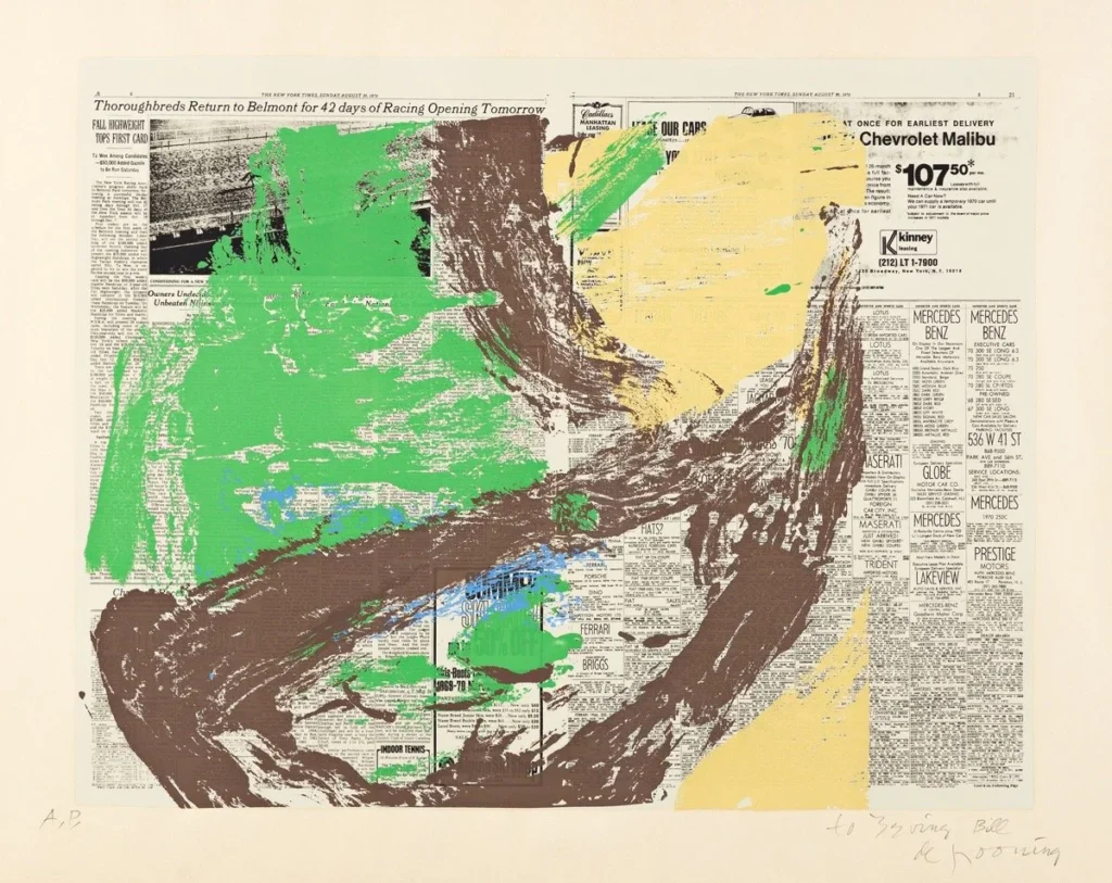
Untitled (1975), Willem de Kooning
Age, Loss, and the Print That Shimmers
There is a further dimension to de Kooning’s late prints that demands attention. Made during the period when his Alzheimer’s disease was beginning its long erosion, works from the 1980s possess an eerie, floating luminosity that his earlier prints do not. The line becomes less violent, more lyrical – looping ribbons of colour that seem to hover above the paper’s surface. Whether this represents artistic evolution, neurological change, or some mysterious convergence of both remains one of art history’s genuinely open questions. What is not in question is the beauty of the result. These late prints shimmer with an almost unbearable lightness, as if the artist had finally stopped fighting the medium and found, in that surrender, something close to grace. In a career defined by struggle, they stand as his most tender mark on paper – and among the most haunting works in the entire history of the print.
Which Willem de Kooning Prints Should Collectors Look For?
For collectors approaching de Kooning’s printed work for the first time, the range can feel overwhelming. His output in the medium spans three decades, multiple techniques, and several distinct periods – each with its own character, its own price range, and its own relationship to his broader career. What follows is not a definitive ranking but an orientation: the works and periods that matter most, and why.
The Hollander Lithographs (Late 1960s–Early 1970s)
De Kooning’s earliest serious engagement with printmaking came through his collaboration with master printer Irwin Hollander in New York. Works produced in this period – including The Preacher (1971), one of his most sought-after prints – show an artist still testing what the medium will and won’t permit. The lines are bold and declarative, the compositions more contained than his later work, but the gestural energy is already unmistakable. These are strong entry points for collectors: historically significant, immediately legible as de Kooning, and produced in editions that still surface at auction and through specialist dealers with relative regularity.
The Untitled Lithographs of the Late 1970s
If there is a consensus among serious collectors and curators about where de Kooning’s printmaking achieves its greatest intensity, it tends to settle here. Works like Untitled (1975) and the sequence of lithographs produced through the late 1970s with printer Emiliano Sorini represent the fullest realisation of his ambitions in the medium. The gestural complexity is at its height, the layering is extraordinary, and – crucially – these prints feel least like prints. They carry the presence of paintings without being pale imitations of them. Expect to pay accordingly: the finest examples from this period command serious prices at the major auction houses, though editions are large enough that patient collectors can find opportunities.
The Late Ribbon Works (1980s)
The prints de Kooning made in the final decade of his active career are the most polarising – and, for a certain kind of collector, the most compelling. As his Alzheimer’s progressed, the furious, slashing mark gave way to something quieter: looping ribbons of lithographic colour, often working in blues, pinks, and yellows, that seem almost to float across the paper. Critics have long debated how much intention remained in these works; what is not debatable is their visual distinctiveness. They look like nothing else in the history of the print, and they attract collectors who respond to their particular quality of weightless, unguarded beauty. They also tend to be more accessible in price than the peak-period works, making them an intelligent entry point for collectors who want a piece of his late voice without the premium of his most contested period.