Ink for the Many: 250 Years of American Printmaking
How a nation built on the radical idea that power belongs to the people found its visual language in a medium built on the same principle: the multiple.
There is a reason the print has always felt like the most American of art forms. A painting is singular – one canvas, one owner, one wall. A print is a proposition: make the image once, then make it available to everyone who wants it. That idea – that beauty and meaning shouldn’t be rationed to whoever can afford the only copy – runs parallel to the country’s founding mythology almost too neatly. From the engraved broadsides that spread revolutionary fervor through the colonies to the screenprints that turned Marilyn Monroe into wallpaper, American printmaking has spent two and a half centuries arguing, image by image, that art belongs to the many. Here’s how that argument unfolded.
The Engraver as Propagandist: 1776 and the Weaponised Image
Before there was an American army, there was an American image problem – and printmakers solved it. In 1770, six years before independence, Paul Revere engraved The Bloody Massacre, a copper-plate depiction of British soldiers firing on a Boston crowd. It was not strictly accurate. It was, however, brilliantly reproducible, and copies flooded the colonies, turning a chaotic street skirmish into a unifying grievance. This was propaganda, yes – but it was also the first great demonstration of what a print could do that a painting couldn’t: travel. Get into taverns, print shops, and parlors simultaneously, doing the work of persuasion at a scale no single canvas ever could. Revere wasn’t alone in recognising the print’s power: Amos Doolittle, a New Haven engraver, produced some of the first widely circulated images of the battles at Lexington and Concord, essentially functioning as the war’s photojournalist a century before photography existed.
Through the Revolutionary period and into the early Republic, engravers and etchers functioned as the nation’s shared visual memory. Charles Willson Peale, better remembered today as a painter, also produced engraved portraits meant for wide distribution rather than a single patron’s wall. David Claypoole Johnston, sometimes called “the American Cruikshank,” turned satirical printmaking into a genuine political weapon, skewering Federalists and Anti-Federalists alike. Portraits of Washington, maps of the new territories, sharp-elbowed cartoons – all of it moved through the same channel: cheap, reproducible ink on paper, available to a shopkeeper as readily as a statesman. The medium’s democratic character wasn’t an accident of technology. It was, from the start, inseparable from the politics it served.
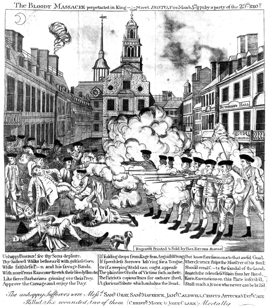
The Bloody Massacre, 1770, Paul Revere
“Printmakers to the People”: Currier & Ives and the Industrial Multiple
Fast-forward to the 1830s, and a new firm figured out how to industrialise that founding impulse. Nathaniel Currier and his partner James Merritt Ives didn’t just make prints – they ran what was essentially a visual newspaper, churning out hand-coloured lithographs of steamboat disasters, western expansion, sporting scenes, and sentimental domestic life, sold for pennies to a middle class hungry for images of itself. Much of that output came from the firm’s most prolific staff artist, Fanny Palmer, whose railroad and landscape scenes did more to define the American visual imagination of the era than almost any single painter. At their peak, the firm produced thousands of titles and sold millions of individual prints.
The lithograph’s reach extended well beyond Currier & Ives’ own studio. George Catlin used the medium to circulate his depictions of Native American life to audiences who would never travel west, while Winslow Homer, decades before he was known as a painter, cut his teeth as a wood engraver producing scenes for Harper’s Weekly – proof that even artists destined for the museum wall often started in the reproducible trade. Critics dismissed prints like these as commercial and unserious – hardly “fine art.” But that critique misses the point entirely: this generation of printmakers proved that an American public, not just an aristocratic few, would buy art if the price and format made ownership possible. The lithograph became furniture for the growing American home, and with it, art stopped being something you visited and became something you lived with.
The New Deal Makes It Official: WPA and the Federal Art Project
If the 19th century commercialized the democratic print, the Great Depression made it a matter of federal policy. In 1935, the Works Progress Administration’s Federal Art Project put thousands of unemployed artists on the government payroll – and a huge portion of that output was printmaking, specifically because prints could be produced in volume and distributed to schools, libraries, hospitals, and community centres that could never have afforded original paintings.
The FAP’s graphic arts division, active in cities from New York to San Francisco, became a genuine laboratory. Artists experimented with silkscreen printing as a fine-art medium for the first time – a technique borrowed from commercial signage that printmakers like Anthony Velonis began pushing into artistic territory, laying groundwork that would matter enormously two decades later. Elizabeth Olds, a printmaker and FAP supervisor, pushed lithography toward hard-edged social realism, while Riva Helfond, Harry Sternberg, and Louis Lozowick each used the medium to document labor, industry, and the texture of ordinary urban life. Even Jacob Lawrence, best known today for his painted narrative series, worked in an era and milieu defined by this same documentary impulse toward accessible, widely circulated imagery. The government’s insistence on wide distribution meant this art was explicitly, structurally built to reach people who would never set foot in a gallery. It’s hard to overstate how radical this was: an American government deciding that access to art was a public good worth funding, and that the print was the tool best suited to deliver it.
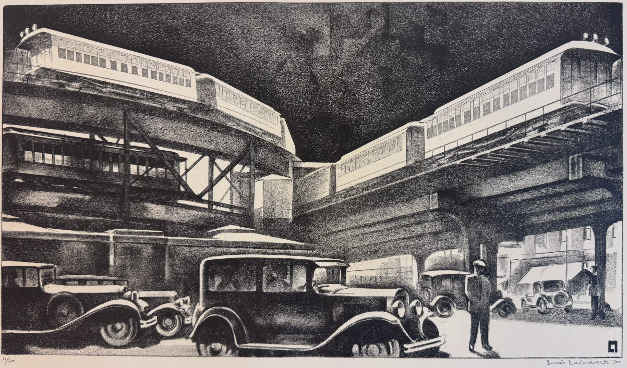
Traffic, 1930, Louis Lozowick, Catherine Burns Fine Art
Warhol and the Screenprint as Cultural X-Ray
By the early 1960s, the same silkscreen technique the WPA had nurtured found its most famous practitioner – and its most subversive purpose. Andy Warhol didn’t just use screenprinting; he used it as an argument. His repeated Marilyns, Campbell’s Soup Cans, and Coca-Cola bottles weren’t celebrating mass production so much as holding it up to the light. Warhol’s famous observation that a Coke is a Coke whether a president or a homeless person drinks it was itself a statement about the democratizing power of the multiple – and he made his art using the exact mechanical repetition that mass culture ran on.
Screenprinting let Warhol produce images at a volume and speed that matched the media saturation he was depicting, collapsing the distance between “fine art” and the advertising and tabloid imagery flooding postwar American life. He wasn’t working in isolation – James Rosenquist, who came up painting billboards before turning to fine art, brought that same commercial-scale sensibility to large-format Pop screenprints. Where Currier & Ives democratized access to images, Warhol and his peers democratised the subject matter – turning soup cans and movie stars into material as worthy of serious art as any classical bust. The print, once again, was the only medium built to make that point.
The Studio Renaissance: Prints as Serious Art, Not Just Accessible Art
The back half of the 20th century saw American printmaking shed any lingering sense that it was a “lesser” medium – largely because a handful of visionary studio founders insisted on it. June Wayne founded the Tamarind Lithography Workshop in Los Angeles specifically to revive lithography as a serious American art form after decades of decline. Kenneth Tyler, the master printer behind Gemini G.E.L. and later Tyler Graphics, became the era’s essential technical collaborator, coaxing ambitious new effects out of the medium alongside the artists he worked with. In New York, Tatyana Grosman founded Universal Limited Art Editions (ULAE) and drew major painters into the print shop for the first time. Robert Rauschenberg and Jasper Johns became two of ULAE’s most important collaborators, while Roy Lichtenstein extended his comic-panel aesthetic through lithography and screenprint at Gemini. Ellsworth Kelly, Frank Stella, and Helen Frankenthaler all produced landmark editions through these same workshops, treating the print shop as a site of invention rather than reproduction, using the medium’s built-in repetition and layering to do things paint alone couldn’t.
This mattered for the democratic thread running through the whole story: it proved that “accessible” and “serious” were never actually in conflict. A print could be technically ambitious, conceptually rigorous, and exist in an edition of fifty that regular collectors could realistically own – not a contradiction, but the whole point.
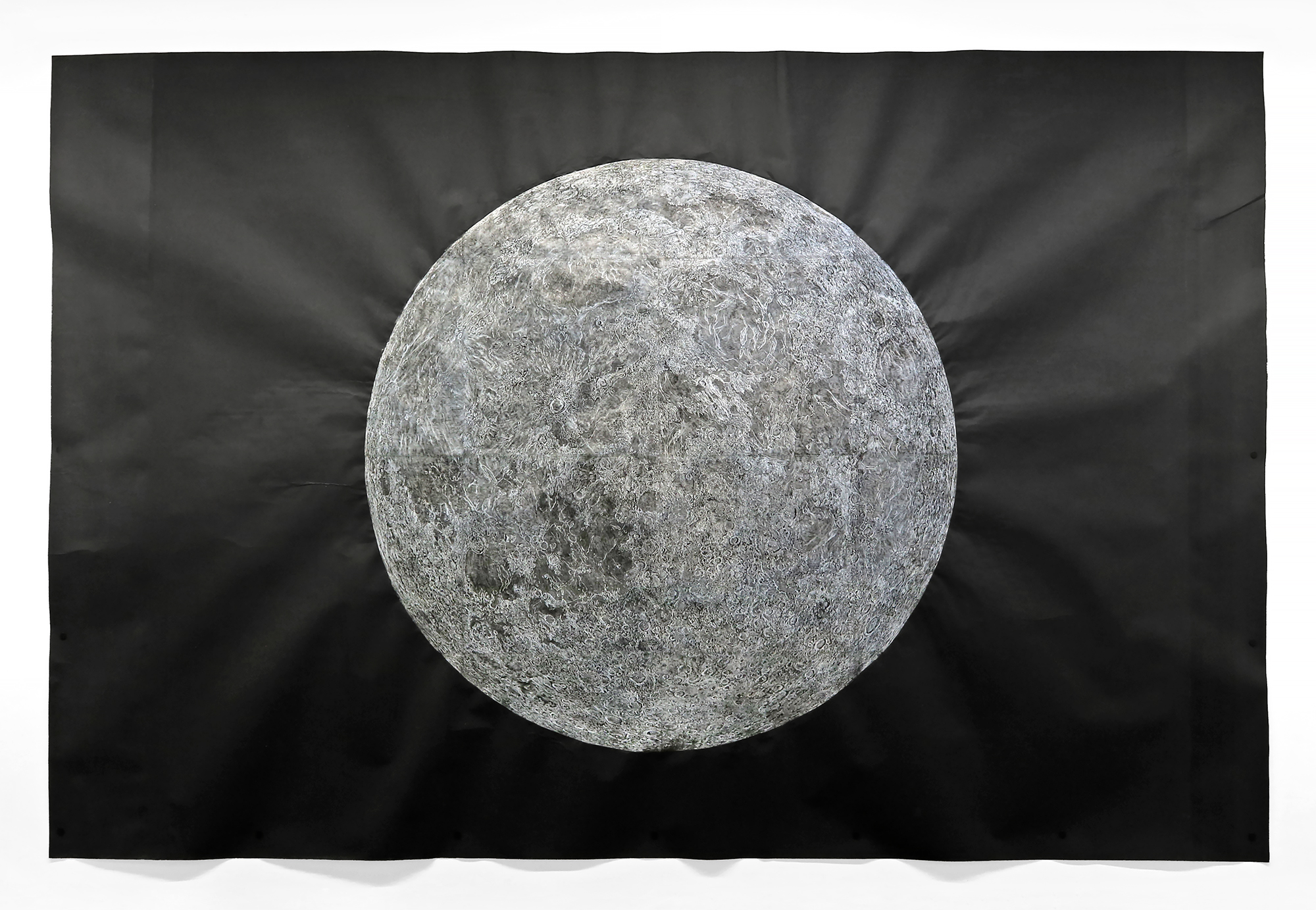
Wooden Moon, 2022, Kiki Smith, Krakow Witkin Gallery
Where the Multiple Stands Today
Contemporary American printmaking carries all of this history at once. Kara Walker uses etching and screenprint to confront race and American history directly, echoing the political urgency of the earliest Revolutionary-era engravers. Kiki Smith works across etching, lithography, and woodcut with a hands-on physicality that recalls the studio renaissance of Wayne, Grosman, and Tyler. Kerry James Marshall continues the social-realist thread first laid down by the WPA printmakers, while Julie Mehretu produces technically ambitious, large-scale editions that push the medium’s formal limits the way Rauschenberg and Johns once did. Giclée and digital printing have pushed accessibility further still, while traditional intaglio, letterpress, and screenprint studios keep the hands-on tradition alive, often explicitly in dialogue with the workshops and studios that came before them. The edition – numbered, signed, finite but plural – remains the medium’s defining gesture: rare enough to matter, multiple enough to reach beyond a single collector’s wall.
Of course, no list of names – however long – could do this story justice. For every printmaker mentioned here, hundreds more spent careers at the press, the plate, and the screen, and their absence from this page is a limit of space, not of significance. That’s especially true today. The working printmakers and master printers currently at studios across the country – the ones pulling proofs, mixing inks, and troubleshooting a stubborn plate at this very moment – deserve the same celebration as any name in the history books. They are the ones actually keeping the tradition alive, one edition at a time, often without the recognition the medium’s pioneers eventually received.
Toward the Next 250 Years
If the last two and a half centuries proved anything, it’s that the print reinvents itself in step with the country it belongs to – engraving for a revolution, lithography for an industrializing middle class, federally funded silkscreen for a nation in economic crisis, Pop screenprint for a media-saturated postwar culture. Two hundred fifty years after an engraver’s copper plate helped light the fuse of a revolution, that same gesture still carries the charge. There’s no telling exactly what tools the next 250 years will hand to American printmakers, but the underlying bet – that meaning multiplies rather than dilutes when it’s shared widely – shows no sign of expiring. Here’s to the printmakers and master printers working right now, quietly writing the next chapter, and to whatever they’ll hand down to the artists who aren’t born yet.