Home > The Master of Colour and Line: Josef Albers’ Journey into Printmaking
Printmaker Short Stories
The Colour of Precision: Josef Albers and the Art of the Print
In 1963, at the age of 75, Josef Albers stood in the workshop of Tamarind Lithography Workshop in Los Angeles, his careful hands adjusting a lithographic stone with the same methodical precision he had brought to everything else in his long career. The German-born artist, who had fled Nazi Germany and found refuge in American art education, was embarking on what would become one of his most significant explorations in printmaking.
Albers had already established himself as a master of colour theory through his famous “Homage to the Square” paintings, but printmaking offered him something different: the ability to democratize his investigations into how colors interact and deceive the eye. Where a painting existed as a single, precious object, a print could be multiplied, shared, studied by students and collectors alike.
His approach to printmaking was characteristically systematic. At Tamarind, he worked closely with master printer Kenneth Tyler, developing a series of lithographs that would translate his colour investigations into the medium’s particular language. Unlike many artists who came to printmaking as an afterthought, Albers embraced its technical demands. He understood that each medium – whether lithography, screenprinting, or etching – had its own vocabulary of mark-making and color reproduction.
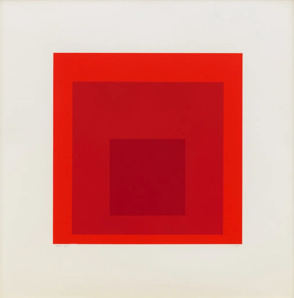
Homage to the Square: Edition Keller IK, 1970, Josef Albers
The breakthrough came with his screenprint series. Working with Tyler, who had moved to establish Gemini G.E.L. in Los Angeles, Albers discovered that screenprinting’s flat, even application of ink was perfectly suited to his geometric compositions. The medium’s precision matched his aesthetic philosophy: that art should emerge from clear thinking and careful observation rather than emotional gesture.
Between 1963 and 1976, Albers produced dozens of print editions, each one a careful experiment in visual perception. His “White Line Squares” series, created through screenprinting, demonstrated how the same set of colors could appear completely different depending on their context. A gray square might appear warm when surrounded by cool blues, then seem cool when placed against warm yellow – all achieved through the precise registration and colour mixing that printmaking demanded.
What made Albers’ printmaking revolutionary wasn’t just his mastery of technique, but his understanding of the medium’s educational potential. These weren’t simply artworks to be collected; they were teaching tools. At Yale, where he taught from 1950 to 1958, and in workshops around the world, Albers used his prints to demonstrate principles that had previously been difficult to communicate. Students could see, in multiple identical impressions, exactly how colour relationships functioned.
His collaboration with printers was legendary for its rigour. Albers would spend hours achieving the precise hue he wanted, sometimes requiring dozens of test prints before approving a colour. Master printer Kenneth Tyler recalled how Albers would examine each proof with a magnifying glass, checking not just for colour accuracy but for the evenness of ink application and the sharpness of edges.
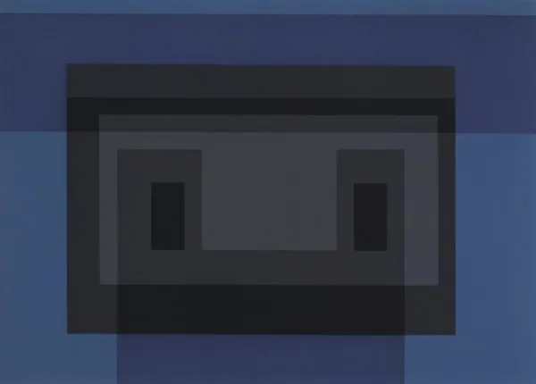
Variant Vii, From 10 Variants, 1966, Josef Albers
The final years of Albers’ career were dominated by this printmaking work. Even as his eyesight began to fail, he continued to create prints, relying increasingly on his deep understanding of colour relationships and his trusted collaborations with master printers. His last major print series, completed in 1976, the year of his death, demonstrated that his investigations into colour and perception remained as rigorous and surprising as ever.
Today, Albers’ prints hang in museums worldwide, but they also continue to serve their original educational purpose. Art students still study his screenprints to understand how colors interact, how our eyes can be fooled, and how systematic investigation can yield profound artistic insights. In this way, his embrace of printmaking’s reproducible nature fulfilled his deepest pedagogical ambitions: making the mysteries of color perception accessible to anyone willing to look carefully and think clearly.