
Ink, Dots, and Rebellion: How the Printing Press Gave Birth to Pop Art
The Studio Was Too Slow – The World Was Already Moving in Print
Picture a painter in 1950s New York, hunched over a canvas for weeks, chasing the perfect brushstroke while the culture around him is being reprinted a million times an hour. Comic strips roll off newspaper presses by dawn. Soup can labels get stamped onto tin by the thousand. Movie star photos are halftoned into magazine pages, dot by mechanical dot, faster than any human hand could ever paint them. The gap between “fine art” and “the actual visual world people lived in” had never been wider – and it was printmaking, more than any other force, that dragged painting kicking and screaming into the twentieth century’s image economy.
Pop Art didn’t spring from nowhere. It sprang from ink.
A Culture Already Mass-Produced
By the mid-1950s, ordinary life in Britain and America was drenched in printed imagery in a way no previous generation had experienced. Offset lithography and photomechanical reproduction had matured to the point where advertisements, tabloids, comic books, and packaging could be churned out with dazzling speed and uniformity. A generation of artists grew up not with unique, handmade objects as their visual diet, but with the repeated, the reproduced, the identical-copy. That was simply what images looked like now – flat, bright, cropped, and multiplied.
Artists in London’s Independent Group, meeting at the Institute of Contemporary Arts in the early 1950s, were among the first to take this seriously as subject matter rather than something to be above. Eduardo Paolozzi, a sculptor with a magpie’s eye for scrap-bin ephemera, had already been assembling collages out of American pulp magazines, pin-up pages, and advertising clippings by the late 1940s – printed matter salvaged directly from discarded reading material and repurposed as raw art supply. His 1947 collage I was a Rich Man’s Plaything, built from a torn magazine cover, contains what may be the first printed use of the word “pop” in an artwork, spelled out in a comic-style explosion over a pin-up girl’s head. Richard Hamilton’s small 1956 collage Just What Is It That Makes Today’s Homes So Different, So Appealing? – assembled from clippings out of American magazines – is often cited as the movement’s opening shot, and it’s telling that its raw material wasn’t paint at all. It was print: a vacuum cleaner ad, a comic-book cover, a canned-ham label, all cut and pasted rather than painted from life. Before Pop Art had a name, it already had a medium – scissors and glue applied to somebody else’s printing press.
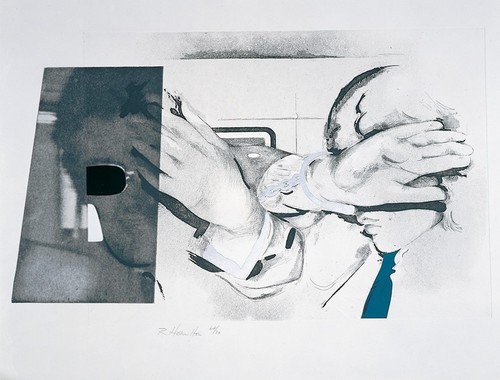
Swingeing London 67, 1968
Richard Hamilton
Sims Reed Gallery
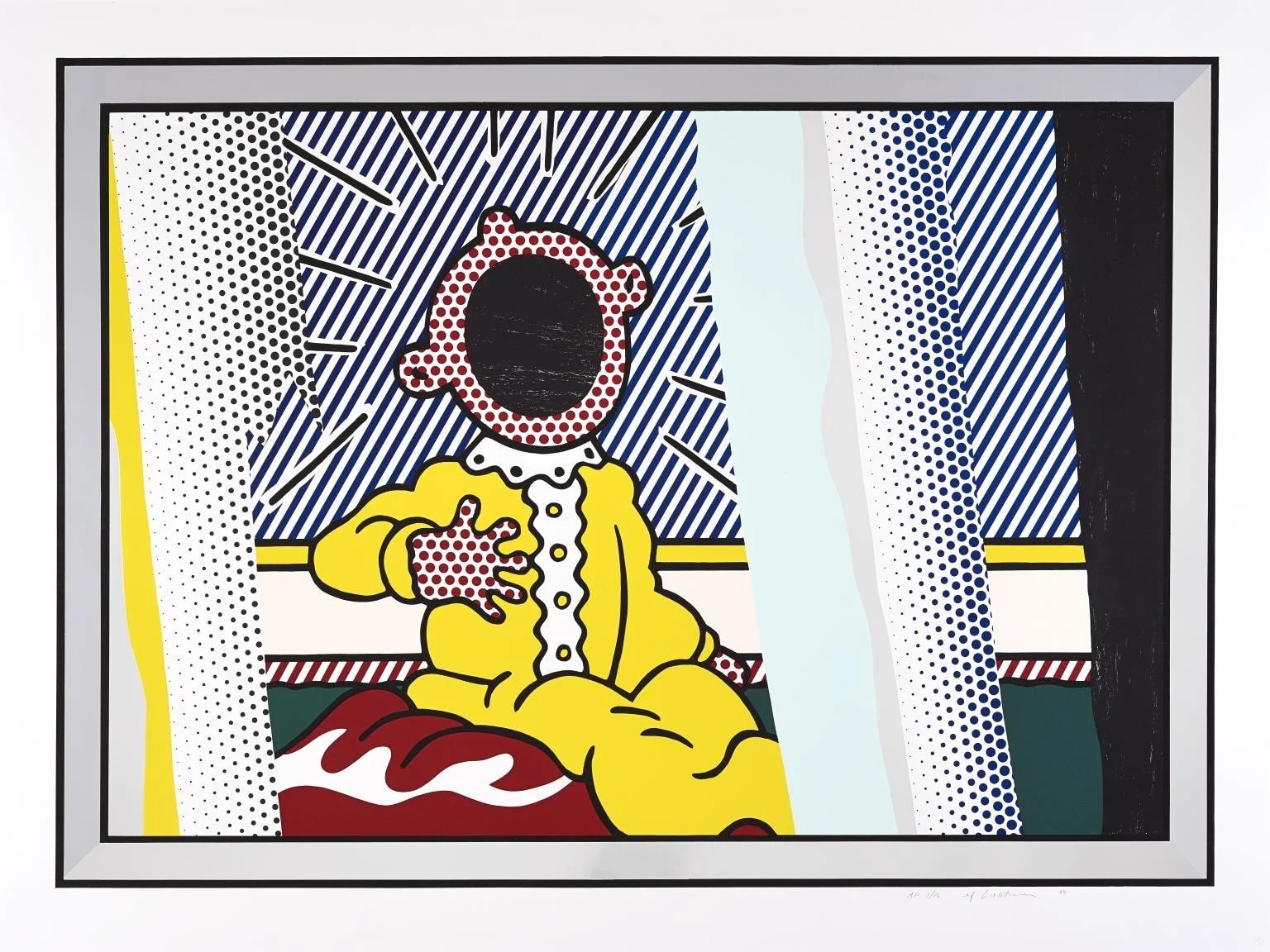
Reflections on The Scream, 1990
Roy Lichtenstein
Hamilton-Selway Fine Art
Printmaking Wasn’t Just an Influence – It Became the Medium Itself
Here’s the pivot point that separates Pop Art from every movement before it: artists didn’t just depict printed mass culture, they adopted its actual production methods.
Screenprinting (silkscreen) is the clearest case. A commercial technique used for decades to stamp identical designs onto textiles, posters, and packaging, screenprinting let an artist push ink through a stencil-and-mesh screen to produce an image with none of the “hand of the artist” that oil painting prized. Andy Warhol seized on this in 1962, using it to turn a photograph of a soup can – or Marilyn Monroe, or a dollar bill – into a repeatable, assembly-line image. He began by hand-painting Campbell’s soup cans that same year, but quickly abandoned the brush once he grasped that photo-silkscreen let him transfer a photographic image straight onto canvas with mechanical exactness, and then repeat it, panel after panel, with only the small human errors of registration and pressure to distinguish one from the next.
The technique wasn’t a stylistic choice layered on top of the subject; it was the argument. A painting of a Campbell’s can made with reverent brushwork would have missed the point entirely. A screenprint of one, slightly misaligned, slightly smudged, run off in multiples in a studio he literally called “The Factory,” made the point unavoidable: in a consumer economy, images – like soup, like celebrity – are manufactured, not created. Warhol staffed The Factory with assistants who helped pull the screens, effectively running it like a small commercial print shop rather than a solitary painter’s atelier, and he made no secret of it. When asked who actually made his art, he’d deflect with the same flatness he brought to the canvases themselves – the joke and the thesis were the same joke.
Ben-Day dots, the halftone dot pattern used in cheap newspaper and comic-book printing to fake gradients of color with a limited number of inks, became Roy Lichtenstein’s signature. He didn’t just borrow comic-strip subject matter – heartbreak, explosions, a girl crying over the phone – he manually reproduced the printing artifact itself, enlarging the dots so the mechanics of mass printing became the visible texture of the painting. The “flaw” of commercial reproduction was elevated into the whole aesthetic.
Commercial and advertising printing techniques more broadly – cropped photographic framing, bold flat color fields, the graphic economy of a billboard or a cereal box – fed directly into how Pop artists composed their work, whether or not the final piece was literally printed. James Rosenquist, who had spent years painting giant billboards over Manhattan before turning to gallery work, brought that same monumental, mechanically-legible scale and fragmentation into canvases like F-111, composing a painting the way a sign-painter composes an advertisement meant to be read at forty miles an hour. And offset lithography, the workhorse process behind newspapers, magazines, and paperback covers, offered its own lesson: that an image could be built entirely out of a handful of flat process colours laid down in overlapping dots and plates, with no gradient, no shadow, no illusionistic modeling required. That flatness – a technical limitation of cheap commercial printing – became, in Pop hands, a deliberate visual signature rather than something to disguise.
Why Printmaking, Specifically, Was the Perfect Weapon
A few converging factors made print the natural engine of the movement, rather than an incidental tool
It matched the message to the medium. Pop Art’s central provocation was that consumer culture its products, celebrities, and advertising – was as worthy of serious artistic attention as myth or landscape had been for earlier generations. Printmaking, being itself the technology of mass consumer culture, let artists make that argument formally, not just thematically.
It democratised (and de-mystified) authorship. Prints could be multiplied, and multiples undercut the traditional cult of the unique masterpiece. This was a direct jab at Abstract Expressionism, the reigning movement Pop was reacting against, which prized gestural spontaneity and the singular, sacred canvas. Warhol’s deadpan reply – that he wanted to be a machine — was made literal in his choice of a mechanical printing process.
It was fast, and speed mattered. Postwar consumer culture moved at the speed of advertising cycles. Silkscreen and photomechanical processes let artists work at something closer to that tempo, producing series and editions rather than single laboured icons.
Commercial art training fed directly in. Many key figures – Warhol chief among them – began their careers as commercial illustrators and advertising artists. They arrived already fluent in the printing trade’s tools and logic, and simply pointed those tools at fine art’s front door instead of a department store window.
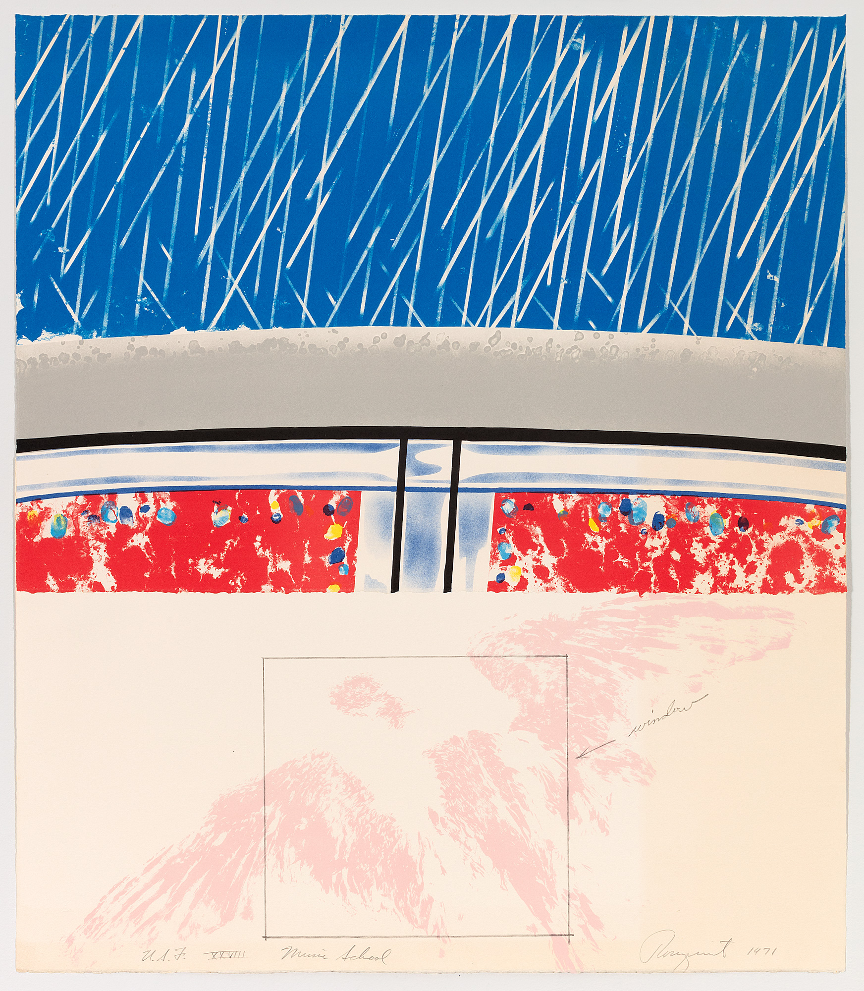
Music School, from Cold Light Series, 1971
James Rosenquist
Graphicstudio
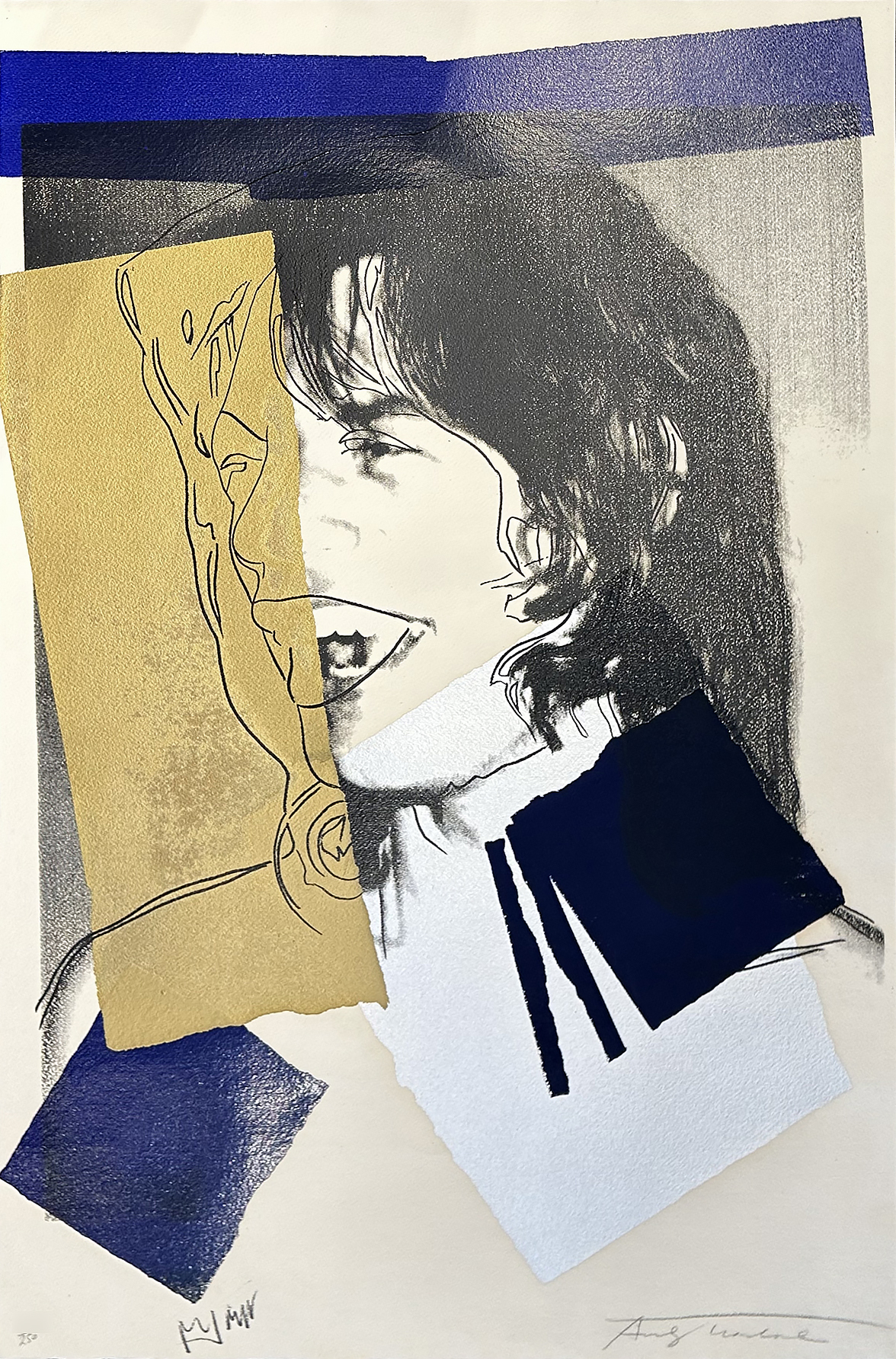
Mick Jagger (FS II.142), 1975
Andy Warhol
Revolver Gallery
The Old Guard Objection – And the Counter-Argument
Not everyone was convinced this counted as art at all. Critics steeped in the seriousness of Abstract Expressionism saw screenprinted soup cans as a joke, a cynical stunt, or an abdication of craft – painting without painting. Some argued Pop Art was merely reproducing consumerism rather than critiquing it, flattering the very culture of mass production and celebrity it claimed to examine.
Pop’s defenders countered that this was precisely the point: a culture of mass reproduction deserved an art that used mass reproduction, deadpan and without moralising, to hold up a mirror rather than deliver a sermon. Whether Warhol’s repeated Marilyns are celebration, elegy, or cold commentary on how fame consumes a person is still argued over today – and that ambiguity, made possible by the flat, repeatable nature of the print itself, is arguably the movement’s most enduring achievement. Lichtenstein faced a parallel accusation – that he was simply copying comic-book panels wholesale, with no more originality than a photocopier. His answer was that the enlargement itself was the transformation: blowing a two-inch comic panel up to six feet forced the viewer to see the dots, the crude color separations, and the flattening logic of commercial printing that a reader normally looks straight through. Nobody, he pointed out, ever really looked at a comic strip as an image; they looked through it to the story. His canvases made that invisible machinery impossible to ignore.
What’s certain is this: Pop Art couldn’t have looked the way it did, or meant what it meant, if artists had stuck to the brush. It took the printing press – the same machine spitting out soup labels and comic strips – to make the argument that those very images were the true portrait of the age. And the movement’s legacy has followed the same logic ever since: every time a gallery sells a numbered print edition, every time a street artist runs a stencil through a screen, every time a contemporary painter borrows the flat, dotted look of cheap reproduction on purpose, they’re working in a lineage that started not with a masterpiece, but with a press check.