
The Stencil That Painted the Jazz Age: A History of Pochoir Prints
There is a particular kind of colour you only find in a handful of places: the inside of a butterfly’s wing, a stained-glass window at noon, and – if you know where to look – a French fashion plate from 1912. That colour is saturated to the point of vibrating, unmixed and unmuddied by any printing press. It is produced by a technique with its own name: pochoir, the French word for “stencil.” For about a century, pochoir was one of the most sophisticated, most labor-intensive, and most gorgeous color-printing methods on earth.
Pochoir is simply the French word for “stencil.” But calling pochoir prints “stenciled pictures” is a bit like calling a cathedral “a big room.” The technique has genuinely ancient roots, a long and scattered global prehistory, and then – in early twentieth-century Paris – a sudden, concentrated flowering into one of the most technically demanding printmaking practices ever industrialised. Understanding pochoir means understanding both halves of that story.
Deep Roots: Stenciling Before It Had a French Name
Using a cut template to apply color is one of the oldest image-making shortcuts humans devised, and it shows up independently across cultures long before Paris got involved.
In Japan, the art of katazome and katagami – stencils cut from mulberry paper reinforced with persimmon tannin and silk mesh – dates back to at least the Nara period (8th century CE) and matured over the following thousand years into an extraordinarily refined craft for dyeing kimono textiles. Japanese stencil cutters achieved staggering intricacy, cutting thousands of tiny holes into a single sheet without the design collapsing into loose fragments, using a fine silk-thread mesh to hold everything in place. When Japanese art flooded into Europe after the 1850s opening of trade, these stencils were among the objects Western collectors and printmakers pored over – and Japonisme’s fingerprints are all over the pochoir aesthetic that emerged fifty years later.
In China, stenciling combined with woodblock printing to color paper goods, playing cards, and devotional images for centuries. In Europe, the earliest documented use of stencils for coloring printed images dates to the fifteenth century, when printers of playing cards and religious woodcuts used simple cut-paper or thin metal templates to speed up hand-colouring – a purely practical shortcut, with no pretensions to fine art. By the eighteenth century, English and French printers were using stencils to add flat washes of colour to mezzotints, botanical illustrations, and topographical prints, again mostly as a labor-saving device rather than an artistic end in itself.
The crucial shift – from stenciling as a shortcut to stencilling as a medium capable of results nothing else could achieve – took nearly four hundred more years to happen, and it happened almost entirely in one city.
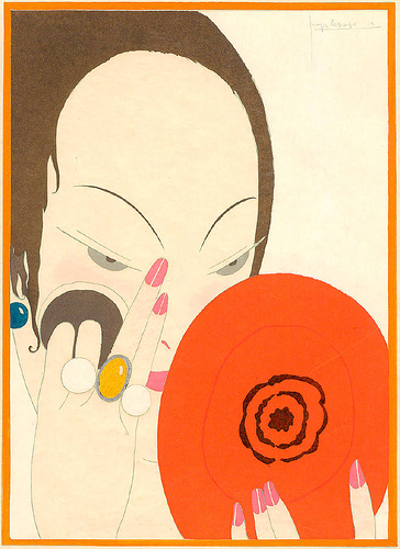
Le Miroir Rouge, 1914
Georges Lepape
Sylvan Cole Gallery
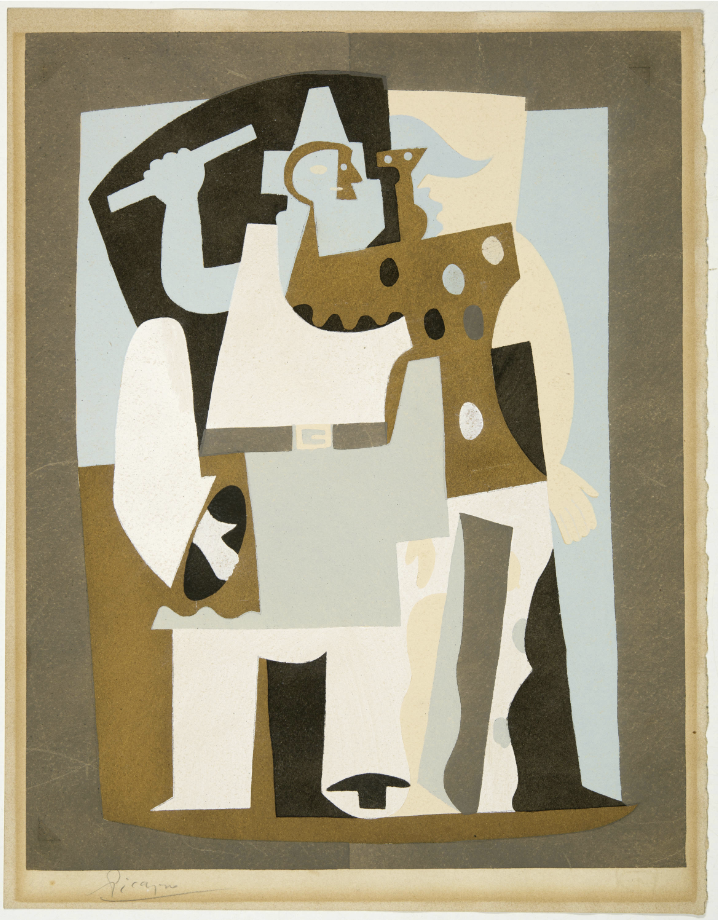
Pierrot et Arlequin, 1921
Pablo Picasso
John Szoke Gallery
Paris, the 1890s–1900s: A Technique Finds Its Purpose
The pochoir renaissance has a fairly precise starting point: Paris in the final years of the nineteenth century, amid the broader explosion of color lithography, Art Nouveau poster art, and a booming market for illustrated books and periodicals. Printers and publishers were hunting for a way to reproduce the luminous, unmixed colour of gouache and watercolour illustration – something photolithography and chromolithography of the period, still reliant on visible printing dots or imperfect ink registration, could not convincingly fake.
Early pioneers in this revival included the printer Jean Saudé, whose 1925 treatise Traité d’enluminure d’art au pochoir would later become the technique’s definitive manual, codifying decades of accumulated workshop knowledge – stencil-cutting methods, pigment recipes, brush techniques, drying times, registration tricks – into a single systematic text. By the time Saudé wrote it, pochoir was already a mature industry with its own trade vocabulary, its own specialist tool-makers, and its own hierarchy of master colourists.
The turn-of-the-century context mattered enormously. This was the era of Art Nouveau, when artists like Alphonse Mucha were already blurring lines between fine art and commercial illustration, and when Parisian publishing houses were competing fiercely to produce ever more luxurious limited-edition books, portfolios, and periodicals for a wealthy clientele. Pochoir offered something none of their rivals’ processes could: color with the vibrancy and texture of an original painting, applied to a printed edition that could, in principle, run into the hundreds of copies.
How It Actually Worked
The technique that emerged was staggering in its patience. A single pochoir print might require anywhere from twenty to well over a hundred separate stencils – one for each individual colour, shade, and tonal variation in the finished image. Each stencil was traditionally hand-cut, using a fine blade or specialized punch, from thin sheets of copper or zinc (durable but expensive and slow to cut), later supplemented by oiled cardboard, brass, or celluloid for shorter runs.
The base image – usually the outline and any fine linework – was first printed conventionally, often by lithography or letterpress, onto high-quality paper. Then the colouring began. A stencil was laid precisely over the printed sheet, and gouache, watercolour, or occasionally metallic or fluorescent pigment was worked through the cutout using a stiff, round-tipped brush called a pochon, or a soft dabbing pad, in a controlled circular motion that pushed pigment into the paper’s fibers without seeping under the stencil’s edge. The stencil was lifted, the paint left to dry, and the next stencil – the next colour – was laid down in its turn. For a complex image, this cycle might repeat for days on a single sheet, with colourists working in careful sequence from the lightest tones to the darkest, exactly as a painter builds up a canvas in layers.
The results are unmistakable once you’ve learned to spot them: color that sits on the paper rather than sinking into it, edges of remarkable crispness, blacks that read as genuinely black rather than printer’s-ink gray, and a faint, almost sculptural ridge where pigment pooled slightly against a stencil’s cut edge. Reproductions of pochoir prints rarely capture this quality – the saturation photographs as almost artificial, too perfect, until you see the original and realize that is exactly the point.
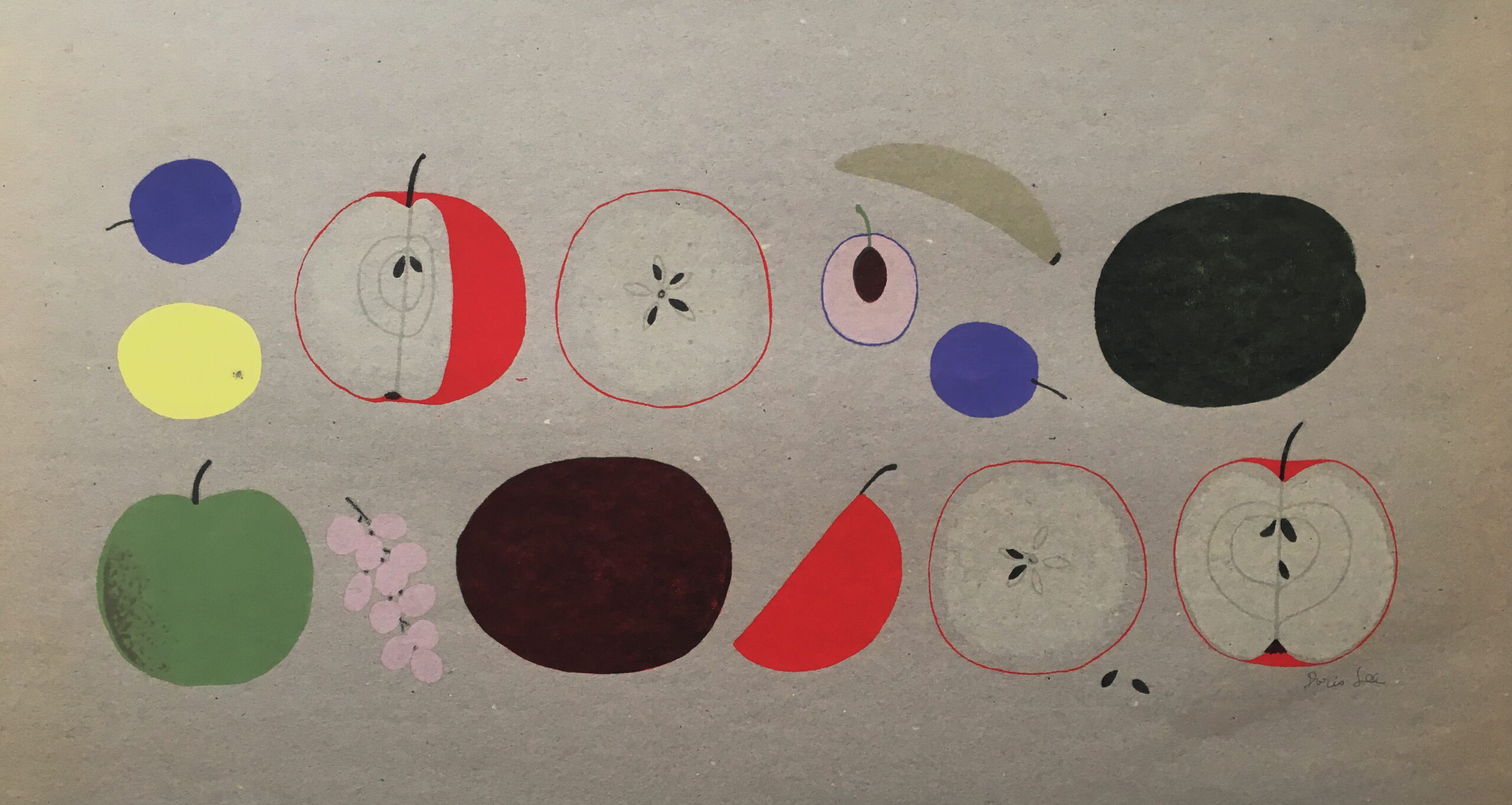
Christmas Fruit (proof), 1960
Doris Lee
William Chambers Art
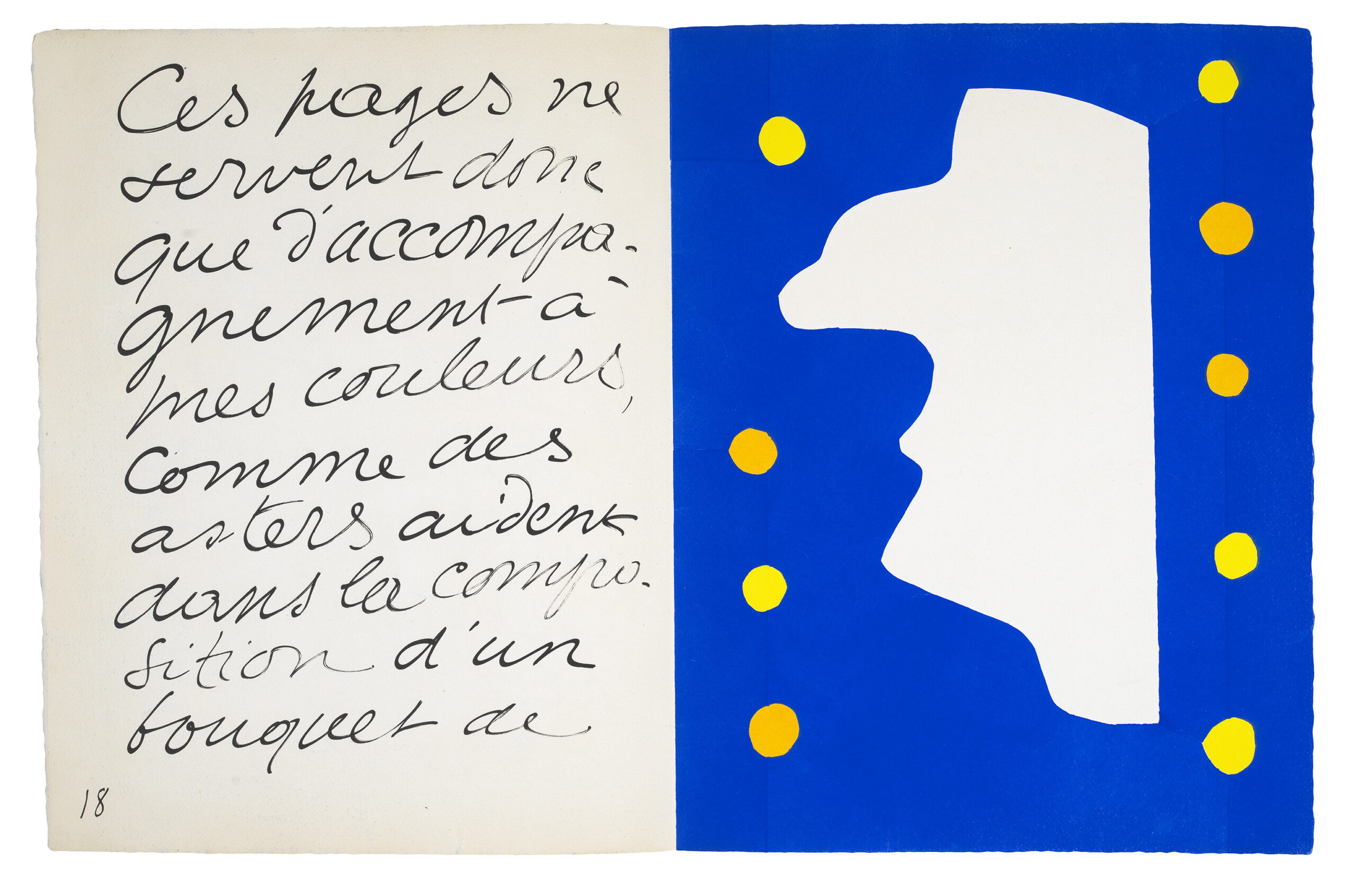
Monsieur Loyal, 1947
Henri Matisse
Sims Reed Gallery
The Paris Ateliers and the Women Who Ran Them
Pochoir colouring became an industry unto itself, centred on specialist workshops – ateliers – that employed teams of colourists, overwhelmingly women, working assembly-line fashion at long communal tables, each colourist responsible for laying one particular stencil across an entire print run before passing the sheets down the line to the next.
The most celebrated of these houses was the Atelier Saudinos–Jacomet in Paris (the successor firm to Jean Saudé’s own workshop), which pochoir-coloured work for nearly every major French Art Deco publication and became so synonymous with quality that “Jacomet” is still effectively used as a stamp of authentication among collectors and archivists today. Other notable workshops included ateliers run by Beaufumé and by André Marty, both of whom also worked as illustrators in their own right and understood exactly what a colourist needed from a stencil to succeed.
These were not anonymous factories churning out kitsch. The colorists were skilled artisans who had to match an artist’s original gouache maquette exactly, judging moment to moment when to let colours bleed softly into one another and when to preserve a hard, graphic edge – real painterly decisions, repeated plate after plate, for editions that might number only in the hundreds and were priced accordingly, as luxury objects rather than mass media.
Fashion’s Golden Vehicle: The Belle Époque to the Roaring Twenties
Pochoir found its truest calling in fashion illustration, and this was no accident of taste – it solved a genuine commercial problem. The great Parisian couture houses, Paul Poiret above all, needed a way to sell clothing through printed image at a moment when photography could not yet reliably capture the drape, sheen, and precise colour of silk, velvet, or Fortuny pleating, and when halftone reproduction flattened everything into muddy grey dots. Pochoir could render a jewel-toned kimono coat or an ivory evening gown with a fidelity that felt almost sculptural.
This demand produced two of the most beautiful sustained publishing projects in fashion history: the Gazette du Bon Ton (1912–1925, with a wartime hiatus) and Modes et Manières d’Aujourd’hui, alongside Paul Poiret’s own extraordinary commissioned albums. The opening shot is often dated to 1908, when Poiret commissioned the young illustrator Paul Iribe to produce Les Robes de Paul Poiret – a coordinated fusion of fashion, illustration, and stencil colour explicitly designed as propaganda for a single designer’s vision, rather than a neutral catalogue. Poiret repeated the gambit in 1911 with Georges Lepape and the album Les Choses de Paul Poiret.
From there the field bloomed. Illustrators including Lepape, George Barbier, André Marty, Charles Martin, and later Erté (Romain de Tirtoff) didn’t just draw clothes – they built entire fantasy worlds around them: women lounging in Orientalist interiors thick with the influence of the Ballets Russes, striding through Cubist-flattened gardens, smoking cigarettes in silhouettes so flat and graphic they anticipate poster design for decades to come. The visual language these artists developed – flattened perspective, decisive black contour line, blocks of unmodulated colour – wasn’t incidental to the printing technique; pochoir rewarded flat colour and crisp edges and struggled with subtle painterly gradation, so the aesthetic of an entire era of fashion illustration was shaped in part by what a stencil and a brush could physically achieve. Technique and style, in this case, were not separable.
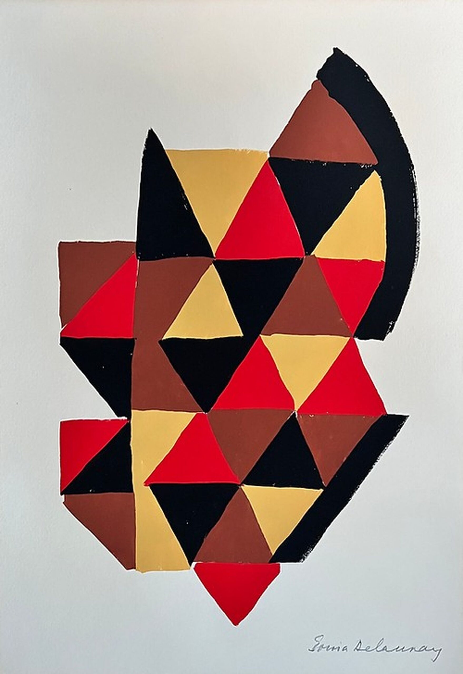
Untitled, 1925
Sonia Delaunay
Clifton Gallery
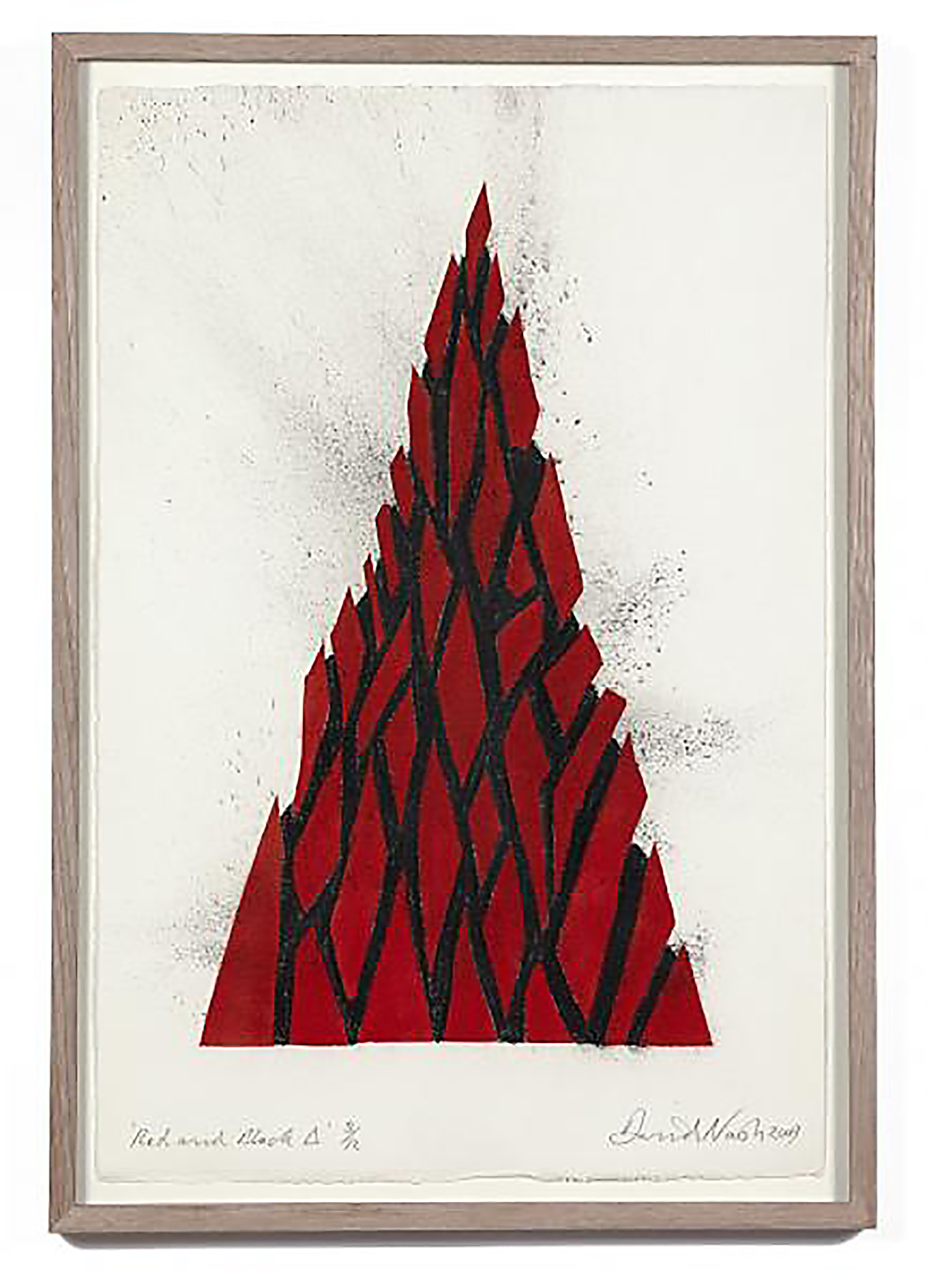
Red & Black Triangle, 2009
David Nash
Gallery TEN
Beyond Fashion: Fine Art, Books, and the Wider World
Pochoir wasn’t confined to hemlines. It became the colour technology of choice for luxury book publishing generally – livres d’artiste, natural history and botanical plates, ornithological studies, children’s books, travel posters, and theatrical and ballet designs (fittingly, given the Ballets Russes’ influence on the whole aesthetic). Established modernist painters embraced it too: Henri Matisse, Raoul Dufy, and Sonia Delaunay all used pochoir at points in their careers for portfolio prints where flat, brilliant, unmodulated colour mattered more than painterly texture. In the United States and Britain the technique found smaller but devoted followings, with artists and printers in the Arts and Crafts tradition experimenting with it on a far more modest scale than the Parisian ateliers ever operated at.
Pochoir solved a practical problem that lithography and photogravure of the period simply couldn’t: reproducing pure, high-key colour without the visible dot pattern of halftone screening or the slight drift and impurity of hand-mixed lithographic inks. For a certain kind of image – one that needed to look painted rather than printed – it had no real rival until much later colour-separation technology matured.
Why It Died
By the 1930s, pochoir was already becoming an anachronism, and by the 1950s it was essentially finished as a commercial practice. The reasons are unglamorous but instructive. Improved offset lithography and, eventually, four-colour process printing could reproduce colour images faster, cheaper, and at vastly larger volumes, even if the results were visually flatter and less luminous than a hand-stencilled sheet. A single pochoir plate might occupy a skilled colourist for the better part of a day; an offset press could run off thousands of sheets in the same span. Fashion magazines, increasingly dependent on photography anyway as the medium matured through the 1920s and ’30s, had no commercial reason to keep funding so expensive and slow an artisanal process.
The Second World War delivered the final blow, disrupting the ateliers physically and gutting the market for luxury print portfolios almost overnight; many of the specialist workshops simply never reopened once peace returned. What had been, in 1900, a genuine necessity – the only reliable way to get true, saturated color onto a fashion plate – had become, by 1950, a beautiful and financially indefensible extravagance that nobody in the publishing trade could any longer justify.
The Afterlife
Pochoir never fully disappeared. A small number of contemporary printmakers, conservators, and specialist studios (a handful survive in France and elsewhere) keep the technique alive, partly for restoration and reprint work and partly because certain visual effects – true flat gold and metallic pigments, specific matte blacks, the exact luminosity of hand-applied gouache – still cannot be convincingly replicated by any other process. Meanwhile, original pochoir prints from the Gazette du Bon Ton era and its contemporaries have become serious collector’s items, prized in the auction and rare-book markets precisely for the qualities that made them commercially obsolete: the hand-touched irregularity, the richness and depth of the colour, the sense that a real person sat at a table and, brushstroke by brushstroke, decided exactly how bright that particular red should be.
Look at one in person if you ever get the chance – in a print room, a rare book library, an auction preview. You’ll notice something photographs of them rarely convey: pochoir prints don’t just show you a Jazz Age fantasy of Parisian glamour, filtered through eight centuries of stencil-craft borrowed from Japan and refined across four hundred years of European printers’ shortcuts. In their tiny ridges of dried gouache and their occasionally imperfect registration, they show you the accumulated labor of every hand, in every century, that ever cut a shape out of a sheet and pushed color through the hole.