
Is a Fine Print a “Work on Paper”? The Art World’s Most Slippery Category
Same Paper, Wildly Different Price Tags
Picture two sheets of paper hanging side by side in a gallery. One is a Rembrandt etching, the other a Rembrandt drawing. Both are made with ink on paper, both are nearly four centuries old, and both would be filed under the same heading in an auction catalogue: Works on Paper. Yet the drawing, a unique object touched by the master’s hand and nowhere else duplicated, could command millions, while a good impression of the etching might sell for the price of a family car. The rarest impressions can climb far higher, but the gap between the two categories remains enormous.
So is a fine print a work on paper? The short answer is yes. The longer answer is that the phrase hides two different meanings, and the difference between them explains a great deal about how the art world thinks, trades and values what hangs on its walls.
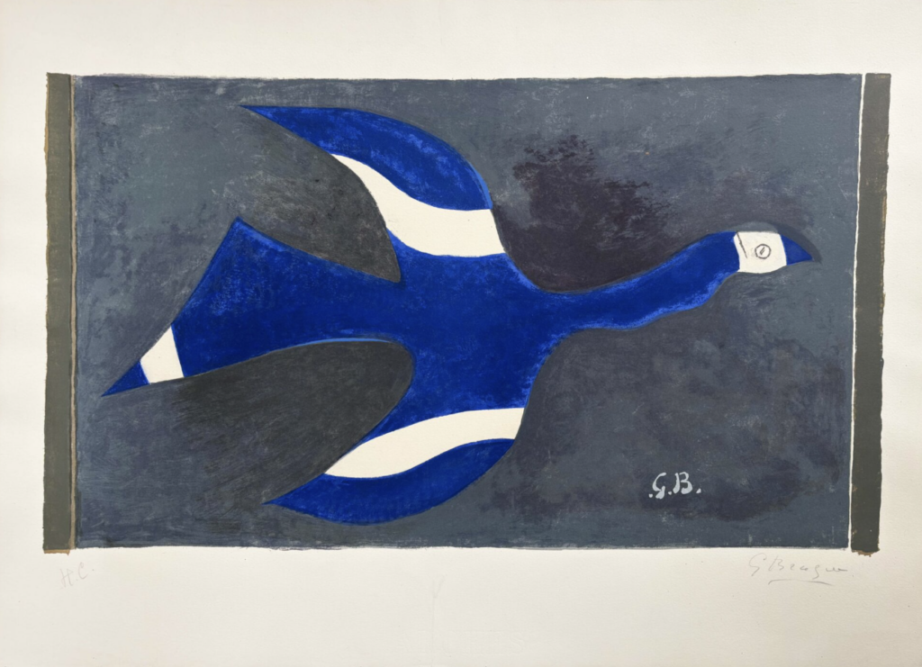
Night Flight (Birds XII) | Vol de nuit (Oiseau XII) (1957)
Georges Braque
Gilden’s Art Gallery
Two Meanings Hiding in One Phrase
“Work on paper” behaves differently depending on who is saying it. In its simplest sense, it is a statement about material. It describes any artwork whose support is paper, a category that stretches across drawings, watercolours, pastels, gouaches, collages and fine prints. By that definition, a fine print is unquestionably a work on paper. A Hokusai woodblock, a Rauschenberg lithograph and a Dürer engraving all qualify, because the paper is the surface that holds the image, whatever process put it there.
The second meaning is institutional. Auction houses, museums and dealers use “Works on Paper” as a departmental umbrella, a way of organizing collections and sales around shared practical concerns. The Metropolitan Museum of Art houses a Department of Drawings and Prints, and the British Museum keeps its Department of Prints and Drawings together for similar reasons. Paper is fragile. It yellows, foxes, tears and fades under light, and it demands controlled humidity, careful framing and limited exposure. A curator who looks after a Michelangelo sketch and one who looks after a Goya aquatint face remarkably similar challenges, so it makes sense for them to share storage rooms, study centers and expertise.
This is why the label is both helpful and misleading. It is helpful because it tells you how an object must be treated and where it will probably live. It is misleading because it flattens enormous differences in how the objects were made, how many exist and what they are worth.
The Real Divide: Unique Versus Multiple
The art market draws its sharpest line not at the material but at the number. The question that matters most is not “what is it made on?” but “how many of these exist?”
A drawing or watercolour is generally unique. The artist’s hand moved across a single sheet, and what you see is the only version that will ever exist. A fine print, by contrast, is a multiple by design. The artist creates a matrix, whether a copper plate, a woodblock, a lithographic stone or a silkscreen, that can yield many impressions. Each impression is pulled by hand, inked individually and often varies subtly from the next, yet the image is meant to be repeated. The artist conceives the edition as part of the work itself.
This distinction ripples through everything. Uniqueness commands a premium because scarcity and the intimacy of direct touch are powerful drivers of value. A drawing offers a kind of access to the artist’s thinking, with the hesitations and corrections that show a mind at work. A fine print offers something different: a deliberate act of design that anticipates repetition and exploits the particular qualities of its medium, whether the biting line of an etching, the grain of a woodcut or the velvety richness of a lithographic crayon.
Authorship shifts as well. In a drawing, the story ends with the artist. In a fine print, authorship can be distributed across the artist, a master printer, a papermaker and a workshop. Think of the great lithographic studios, where printers such as Fernand Mourlot worked alongside Picasso, Miró and Chagall, translating ideas into stone and ink with technical skills the artists did not always possess. The credit belongs to the artist, but the result is a partnership.
Even the vocabulary changes. Fine prints come with a specialized language of their own: edition size, state, impression, artist’s proof, trial proof, bon à tirer, and catalogue raisonné number. A buyer of drawings rarely needs such terminology, but a buyer of fine prints cannot do without it.
What Makes a Print ‘Fine’
The term “fine print” signals that the work was conceived by the artist as a print from the outset and made, or closely supervised, by them. The plate or block was not a means of copying something else. It was the artwork’s birthplace. Goya’s Disasters of War, Käthe Kollwitz’s woodcuts and Picasso’s lithographs are classic examples. Each artist chose the medium because its particular visual language suited what they wanted to say.
Several conventions have grown up to protect this idea. Editions are limited, and each impression is usually numbered, such as 23/100, and signed in pencil by the artist. The matrix is often canceled after printing, with a line scored across the plate, so that no further impressions can be made. Early prints in an edition may be prized for their crisp detail, while later impressions from a worn matrix can look softer. The word “original” carries real weight in this world, and honest dealers use it carefully.
Modern and contemporary practice has complicated the picture. Artists now combine traditional techniques with digital tools and photographic transfer, and the market continues to debate how much weight to give the artist’s direct involvement, the edition limit and the signature. The questions are not new, but the technologies keep giving them fresh urgency.
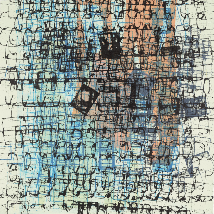
Untitled (2003)
Mark Bradford
Jim Kempner Fine Art
When Printmaking Became High Art
It is easy to forget how long printmaking struggled for artistic status. Its elevation was gradual, hard-fought and driven by a handful of ambitious figures.
Albrecht Dürer was among the first to grasp the medium’s potential. In the early sixteenth century, he treated engraving and woodcut as vehicles for his own inventions, and he built a pan-European reputation largely through prints. Because they were portable and could be sold in large numbers, they carried his name far beyond Nuremberg. Rembrandt then pushed etching to extraordinary expressive depth, reworking plates through multiple states, experimenting with drypoint and varying the paper he printed on, including fine Japanese stock. His prints were not repetitions but explorations, each state a new decision.
In the nineteenth century, a new wave of influence arrived from the East. Japanese ukiyo-e woodblock prints by masters like Hokusai and Hiroshige reached Europe and electrified artists such as Van Gogh, Monet, Degas and Whistler, who admired their flattened space, bold colour and daring compositions. At roughly the same time, the Etching Revival in Britain, France and America restored prestige to the artist-etcher, and collectors began to value the personal, handmade qualities of the medium.
The twentieth century cemented printmaking’s standing. Specialist workshops such as Tamarind Lithography Workshop, Gemini G.E.L. and Universal Limited Art Editions invited painters and sculptors to collaborate with master printers, resulting in landmark bodies of work by Jasper Johns, Rauschenberg, Louise Bourgeois and many others. Meanwhile, Andy Warhol and the Pop generation embraced the multiple as a concept, turning repetition into the very subject of the work. For them, the print was not a lesser version of a painting. It was an idea made visible.
Why the Distinction Matters to Collectors
For anyone buying, selling or simply looking at art, the practical consequences are significant. A listing that describes a piece merely as a “work on paper” is accurate but incomplete, and sometimes strategically vague. It may refer to a unique drawing of great value or to an impression from a large edition. The phrase tells you what the object is made on, and almost nothing else.
Serious collectors therefore learn to ask follow-up questions. Is it unique or part of an edition? Was it printed during the artist’s lifetime, or posthumously from the original plate? Is it an early impression or a late one? Is the signature in the artist’s hand? Does the work appear in a catalogue raisonné? Each answer can shift the value by orders of magnitude, which is why fine prints reward patient study more than almost any other corner of the market.
There is also good news in this complexity. Because fine prints are multiples, they have always been the most accessible entry point to collecting. A student with a modest budget can own a genuine Goya, Hogarth or Hiroshige impression, something unimaginable in the world of unique paintings.
So, What’s the Verdict?
- A fine print is a work on paper in the most literal sense and in the most institutional one. It lives in the same museum departments, hangs in the same galleries and demands the same careful handling as a drawing. Nobody in the art world would argue otherwise.
But the phrase is a very big tent, and under it sit very different animals: one-off sketches and editions of hundreds, intimate studies and workshop collaborations, a delicate drypoint and a bold screenprint. Calling something a work on paper describes its material and its fragility. It does not describe its rarity, its authorship or its worth. For that, you need the finer vocabulary that printmakers, curators and dealers have developed over five centuries.
The next time you see those three words on a wall label or in a sale catalogue, treat them as an invitation rather than an answer. Ask what kind, how many and who made it. In the world of paper, that is where the art, and the money, truly lives.