The Fine Art Technique That Wasn’t Supposed to Be Fine Art
Almost every printmaking process traces its origins to artists trying to solve an artistic problem. Silkscreen is the exception. For the first several decades of its existence, nobody involved in it thought of it as art at all.
The core idea – stretching a fine mesh fabric across a frame, blocking out the areas you don’t want printed, and forcing ink through the open areas with a squeegee – descends from stencil techniques used for centuries in textile decoration across Asia. But the specific commercial process that became modern silkscreen printing was developed and patented in the early twentieth century by industrial printers looking for a fast, cheap way to put text and simple graphics on posters, banners, cardboard displays, and shop signs. It was a trade technique, taught in vocational programs, used to sell soap and cigarettes, and almost entirely absent from museums and galleries.
That silkscreen eventually became one of the defining printmaking techniques of twentieth-century fine art is one of the great plot twists in modern art history – and it happened because a handful of artists looked at a commercial printing process everyone else dismissed as beneath serious art, and saw exactly the opposite.
How Do You Print Through a Piece of Fabric?
The mechanics of silkscreen are stranger, and in some ways simpler, than any other major printmaking technique. There’s no plate to ink, no press exerting crushing pressure, no acid biting into metal. Instead, a screen – originally silk, now more commonly synthetic mesh – is stretched drum-tight across a wooden or metal frame, like a small trampoline.
To create an image, the artist blocks certain areas of that mesh so ink can’t pass through them, using anything from hand-cut paper stencils to painted glue to light-sensitive photographic emulsion exposed with a film positive. Wherever the mesh is left open, ink can pass through when it’s pulled across the screen with a rubber-bladed squeegee, forcing colour through the tiny holes and onto the paper, fabric, or surface sitting directly beneath.
Each colour in a silkscreen print requires its own separate screen and its own separate pass – a red screen, then a blue screen, then a black screen, each one precisely registered to land exactly on top of the last. A print with a dozen distinct colours might mean a dozen separate screens, a dozen stencils, and a dozen individually squeegeed passes, all of which have to align with near-perfect precision or the whole image falls apart into a blurry, misregistered mess.
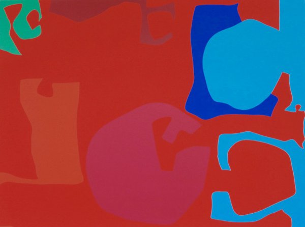
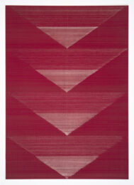
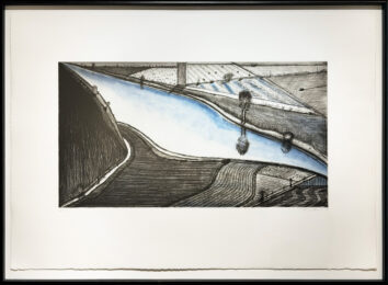
Untitled (1971)
Patrick Heron pgr fine art
The Technique That Made Flat, Saturated Colour Its Whole Personality
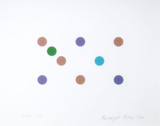
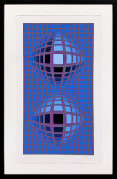
Every printmaking process has a visual signature, and silkscreen’s is unmistakable: flat, unmodulated fields of pure, saturated color with hard, crisp edges between them. Unlike etching or mezzotint, which excel at subtle tonal gradation, silkscreen struggles to fade smoothly from dark to light within a single screen. What it does instead – brilliantly – is lay down large, uniform areas of intense, poster-bright color, stacked and overlapped with mechanical precision.
That flatness wasn’t a limitation artists eventually learned to work around. It became the entire point. A silkscreen print doesn’t ask to be mistaken for a painting or a drawing the way a mezzotint or a chiné collé print does. It looks unapologetically manufactured – bold, graphic, and mass-produced – and for a generation of artists interested in exactly that quality, silkscreen wasn’t a compromise. It was the ideal medium for the message.
Pop Art Found Its Perfect Weapon
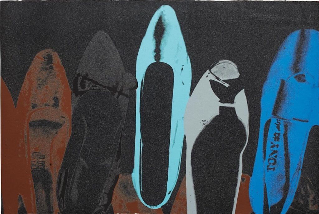
No single artist did more to drag silkscreen out of the commercial print shop and into the museum than Andy Warhol, who began using the technique in the early 1960s specifically because of everything traditional fine-art printmaking snobs held against it. Warhol wanted his images to look mass-produced, repetitive, and impersonal – an aesthetic commentary on a culture saturated with advertising, celebrity, and consumer branding. A hand-drawn lithograph would have undercut that message before it even started. A silkscreen, with its flat colors and mechanical repeatability, delivered it perfectly.
Warhol’s silkscreen process leaned into the technique’s commercial DNA rather than hiding it. He photographically transferred existing images – a soup can label, a wire-service photograph of Marilyn Monroe, a newspaper clipping – directly onto screens, deliberately embracing slippage, misregistration, and the occasional smeared or uneven pass rather than treating them as flaws to eliminate. The imperfections of mass production became part of the artwork’s meaning, not an accident to be corrected out of it.
Warhol wasn’t alone. Roy Lichtenstein, Robert Rauschenberg, and other Pop artists all recognized the same thing: a technique built for advertising was uniquely suited to art about advertising, and silkscreen’s commercial fingerprints, rather than disqualifying it from fine art, were exactly what made it the right tool for the job.
Shoes (FS II.257) (1980)
Andy Warhol Revolver Gallery
From Trade Skill to Museum Wall: The Long Fight for Respectability
Silkscreen’s climb into fine-art legitimacy wasn’t instant, and it wasn’t universally welcomed. For years, some critics and curators dismissed silkscreen prints as fundamentally lesser than etchings or lithographs, arguing that a technique so closely associated with commercial signage and mass manufacturing couldn’t produce work with genuine artistic weight, no matter who was pulling the squeegee.
Part of what eventually shifted that perception was a rebranding: fine-art practitioners increasingly used the term “serigraphy” – from the Latin for silk and the Greek for writing or drawing – specifically to distinguish artist-made silkscreen prints from commercial screen printing, even though the underlying process was often identical. It was as much a marketing move as a technical distinction, an attempt to give the medium a vocabulary that sounded appropriately serious for gallery walls.
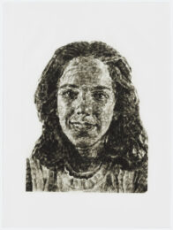
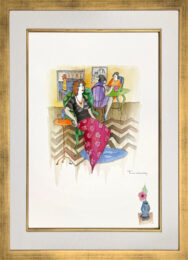
What ultimately settled the argument wasn’t terminology, though – it was the sheer range and ambition of what artists proved the technique could do. Beyond Pop Art’s flat, graphic bravado, printmakers discovered silkscreen could achieve remarkably subtle, painterly effects when handled with enough patience: dozens of translucent color layers built up to create depth and complexity rivaling any other medium, photographic imagery blended seamlessly with hand-drawn elements, and textures ranging from glossy and hard-edged to soft and atmospheric depending entirely on how the ink, screen mesh, and technique were handled.
Why Silkscreen’s Democratic Roots Still Shape How Artists Use It
Perhaps more than any other printmaking process, silkscreen carries the memory of its working-class, commercial origins into how artists actually use it today. It remains relatively accessible and inexpensive compared to etching presses or lithography stones, requiring less specialized equipment and less institutional infrastructure – a fact that made it a favourite tool of protest movements, independent zine-makers, and DIY poster artists throughout the latter half of the twentieth century and into the present.
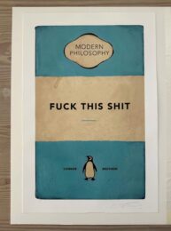
That accessibility gave silkscreen a genuinely different social life than most fine-art printmaking techniques. Where etching and lithography largely stayed within academic ateliers and professional print studios, silkscreen spread into basements, garages, and community art spaces, used to produce concert posters, political protest graphics, and grassroots activist imagery alongside gallery editions worth small fortunes. The same technique that built Andy Warhol’s Marilyn prints also built the visual language of punk rock flyers and civil rights-era protest posters – a range almost no other printmaking process can claim.
A Trade Technique That Changed What Fine Art Could Look Like
Silkscreen’s improbable journey – from soap advertisements and cardboard signage to some of the most valuable and recognisable artworks of the twentieth century – says something larger about how artistic hierarchies get built and occasionally torn down. For decades, a technique’s commercial associations were treated as evidence against its artistic seriousness, as though a process couldn’t be both useful for selling cigarettes and capable of profound artistic statement.
Silkscreen didn’t just survive that skepticism. It used its commercial DNA as raw material, turning the very qualities that once disqualified it – flatness, repeatability, an unapologetically manufactured look – into a visual vocabulary perfectly suited to an era obsessed with mass media, branding, and reproduction. Few printmaking techniques have traveled further from where they started, and none have made a stronger case that where a technique comes from says nothing about what it’s capable of becoming.