
The Poison in the Print Room
How centuries of master printers worked alongside arsenic, mercury and lead, and how the craft slowly cleaned up its act
Somewhere in a museum print room right now, a conservator is holding a Victorian book up to an X-ray fluorescence scanner. The cover is a lovely, saturated green – the kind of colour that made Victorian parlours glow. The reading on the screen is not lovely at all: arsenic.
Prints, books, and engravings look serene under glass. But the people who made them worked shoulder to shoulder with some of history’s most dangerous materials, often without knowing it. Vermilion reds, arsenical greens, and lead whites weren’t rare exotic pigments reserved for painters in ivory towers – they were the everyday palette of the print shop, ground fresh each morning by apprentices whose hands would carry the evidence for the rest of their lives. The story of printmaking is, in its own quiet way, a story of slow, reluctant detoxification – one that took nearly five centuries to complete, and arguably still isn’t finished.
The Alchemy in the Ink Pot
Early printing ink was closer to paint than to the thin, water-based ink of a quill. Gutenberg’s real innovation wasn’t only movable type – it was an oil-based ink that would cling to metal instead of beading up and smearing. Printers boiled linseed oil into a thick, dark varnish, then ground in lampblack for the deep, velvety black that still looks startlingly fresh on 15th-century pages.
The recipe wasn’t gentle. Boiling oil for hours in an open workshop was a serious fire hazard, and the fumes weren’t pleasant to breathe either. Drying agents made from lead or manganese compounds were common additives, sped along the curing of the ink so pages wouldn’t smudge. When scientists analysed pages of the Gutenberg Bible using particle-beam techniques in the early 1980s, they found lead and copper embedded in the ink itself. The founding document of mass communication was, in a small but literal way, a metallic one – printed with a substance we would now handle in gloves.
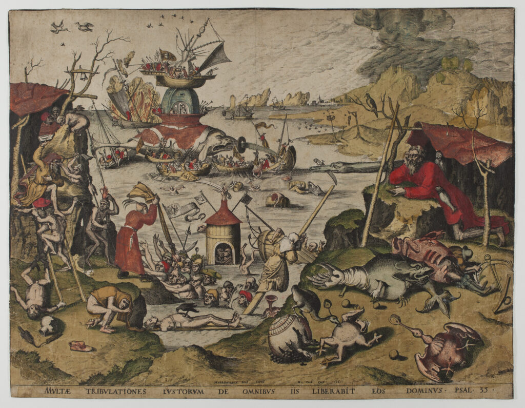
The Temptation of St. Anthony (1561)
Hieronymus Bosch
Sarah Sauvin
Vermilion: The Red That Cost a Fortune (and Some Nerves)
Red was the prestige colour of the early print shop – the colour of title pages, rubricated initials, and anything meant to announce its own importance. For centuries, that meant vermilion: mercuric sulphide, HgS, a pigment so vivid it made ordinary reds look apologetic by comparison.
Nature offered a version of it in cinnabar ore, but by the medieval period, makers were synthesising it directly by combining quicksilver and sulphur over heat – essentially cooking liquid mercury until it transformed into a brilliant crystalline red. This is where the real danger lived. The finished pigment, once bound into ink or paint, is relatively stable and doesn’t easily release mercury vapour. But the making of it meant standing over pots of heated mercury for hours, inhaling fumes that would slowly poison the nervous system. Workers in vermilion workshops were known for tremors, memory loss, and the erratic behaviour that later gave us the phrase “mad as a hatter” – though that particular saying belongs more properly to felt-makers using mercury nitrate.
Vermilion travelled the world along with printing itself. Woodblock printers across East Asia prized mineral reds, and Japanese printmakers sometimes turned to red lead, known as tan, as a cheaper substitute. Red lead had its own quiet betrayal: it darkens and browns with age, which is why so many old prints have faces, lips, and decorative borders that have gone dull and sooty where they were once bright scarlet.
White Lead: Sweet, Silky and Slowly Deadly
If vermilion was the glamorous poison, lead white was the everyday workhorse – and arguably the more insidious of the two, because it was everywhere. Nothing else gave such a warm, opaque, buttery finish. Printers and colourists used it for highlights, for lightening inks to pastel tints, and for the lush, dimensional effects seen in chiaroscuro woodcuts and hand-finished engravings.
Its manufacture was notorious even by the standards of the age. The traditional “stack process” involved coiling sheets of lead and burying them in earthenware pots layered with vinegar and horse dung, then sealing them in a shed for weeks. The acetic acid vapours and the heat from the fermenting dung corroded the lead into a soft white crust, which workers then scraped off by hand – repeatedly, for years, without protection. This produced generations of tradesmen with “painter’s colic,” the agonising abdominal cramping of lead poisoning, along with wrist drop, a distinctive paralysis of the hand that became almost a trademark of the profession.
Lead white also aged badly on the page. It reacts with trace sulphur compounds in polluted air, slowly converting from brilliant white to grey and eventually black. Look closely at old hand-coloured prints or Japanese woodblocks and you can sometimes find ghostly reversals – the white areas that should be the brightest part of the composition have quietly gone dark, a chemical betrayal decades after the print left the shop.
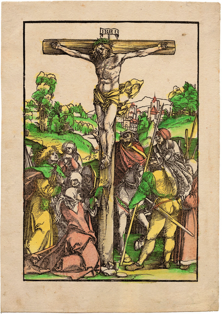
Christ on the Cross (1487)
Hans Schäufelein
Emanuel von Baeyer – Cabinet
Green With Envy (and Arsenic)
Then came the 19th century and its most seductive villain.
In 1775, the Swedish chemist Carl Wilhelm Scheele created a brilliant copper-arsenic green that bears his name. In 1814, a German firm refined it into an even more vivid version known as emerald green or Schweinfurt green. It was cheap to produce, dazzlingly saturated, and colour-fast in a way earlier greens simply weren’t. It ended up in everything: wallpapers, dress fabrics, artificial flowers, children’s toys, confectionery wrappers, and – crucially for this story – printed cloth bookbindings and decorative papers.
Victorian publishers adored it for cloth-bound book covers. Recent work by the Poison Book Project, a research collaboration led by conservators and scientists at Winterthur Museum and the University of Delaware, has been systematically testing library collections with handheld XRF scanners and finding that a striking number of green-cloth books from the mid-19th century do indeed contain arsenical pigments. Their guidance is measured rather than alarmist: the danger comes primarily from flaking dust and prolonged handling, not from a book simply sitting on a shelf, so the recommended precautions are gloves, careful storage, and washing hands afterward.
Wallpaper printers were on the front line of public anxiety. Block-printed and later machine-printed papers covered bedroom walls across Europe, and a genuine moral panic erupted from the 1860s onward, with physicians, newspapers, and satirical magazines all weighing in on the supposed “arsenic wallpaper” menace. One persistent theory even blamed Napoleon’s death on St Helena on damp, mould-affected arsenical wallpaper releasing toxic vapour in his bedroom – a claim historians and toxicologists still debate today.
The pigment had a second, quieter flaw. Copper-based greens like verdigris can chemically eat into paper fibres over time. Old prints and manuscripts sometimes show brown, brittle halos or actual holes where a green passage once sat – a pigment that slowly consumed the very surface it was meant to decorate.
The Air Was Worse Than the Ink
Here’s the twist in the story: the finished pigment sitting on a page was often the least dangerous part of a printer’s day.
Type metal. Compositors handled lead alloy type constantly, setting and resetting it letter by letter. Lead dust and residue absorbed through skin and inhalation made “lead colic” a well-documented occupational hazard of the printing trade specifically, distinct from painters’ exposure.
Acids and mordants. Etchers working in the 17th century used corrosive recipes involving vinegar, salt, sal ammoniac, and verdigris to bite designs into metal plates. Later etchers turned to nitric acid, which releases choking nitrous fumes, and the so-called “Dutch mordant” – a mix of hydrochloric acid and potassium chlorate – which could release chlorine gas if mishandled.
Grounds and dusts. Aquatint technique required dusting plates with fine powdered resin, filling small, poorly ventilated workshops with airborne particulates that lodged deep in the lungs.
Solvents. Turpentine, and later petroleum distillates and benzene, were used constantly to clean plates, lithographic stones, and rollers – usually in cramped rooms with little airflow.
The people breathing all of this in were rarely the celebrated master printmakers whose names appear in art history textbooks. They were apprentices, ink-grinders, colourists – often women working long hours at communal tables hand-tinting plates one by one – and shop assistants doing the unglamorous labour. Occupational medicine had actually flagged trades like these since the early 1700s, when the Italian physician Bernardino Ramazzini catalogued the illnesses of dozens of artisan professions in his landmark work De Morbis Artificum Diatriba. But for generations, the hazards of the print shop were simply absorbed as the ordinary cost of doing business.
The Slow Clean-Up
Detoxification didn’t arrive with a single dramatic reform. It crept in through a long accumulation of alternatives, public scandals, and eventually, legislation.
Whites. Zinc white became commercially available as a pigment in the 1830s, offering a cooler but non-toxic alternative. Titanium white took over almost entirely in the early 20th century once it became affordable. International agreements in the 1920s began restricting white lead in interior house paints specifically, and the printing trade gradually followed that same direction.
Greens. Chromium oxide pigments such as viridian, and later the synthetic phthalocyanine greens developed in the 20th century, slowly replaced arsenical greens in commercial use. Public health scares and national legislation in the late 19th century – including restrictive laws passed in Germany in the 1880s – helped push arsenic compounds out of consumer textiles and papers.
Reds. Vermilion was gradually displaced first by cadmium reds and eventually by synthetic organic pigments developed through the 20th century. Cadmium, notably, brought its own toxicity concerns, a useful reminder that detoxification in this craft has always been a rolling process rather than a single finish line.
Solvents and mordants. Printmakers slowly moved away from benzene and harsh acids toward gentler options like ferric chloride, alongside basic but transformative studio reforms: proper ventilation, gloves, and cleaning plates with vegetable oil instead of aggressive solvents.
Printmaking Goes Green (for Real)
- – Ferric chloride and salt-based etchants, replacing nitric acid and the fume-heavy Dutch mordant
– Electro-etching, where a low electric current passed through a copper sulphate bath bites the plate without any acid fumes at all
– Photopolymer plates, which swap acid baths entirely for light exposure and a water rinse
– Soy- and vegetable-oil-based inks, along with safer citrus-based solvents for clean-up
– Acrylic resist grounds, used in place of traditional asphaltum and rosin
None of this makes the old masters’ results unattainable today. It simply makes them survivable to produce.
The Ghost in the Archive
The poison hasn’t disappeared – it’s simply relocated, now resting quietly in archives, print rooms, and family bookshelves around the world. Conservators rely on tools like XRF scanning to identify hazardous pigments without damaging the objects themselves, and the practical guidance that follows is refreshingly simple: handle collections with care, wash your hands afterward, avoid eating near old books and prints, and never sand, scrape, or sniff a suspicious surface.
There’s something almost poetic in that closing image. The very materials that made prints so luminous and desirable could also quietly harm the people who made them – and the long history of the print room is, at its heart, a story of learning, slowly and sometimes at great cost, to tell the difference between a dazzling colour and a safe one.