Pick up a print and you’ll find, in pencil, down in the bottom margin, a little fraction: 17/50. Or 3/100. Or, more mysteriously, 14/34. It looks official, like a serial number on a banknote. It feels like there must be a rulebook somewhere.
There isn’t. Not a single global rulebook, anyway. Edition size is one of the great quiet negotiations of the art world, a decision shaped by physics, money, reputation, and plain old paper arithmetic. And once you know the forces behind it, every number in that margin starts to tell a story.
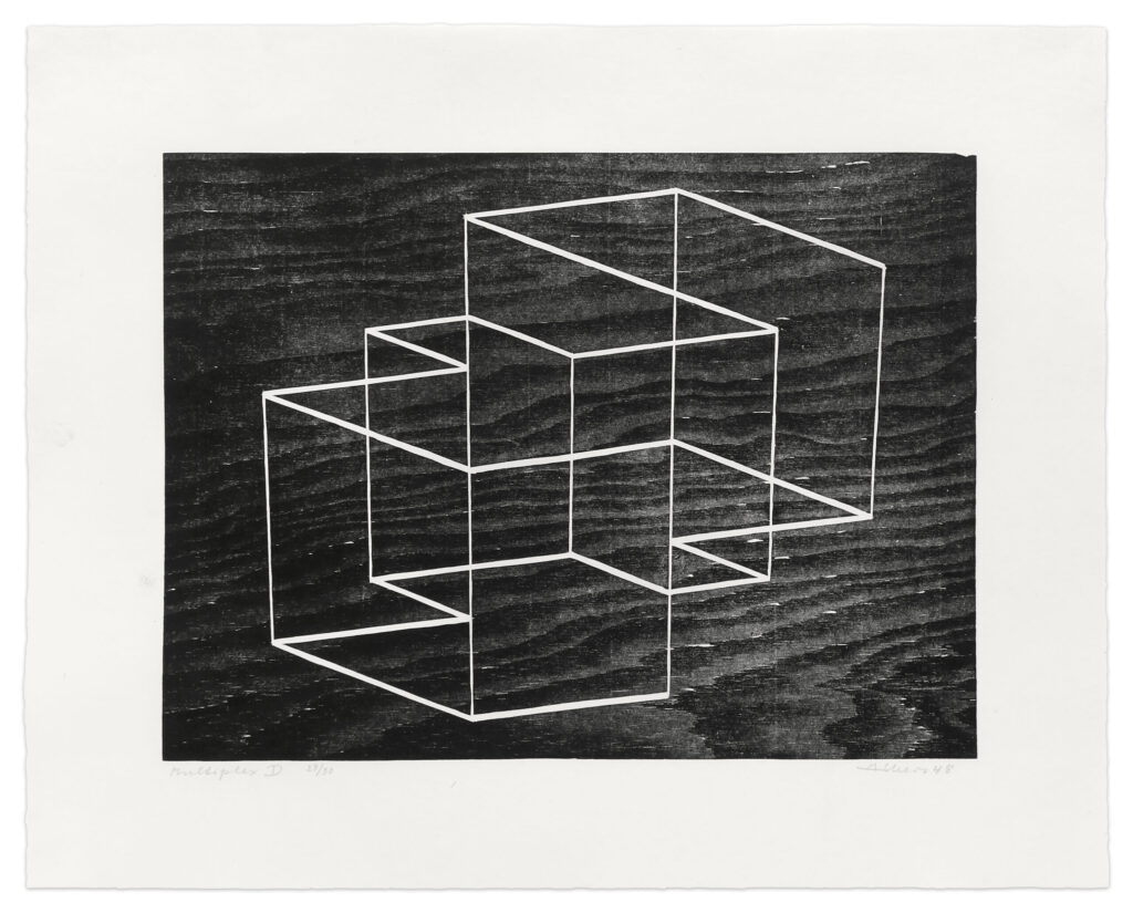
Multiplex d (1948) Josef Albers
Krakow Witkin Gallery
First, a plot twist: the edition is a modern invention
Dürer didn’t number his prints. Neither did Rembrandt. In the early centuries of printmaking, you printed until demand dried up or the plate gave out, and sometimes beyond that. Rembrandt famously reworked his copper plates over and over, producing different “states” of the same image. Prints were a product, not a limited edition.
The idea that scarcity should be declared in advance took hold in the 19th century. During the etching revival of the 1860s to 1880s, artists and champions such as James McNeill Whistler and Francis Seymour Haden pushed prints as fine art rather than cheap reproduction. Signing in pencil, printing on choice paper, and limiting the run were all ways of saying: this is not a reproduction, this is an artwork. Around the same time, steel-facing a copper plate (coating it with a thin layer of iron) made it possible to print far more impressions without wear, which meant artists now had to choose to stop, because the plate no longer forced them to.
That is the heart of the story. Edition size went from being a limit imposed by materials to a limit imposed by choice.
Reason one: the material still has opinions
Even today, the medium sets a ceiling.
• Drypoint scratches a burr of raised metal that holds a velvety line of ink. That burr flattens quickly under the press, so fine impressions may run out within a couple of dozen pulls. • Mezzotint has a similar fragility: its rich velvety darks wear down with printing. • Etching and engraving on copper last longer, often into the hundreds before the lines soften, and steel-facing extends that. • Lithography from stone or plate can run for a long time, but every color means another stone or plate, and every color is another chance for a sheet to go wrong. • Woodcut and linocut can print a lot, but the printing is physical, and the printer’s hands and time are the constraint. • Screenprint can run large, but registering a dozen layers across a hundred sheets is exhausting, and a single bad layer can ruin a sheet.
So sometimes a small edition simply means the artist or printer didn’t want to print past the point where quality drops.
Reason two: why 100 is such a popular number
Honestly? Partly because it’s round.
A hundred is easy to say, easy to understand, and sits in a sweet spot psychologically. It’s large enough to spread the studio’s costs and reach a decent number of collectors, small enough to still feel like scarcity. Anything much larger starts to feel like a poster, and Andy Warhol’s famous Marilyn portfolio of 1967, issued in a run of 250, shows how a big edition can still become an icon when the image carries it. But for most artists, 50 to 100 is the comfortable middle.
It’s also a number that fits a business model. A studio might fund a print with its own money, then recoup through sales. Here’s a simplified illustration (the figures are invented to show the logic):
• Paper, ink, plates, and master printer time cost $20,000 • Each print sells for $1,000, with the artist and publisher splitting proceeds • You need to sell enough impressions to cover costs before anyone profits
Push the edition too small and the math doesn’t work. Push it too big and you risk flooding the market or sitting on unsold stock for years. Round numbers like 50 and 100 are a way of landing in the middle without overthinking it.
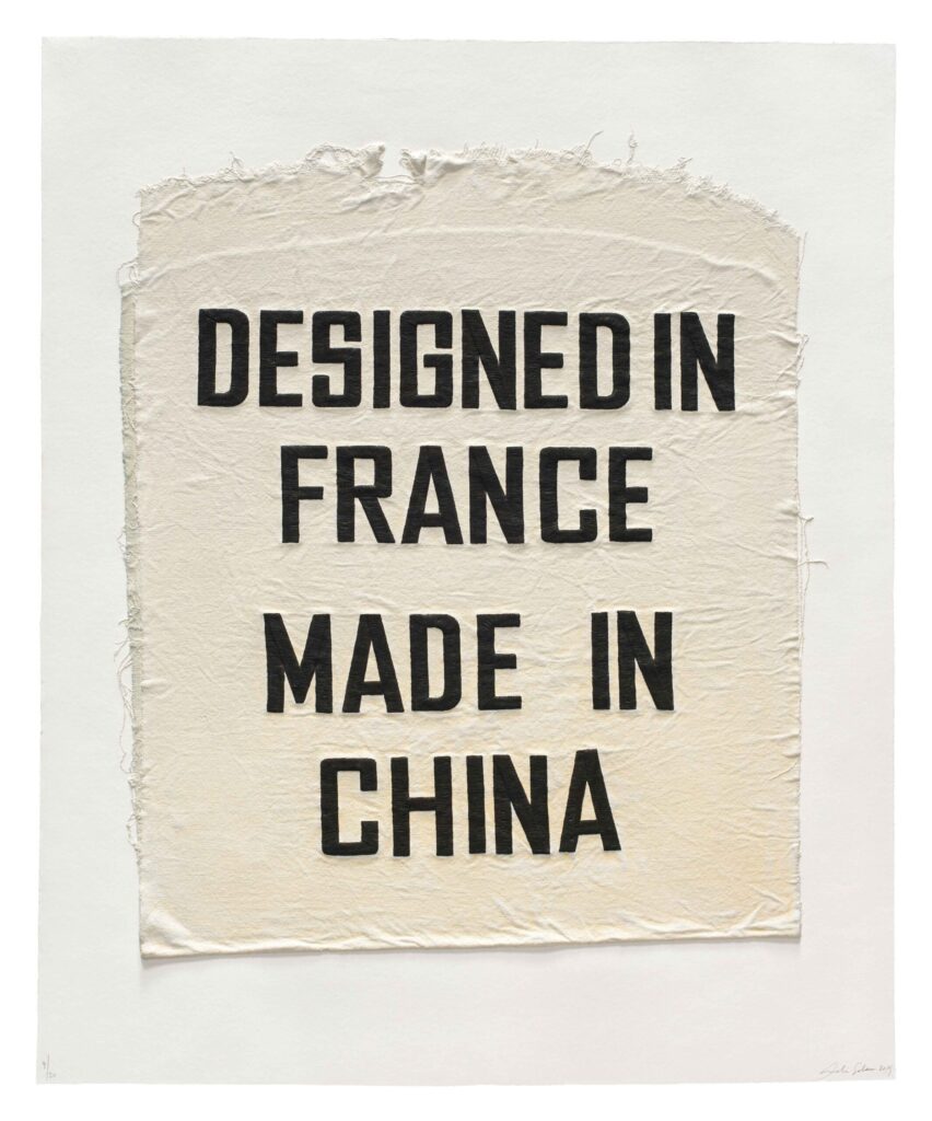
Designed in France, Made in China, Clothing Tag (2019) Analia Saban
Mixografia
Reason three: the odd numbers are where the real story lives
Now to your question. Why 34? Why 44?
Here I’ll be honest: there’s no mystical formula, and no single answer for any specific number. Odd edition sizes are usually the fingerprints of a practical decision. A few of the most common ones:
1. The paper decided. Handmade or mold-made paper often comes in a set quantity, and a printer will order what’s needed for the project. If 40 good sheets were ordered and a few are set aside for trial runs, you might land on an edition in the 30s.
2. The proofs ate into it. Every edition comes with extra impressions that aren’t numbered in the main run:
• Artist’s proofs (AP), traditionally around 10% of the edition, belong to the artist • Printer’s proofs (PP) go to the master printer or workshop • Bon à tirer (BAT), French for “good to pull,” is the single approved impression the printer must match for the rest of the run • Hors commerce (HC), “not for sale,” covers copies kept out of the market • Trial proofs record the image as it evolved
So “an edition of 30 plus 4 APs” is a very natural, very human outcome, and a collector might see that as 34 total.
3. The survivors set the count. Some printers print a batch and then declare the edition from the sheets that came out right. If 44 sheets passed inspection out of a few more pulled, then the edition is 44. The number is a record of attrition.
4. The print has companions. Portfolios, multiple colorways, or different paper variants can each get their own edition sizes, so you end up with odd divisions.
5. The artist just liked the number. It happens. Never underestimate superstition, birthdays, or a printmaker’s gut feeling.
So when you see 34 or 44, read it as a clue that someone was counting sheets, not following a rule.
Why studios care so much: the pact with the collector
The whole system rests on trust. When a collector buys 12/50, they’re buying a promise that there are 50 and only 50. The institutions of modern printmaking exist to protect that promise.
Tamarind Lithography Workshop, founded in 1960 by June Wayne in Los Angeles, helped codify standards such as the printer’s chop (a mark identifying who printed it), documentation of each edition, and the cancellation of plates and stones after printing so nothing can be secretly printed later. Workshops like Crown Point Press and Gemini G.E.L. adopted similar practices, and they’re why serious editions come with colophons and records.
And the cautionary tale? Salvador Dalí, who in his later years reportedly signed large numbers of blank sheets of paper, which unscrupulous dealers then used for prints of dubious authorship. The result was a market so clouded that Dalí prints are still treated with suspicion by cautious collectors. The lesson stuck: an edition size means nothing if you can’t trust whoever declared it.
One more myth to bust: the number on the left
That 17 in 17/50 is not a ranking. It’s usually just the order in which the artist signed and numbered the sheets, and not necessarily the order they were printed. A 1/50 is not inherently more valuable than a 50/50. What matters is the quality of the impression, the condition of the paper, and the provenance.
The takeaway
Next time you see an edition size, treat it like a tiny piece of evidence:
• A small number (under 30) often signals a fragile process, a labor-heavy print, or a deliberate play for rarity • 50 or 100 is the classic, comfortable convention • 250 and up suggests a bigger audience, a reproduction-friendly process, or an artist leaning into wide reach • Odd numbers like 34 or 44 whisper about paper counts, proofs, survivors, and the practical haggling behind the scenes
Edition size is where art, craft, and commerce shake hands. And the next time someone tells you that the number is arbitrary, you can smile and say: only until you ask who was counting the sheets.