These two floral prints offer a fascinating contrast in artistic approach and philosophy.
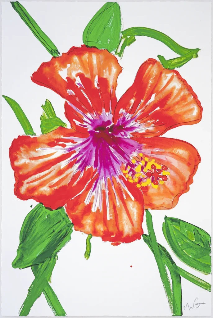
Marc Quinn’s hibiscus represents a contemporary, expressive approach to botanical art. The flower is rendered with loose, gestural brushwork in vibrant watercolors, emphasizing the organic, flowing nature of the bloom. The orange-red petals seem to burst with energy, and the purple center creates a dynamic focal point. Quinn’s style celebrates the spontaneous and ephemeral qualities of natural forms – there’s a sense of movement and life captured in the moment.
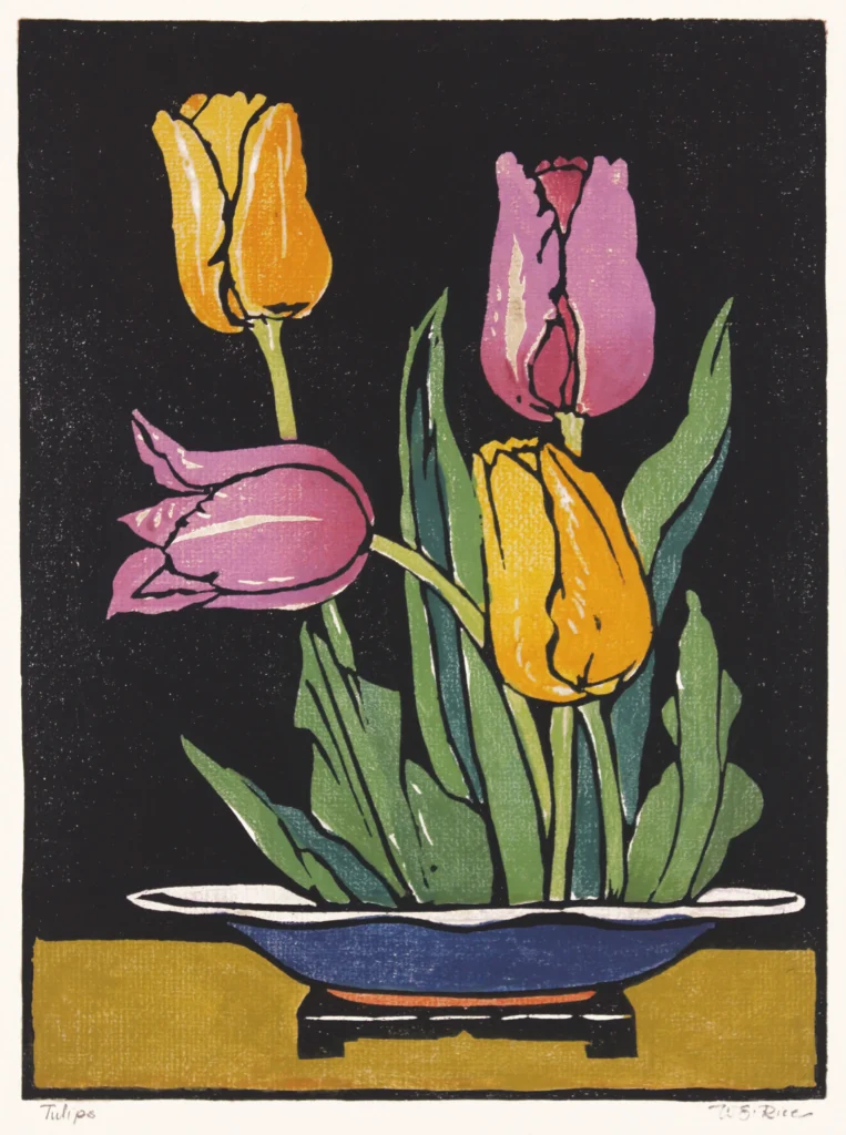
In stark contrast, William Seltzer Rice’s tulip print reflects the Arts and Crafts movement’s principles of simplified, decorative design. Created as a woodblock print, it shows four tulips arranged formally in a blue bowl against a black background. The forms are highly stylized and geometric, with bold outlines and flat color areas. Rice has reduced the flowers to their essential shapes, prioritizing pattern and design harmony over naturalistic representation.
The juxtaposition reveals two fundamentally different relationships with nature in art: Quinn embraces nature’s unpredictability and organic complexity, while Rice imposes order and structure, transforming natural forms into decorative elements. One celebrates botanical chaos; the other seeks botanical control. Quinn’s work feels immediate and emotional, while Rice’s feels timeless and meditative. Together, they demonstrate how the same subject matter – flowers – can serve completely different artistic visions and cultural values.