
Against the Grain: How Printmaking Set Helen Frankenthaler Free
Helen Frankenthaler didn’t need printmaking. By 1961, when she made her first lithograph, she had already changed the course of postwar painting. Her 1952 canvas Mountains and Sea — oil paint thinned to the consistency of watercolor and poured onto raw, unprimed canvas — had given rise to an entire movement, Color Field painting, and made her one of the few women fully embraced by the Abstract Expressionist old guard. She was, by any measure, already arrived.
So why did she spend the next five decades pulling proofs in freezing print workshops, arguing with master craftsmen over registration marks, and — by her own account — sometimes hating the entire process while she was in the middle of it? Because printmaking gave her something painting couldn’t: resistance. And Frankenthaler, it turns out, did her best thinking when something pushed back.
It’s worth pausing on how unusual this makes her among her generation. Most Abstract Expressionists treated printmaking, if they touched it at all, as a minor sideline — a way to reproduce an image in multiples, not a place to invent something new. Frankenthaler inverted that logic, running her printmaking as a parallel practice with the same seriousness as her painting, and arguably a more experimental one, precisely because the medium refused to simply do what she told it.
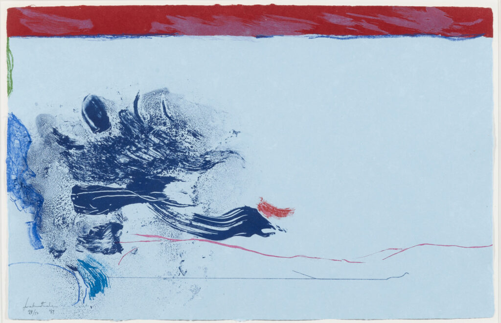
In The Wings (1987)
Helen Frankenthaler
Leslie Sacks Gallery
The Medium That Said No
Painting, for Frankenthaler, was intimate and immediate. She stood over a canvas on the floor, poured color, and watched it bloom into the fabric in real time. Printmaking offered almost the opposite experience. A lithograph stone doesn’t behave like a canvas. A woodblock has a grain that fights you. And crucially, Frankenthaler wasn’t the one holding the tools — a team of technicians stood between her gesture and the final print.
She was candid about how uncomfortable that first felt. Recalling her earliest sessions at Tatyana Grosman’s Universal Limited Art Editions in the early 1960s, she admitted she initially needed real persuading to even commit to the process. What changed her mind was the discovery that constraint could be generative rather than limiting — that a medium with its own stubborn rules could force a new kind of invention out of her.
This is what separates Frankenthaler from an artist merely dabbling in a new format. Most painters who try printmaking spend their first few years fighting the medium’s limitations. Frankenthaler let the friction become part of the work — watching for the places where a stone’s chemistry or a block’s grain produced effects she could never have planned, and preserving them rather than correcting them.
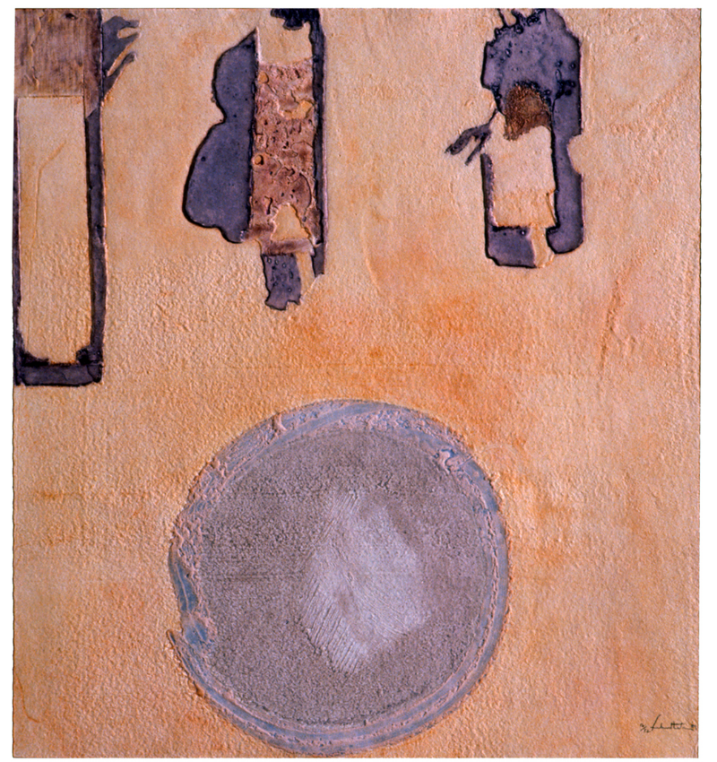
Sirocco (1989)
Helen Frankenthaler
Mixografia
Turning Stone Into Watercolor
Lithography became her gateway. It’s a medium built on chemistry — grease and water refusing to mix — traditionally used for crisp lines and flat, graphic color. Frankenthaler had no formal printmaking training, so she simply treated the stone the way she treated canvas: dragging her fingers through the ink, dabbing it with brushes and crayon, flooding it with washes of tusche until it produced the same loose, atmospheric quality as her paintings. She was, in effect, smuggling a painter’s instincts into a printer’s medium — and workshops built around rigid technical tradition had to invent new methods just to keep pace with her.
Part of what made this possible was the environment she worked in. The 1950s and ’60s saw a genuine renaissance in American printmaking, driven by workshops like ULAE, which actively recruited painters rather than trained printmakers. The model depended on creative negotiation: the artist brought vision and gesture, the technicians brought the craft needed to translate it into an editioned print. Frankenthaler insisted on drawing her own images, mixing her own colors, and approving every registration mark — but she also came to depend on, and deeply respect, the technicians who made her ideas physically possible. Some of her most important formal discoveries came directly out of a printer suggesting a workaround she never would have arrived at alone.
Fighting the Grain, Literally
If lithography was the gateway, woodcut was where she staged her most radical takeover. Wood is the least forgiving surface imaginable for someone chasing soft, blurred, watery color — the grain shows through, the blade leaves hard edges, and the whole tradition of woodcut, from German Expressionism to Japanese ukiyo-e, prized bold contour over atmosphere.
Frankenthaler decided that was exactly the point. Working first with ULAE in the mid-1970s and later in an extraordinarily productive partnership with master printer Kenneth Tyler, she set out to make wood behave like poured pigment. Prints like East and Beyond (1973) and Savage Breeze (1974) are now credited with sparking a broader revival of the woodcut in America. For Savage Breeze, when her early proofs came out looking flat, she and her printers solved it by printing an entire layer of white ink across the whole sheet before adding color on top — a trick that made the subsequent hues glow with a luminosity nobody had gotten out of wood before.
By the time she made Essence Mulberry (1977), she’d developed a signature vocabulary for the medium: letting the visible wood grain show through as texture, blending colors directly on the block rather than keeping them separate, and leaving raw paper exposed as if it were unpainted canvas. She had, essentially, taught a five-hundred-year-old medium to speak watercolor.
None of this came easily. Woodcut is unforgiving in a way lithography isn’t — a wrong cut can’t be undone, and registering multiple blocks of color so they align precisely is exacting work even for experienced printers. Frankenthaler made it harder still by asking for things the medium had never been built to do: color blended within a single block so one hue faded into the next instead of sitting beside it in a hard edge; translucent layers stacked so the paper’s own tone showed through; blocks cut and reassembled almost like a jigsaw so one sheet of wood could hold several passages of color at once. Each demanded her printers reinvent standard procedure on the fly — and the results look less like the woodcut tradition than a watercolor that happened to be carved and inked rather than painted.
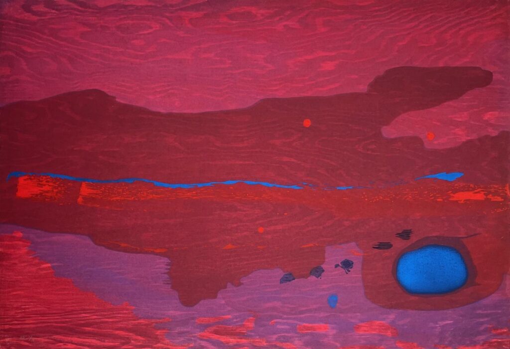
Japanese Maple (2005)
Helen Frankenthaler
Hamilton-Selway Fine Art
Chasing Technique Across the Globe
Frankenthaler treated printmaking like a series of expeditions, each workshop offering a different vocabulary to raid. At Crown Point Press, and later in Kyoto, she learned water-based woodblock printing with vegetable inks from Japanese craftsmen, building transparent veils of color, layer over layer, with none of the opacity of Western ink. In Barcelona, during one intense ten-day stay, she combined lithography with etching, drypoint, and photolithography on a single sheet, producing hybrid prints unlike anything else in her catalogue. With printer Garner Tullis she began printing from sheets of plywood instead of traditional blocks, expanding what a “woodcut” could even mean.
Each collaborator unlocked a different set of hands-on possibilities, and Frankenthaler absorbed them all — not as a tourist collecting techniques, but as an artist restlessly testing how far the definition of a medium could stretch before it broke.
When the Workshop Became a Second Studio
By the late 1970s and through the 1980s, Frankenthaler’s relationship with Kenneth Tyler’s workshop, first in Bedford Village and later in Mount Kisco, New York, had become one of the most important creative partnerships of her career. Tyler was known for building custom equipment and inventing new processes on demand, and Frankenthaler gave him plenty of reasons to do exactly that. For the ambitious Gateway Screen (1982–88), the two linked printmaking, painting, and sculpture into a single freestanding object, pushing so far past the conventional boundaries of a “print” that the finished piece defies easy categorization.
What’s striking is how much waiting was involved — editions could take months or years, with long stretches between proofs while blocks were carved or plates reworked. Frankenthaler didn’t treat that downtime as dead air; she kept drawing on proofs mid-process, and one drawing begun in the mid-1990s sat untouched for over a decade before she returned to finish it as a new print. The workshop wasn’t just a place to execute finished ideas — it was a second studio, with its own rhythm.
The Marathon Prints
Her most audacious print projects took years, not weeks. Working with Tyler and master woodblock carver Yasuyuki Shibata, trained in the traditional Japanese ukiyo-e method, she spent roughly five years developing Tales of Genji (1998), a six-print suite inspired by the eleventh-century Japanese epic, followed by Madame Butterfly (2000), a three-panel woodcut built from 46 separate blocks and around a hundred distinct colors. Tyler’s stated ambition for the project — to make something genuinely unprecedented — matched Frankenthaler’s own appetite for pushing past what a medium was “supposed” to do.
No Rules
Late in her career, in a 1994 conversation with Tyler, Frankenthaler summed up the philosophy that had driven her printmaking from the very beginning: that breakthroughs happen precisely when an artist ignores the rules of a medium rather than obeying them.
That’s the real gift printmaking gave her — not a secondary hobby alongside painting, but a laboratory. Over four decades and more than 300 print editions, she used etching, lithography, silkscreen, and woodcut to test what happened when her painter’s instincts collided with materials that had their own opinions. The friction wasn’t an obstacle to her signature style — it was the whole point. More than a decade after her death, that print work is increasingly seen not as a footnote to her paintings, but as one of the most sustained acts of innovation in her entire career.