Elizabeth Murray: Sculpture, Disguised as a Print
Elizabeth Murray is remembered first as a painter – the artist who took the flat, rectangular canvas and warped it into cartoonish, sculptural shapes that lurched off the wall. But hand her a lithography stone or a copper plate, and she brought exactly the same instinct to a medium that, for most of its history, had prided itself on staying flat, rectangular, and obedient. Murray refused to let printmaking be the well-behaved cousin of her paintings. She dragged it, tore it, folded it, and built it into three dimensions right along with everything else.
A Painter Who Landed in the Wrong Decade, on Purpose
Murray arrived in New York in 1967 into an art world dominated by the cool, spare, cerebral modes of Minimalism and Conceptualism. She experimented in those veins but her preferred medium was painting, which at that exact moment was under critical scrutiny and often disdained by the reigning tastemakers. It was a strange time to commit to paint – and an even stranger time to commit to a wildly personal, cartoon-inflected, emotionally loaded version of it. Murray did both anyway, and spent the next four decades pioneering a pictorial practice that drew as much from popular sources like cartoons as from Cubism, Surrealism, and Abstract Expressionism, while dismantling the divide between figuration and abstraction and the old prohibition against painting carrying personal or domestic content.
Printmaking entered that project relatively late but decisively. She began making lithographs in 1980, and the timing tells you something: by then Murray already knew exactly what she wanted a picture to do. Printmaking didn’t teach her a new visual language. It gave her a new material to bend her existing one through.
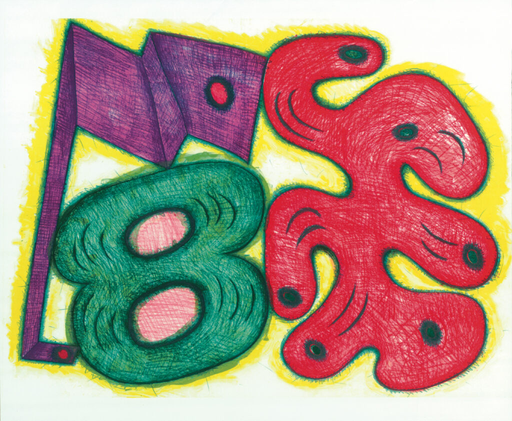
We Meet Again (2004)
Elizabeth Murray
Lincoln Center Editions
Why Lithography, Specifically
Ask why Murray gravitated toward lithography over other print processes, and the answer is refreshingly direct: in the 1980s, the renowned New York printmaking studio Universal Limited Art Editions invited Murray and other rising artists to make prints, and she chose lithography because the process most closely related to her drawings. That’s a telling admission from an artist who spent her painting career breaking every formal convention she touched – when it came to picking a print technique, she picked the one that let her keep drawing, more or less directly, onto the plate.
That directness mattered because Murray’s whole visual vocabulary – the loopy, hand-drawn contours around cups, tables, dogs, and abstracted body parts – depended on a sense of the artist’s hand moving in real time. Lithography, worked with grease pencil or tusche directly on stone, preserved that immediacy better than a more removed process like engraving ever could.
Watching a Drawing Argue With Itself: The State-Print Obsession
One of the most distinctive things about Murray’s print practice is her fascination with the state print – an old printmaking convention she turned into a genuine subject. As the Whitney Museum has explained it, Murray was fascinated by the evolutionary process of printmaking: an artist can carve an image into a stone, print it, then carve further into that same stone and print it again to produce a different “state” of the same image, repeating the process indefinitely.
Most artists treat states as a technical means to an end – proofs pulled along the way to a final, “correct” version. Murray treated the sequence itself as the artwork. In her print series Untitled States (I-V), she explored that progressive quality directly, creating a run of printed states of the same image that cannily admits the temporality of its own making – resembling a film clip viewed as a stop-motion sequence, the work records the actual stages of the artist’s working process rather than hiding them. It’s a small, radical idea: instead of erasing the evidence of revision, let the revisions become the show.
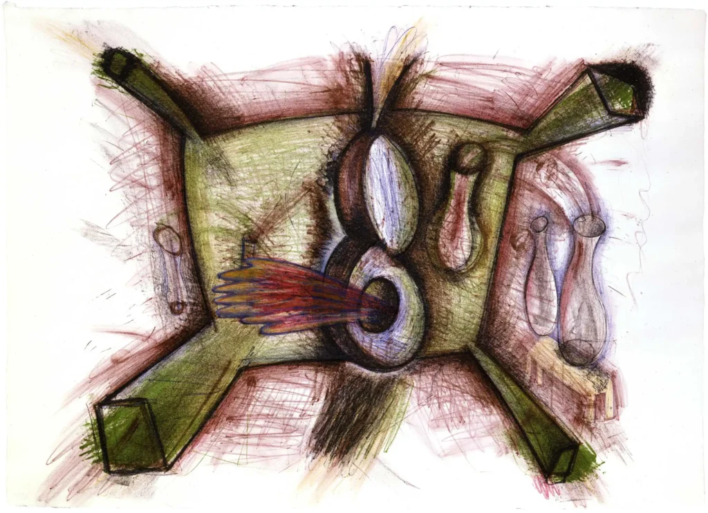
#1 (1986)
Elizabeth Murray
Jim Kempner Fine Art
From Flat Stone to Sculpture: Prints That Refuse to Lie Down
If Murray’s paintings are famous for breaking out of the rectangle, her prints eventually followed them off the wall. Working again and again with Universal Limited Art Editions, she pushed lithography into genuinely three-dimensional territory. Shack (1994), a three-dimensional lithograph printed in twenty colors, exists as a physical object with real depth rather than an illusion of it, while other prints – like the yoga-inspired Up Dog and Down Dog (1987–88) – required complicated, irregularly shaped frames just to hold the image’s warped geometry.
Some of her most inventive works didn’t just bend paper, they reassembled it. Up Dog (1987–88) was built as a lithograph printed on fourteen separate sheets of torn and pasted paper, an approach echoed elsewhere in her practice of deconstructing existing structures and reimagining them into whimsical heptagrams and irregular polygons through the physical overlap of collaged picture planes. A print, in Murray’s hands, could be cut up and re-glued as readily as a canvas could be knotted and warped – the medium never got to claim any special exemption from her sculptural instincts.
A Growing Toolkit for a Growing Ambition
As Murray’s print career matured, particularly through her long collaboration with Gemini G.E.L. in the 1990s and 2000s, her technical range expanded well past straight lithography. Editions like Red Violet, Disguise, and Night and Day combined lithograph, screenprint, and intaglio in a single sheet, often built up over eight or nine separate print runs to achieve their layered color. Others, like Body and Soul and Capree, pushed further still, fusing lithograph and screenprint with hand-cutting and collage after the printing was done – meaning the press was only the first stage of a process that ended with scissors and glue.
That layering wasn’t decoration for its own sake. Each additional process gave Murray a different kind of mark: lithography for the loose, drawn contour; screenprint for flat, saturated color fields; intaglio for a bitten, textured line. Stacking them let a single print carry the same collision of textures and depths that her paintings achieved by literally building up the canvas surface in relief.
The Master Printer as Creative Partner
None of this happened in isolation. Murray’s print career is inseparable from her sustained partnerships with master printers – first at Universal Limited Art Editions, later at Gemini G.E.L., and in her final years in a workshop relationship with printer Maurice Sanchez, with whom she developed a technique of pulling multiple strong monotypes from a single plate, generating whole series of related images from one compositional drawing. Institutions organizing print retrospectives have pointed specifically to the way her later, three-dimensional, shaped, and collaged editions underscore the collaborative relationship between artist and master printer – Murray’s most sculptural print ideas simply weren’t executable by one person working alone.
That collaborative dependency is worth pausing on. A painter can warp a canvas alone in the studio. Warping a lithographic edition into a shaped, three-dimensional object printed in twenty colors requires a printer who can solve the registration, the paper engineering, and the physical construction to match the artist’s ambition. Murray’s decades-long relationships with these workshops functioned less like a service she hired and more like an ongoing technical collaboration essential to realizing ideas her paintings alone couldn’t fully carry out.
Her Influence: Making the Print Object Argue Like a Sculpture
Murray’s print work extended, rather than diluted, the central argument of her whole career – that a two-dimensional picture doesn’t have to stay flat, rectangular, or illusionistic to be taken seriously. By treating lithographic stones as a site for the same twisting, torn, collaged, dimension-breaking instincts she brought to canvas, she helped widen what a fine-art print was allowed to be: not a flat multiple reproducing a flat image, but an object that could jut, fold, and physically occupy space in its own right.
That expanded sense of the print as sculptural object, combined with her radical embrace of the state print as a subject rather than a technical footnote, gave later printmakers and print publishers a broader vocabulary to work from – proof that a medium built on reproduction could still carry an artist’s most idiosyncratic, hand-built impulses intact. Murray’s prints hang today in the major museum collections that also hold her paintings, not as secondary artifacts of her “real” work, but as full participants in the same restless project: making a picture behave like something alive.
The Takeaway
For Elizabeth Murray, printmaking was never going to be the disciplined, rectangular art form its history suggested it should be. She brought the same warped, cartoon-charged, sculptural imagination to the lithography stone that she brought to canvas, and in doing so, turned decades of collaboration with master printers into some of the most physically inventive editions of the late twentieth century. The stone, like the canvas before it, was just another surface waiting to be knotted, twisted, and set loose.