Georges Braque is remembered as the co-inventor of Cubism, the artist who spent the years 1908 to 1912 working side by side with Picasso, dismantling perspective and pasting paper onto canvas. Less often remembered is the other half of his career: a printmaking practice that stretched from a Cubist etching made in 1911 to delicate colour lithographs of birds completed the year he died. Braque never approached the print as a way to copy his paintings. He treated it as a separate language, one that rewarded patience, and he spoke it fluently for more than fifty years.
A House Painter’s Son at the Press
Braque was born in 1882 and grew up in Le Havre, where his father trained him as a house painter and decorator while he studied art in the evenings at the École des Beaux-Arts. That apprenticeship matters. A decorator thinks in surfaces, textures, and materials, in how a substance behaves when it meets a wall. Braque carried that craftsman’s curiosity into every medium he touched, and printmaking, with its inks, grounds, stones, and acids, suited him well.
Over his lifetime he mastered etching, lithography, aquatint, and woodcut. A gallery note puts the contrast between the first two neatly: etching relies more on drawing, while lithography leans toward painting, allowing the artist to bring colour into the composition. Braque would eventually do both, but at different moments and for different reasons.
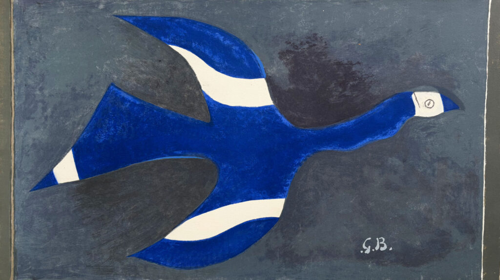
Night Flight (Birds XII) | Vol de nuit (Oiseau XII) (1957) Georges Braque
Gilden’s Art Gallery
Cubism Cut Into a Plate
His earliest serious print engagement came at the height of Cubism. The etching Job (1911) shows the movement’s hallmarks transferred to copper: lines, geometric shapes, and simultaneous perspectives, with the figure and its surroundings built from straight lines of varying thickness. The scene reads as busy and fragmented, a sketchy network of sharp angles that dissolves the boundary between a figure and the room around him.
Etching suited that moment. The needle on a grounded plate produces exactly the kind of crisp, scratched, angular line Cubism favoured, and Braque could make the plate behave like one of his drawings. It was a short, intense chapter. He soon turned to collage, working with Picasso on the technique of papier collé, in which cut paper was pasted directly into the composition. A decade would pass before he returned to the press in earnest.
The Lithograph That Felt Like a Painting
Braque first tried lithography in 1921, and the medium fascinated him. It was less demanding as a technique than etching, and it was far closer to painting, especially in its chromatic possibilities. His first lithograph, Nature morte III (Verre et Fruits), dates from that year. Early lithographs like it exemplified what writers on Braque call his painterly approach to printmaking, and he gravitated toward still life, the subject he knew better than any other.
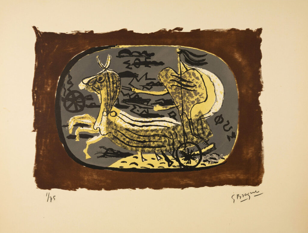
Then he stopped. After this brief period of experimentation, one gallery biography notes, he abandoned lithography for a number of years, only returning to it in 1945 at age 63. When he came back, the results were richer. A print from 1952 shows a greater array of colours and undulating, painterly forms, marks of his later approach to the medium.
Phaéton (Char I) (1945) Georges Braque
Epicentrum Art Gallery
He Didn’t Copy His Paintings
One of the most telling facts about Braque’s lithographs is what he refused to do with them. Despite their similarities to his canvases, he did not copy his lithographs after his paintings. Instead, he extracted only the subject matter and the format. A bird, a vase, a table: these motifs migrated between media, but each print was composed fresh for the stone.
That distinction explains why his prints feel like independent works rather than reproductions. A painting by Braque is built up slowly in layers of oil. A lithograph, drawn directly on the stone, asks for a different rhythm, one of fluid line, flat zones of colour, and economy of means. He let each medium dictate its own solution to a familiar subject.
Myth in Copper: The Theogony Etchings
If one project shows Braque’s seriousness as a printmaker, it is his illustration of Hesiod’s Theogony. In 1932, the publisher Ambroise Vollard, a merchant fascinated by artists’ books, asked Braque to illustrate a text for him. Braque agreed immediately, having read Hesiod’s account of the birth of the universe and the gods with great admiration. Between 1932 and 1935 he made numerous drawings and chose sixteen compositions, later entrusting the printing of the etchings to the Greek painter Demetrios Galanis, who worked from a studio in Montmartre.
The finished plates have a grace and clarity that one curator compares to the automatic writing of the Surrealists. They trace the flowing outlines of figures including Hesiod himself, Gaia, Hera, Artemis, Themis, Nike, Hercules, and the lesser-known Zelus. The project was left unfinished when it was discontinued in 1939, and the published edition did not appear until 1955, when Maeght issued it in a run of 150 copies. For that edition Braque removed the marginal notes from the plates, and the book gained a frontispiece supplemented with coloured aquatint and a five-colour varnished etching on the cover. A twenty-year gestation is rare in any art. It shows how much patience Braque brought to the medium.
Birds, Boats, and Thirteen Layers of Colour
Braque’s late prints are the ones most people picture, and for good reason. Birds became his signature motif in the 1950s and 1960s, appearing in lithographs like L’Oiseau Blanc (1961), Grand Oiseau Gris (c. 1956), and L’oiseau et son nid (1956), and in etchings like L’ordre des oiseaux (1962). His final year produced Couple d’oiseaux (1963), a lithograph printed in three colours that measures under eight inches across, a small, luminous farewell.
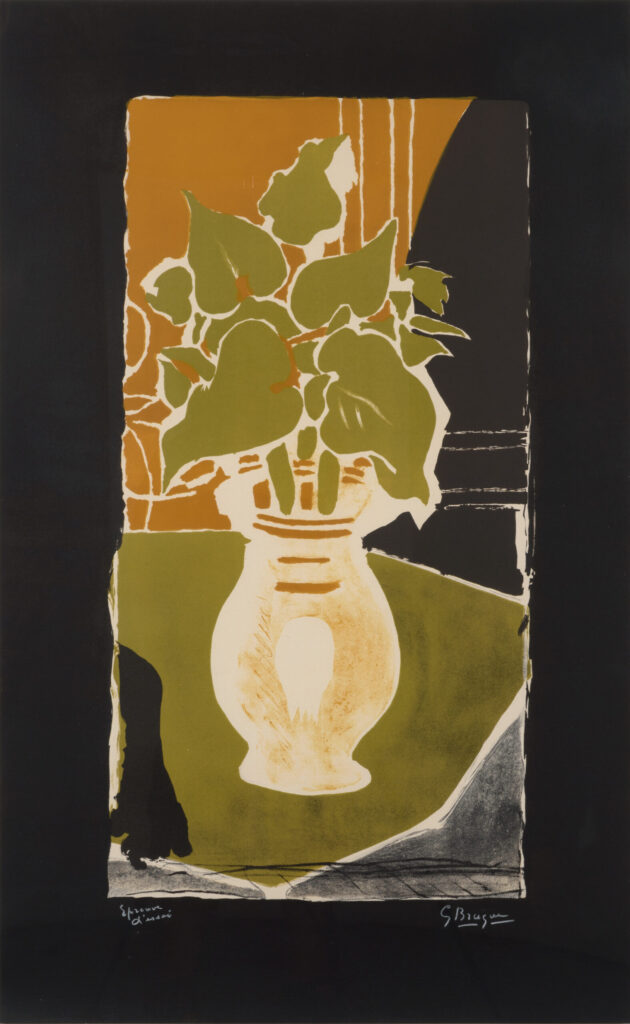
The colour work could be astonishingly complex. For some of the lithographs in the Lettera amorosa suite of 1963, as many as thirteen colours were layered in succession, each requiring its own stone or plate. That is a long way from the spare, angular lines of Job. Braque had moved from analysing objects through fragmented drawing to building them out of luminous overlapping colour, and the press was where much of that evolution happened.
Feuilles Couleur Lumière (1954) Georges Braque
Leslie Sacks Gallery
Books as a Home for Prints
Braque did not simply make loose sheets. A large share of his printmaking was devoted to illustrated books, and by the last decade of his life he had made around 300 compositions, nearly 200 of them for illustrated books. Working with publishers like Vollard and Maeght, he treated the book as a natural home for a print, where image and text could speak to each other across the page.
His relationships with workshops and publishers were equally important. Mourlot printed many of his lithographs in Paris, while Maeght published Braque suites and featured his work in its journal Derrière le Miroir, which gave colour lithography a central place alongside commentary on gallery exhibitions. The scale of the output is captured in the standard reference on his prints, Dora Vallier’s catalogue raisonné, Braque: The Complete Graphics.
His Influence: The Print as a Studio of Its Own
Braque’s contribution to printmaking is quieter than his contribution to Cubism, but it is real. The Vollard commission, as one dealer’s history notes, represented a milestone for both the artist and for the practice of printmaking, helping establish that a major painter could bring serious, sustained attention to the illustrated book. His refusal to copy paintings in lithography reinforced a principle that later painter-printmakers took for granted: that a print should be conceived for its own medium rather than translated from another.
He also showed how a printmaking career could follow its own rhythm. He worked in bursts, set the medium aside for years, then returned with new ideas and a richer palette, unconcerned with maintaining a steady output. That willingness to follow the medium on his own timetable makes his prints feel unforced, the work of an artist who returned to the press only when he had something to say.
The Takeaway
For Braque, printmaking was never a spin-off of painting. Etching gave him a way to draw Cubism in copper, lithography a way to paint in colour on stone, and book projects like the Theogony a way to spend two decades on a single act of devotion to a text he admired. By the end, a three-colour bird no larger than a postcard could hold everything he had learned about line, space, and colour. The artist who helped break apart the picture spent a lifetime at the press quietly putting it back together.