
The Man Who Broke Printmaking: How Frank Stella Turned Paper Into Sculpture
For five hundred years, a print was a simple promise: ink, pressed into paper, flat. Albrecht Dürer understood this. Rembrandt understood this. Every printmaker who came after them understood this too – until Frank Stella sat down at a press in the early 1980s and decided the promise was negotiable.
By the time he was done, “print” no longer meant flat. It didn’t even reliably mean paper. Stella took one of the oldest, most rule-bound mediums in art history and bent it, literally, into something closer to sculpture. Here’s how he did it – and why it still matters to anyone thinking seriously about what a print can be.
A Painter Walks Into a Print Shop
Stella arrived at printmaking already famous for breaking rules elsewhere. He’d spent the early 1960s stripping painting down to its studs with his austere, geometric “Black Paintings” – canvases so minimal they seemed to dare viewers to call them art at all. He’d built a reputation, while still in his early twenties, as the cool, analytical counterpoint to the emotional sprawl of Abstract Expressionism. His famous explanation that he wanted viewers to see “what you see is what you see” became a kind of manifesto for an entire generation of minimalists.
Then, in the 1970s and 80s, he did something almost nobody expected: he abandoned the austerity entirely. The shaped canvases of his Polish Village series and the riotous, three-dimensional constructions of Exotic Birds and Indian Birds blew the cool restraint of the Black Paintings back open into something baroque, curvilinear, and almost violently energetic – shapes that looked like they’d escaped from a blueprint for a roller coaster, smeared with color and bristling with cut metal.
So when Stella finally turned his full attention to printmaking in the 1980s, he didn’t arrive with a printmaker’s instincts or a printmaker’s patience for tradition. He arrived as a painter-turned-sculptor with a restless appetite for physical space, looking at a print shop’s worth of accumulated craft and technique not as a finished toolkit to respect, but as raw material waiting to be smashed together into something new.
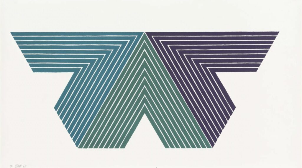
Black Adder (1968), Frank Stella, Susan Sheehan Gallery
The Collision: Every Technique, One Sheet
Traditionally, printmaking disciplines stayed in their lanes. Etchers etched. Lithographers worked stone or plate. Woodcut artists carved blocks. Screenprinters squeegeed. Each technique carried its own workshop culture, its own centuries of accumulated craft wisdom, and its own quiet snobbery about staying in your lane. A serious print collector in 1970 could often identify a technique at a glance, the way a wine drinker identifies a grape.
Stella ignored the lane markings entirely. Working with master printer Kenneth Tyler at Tyler Graphics – the same legendary workshop that had collaborated with Jasper Johns, Robert Rauschenberg, and Roy Lichtenstein – Stella began stacking etching, lithography, woodcut, screenprint, and hand-collage onto single sheets. A single print might require dozens of separate passes through the press, dozens of distinct colours, and registration so precise that one misaligned pass could ruin weeks of preparatory work. Where a traditional print might involve one technique executed with mastery, a Stella print might demand the combined technical expertise of five separate printmaking traditions, executed in sequence on top of one another, each layer fighting for visual dominance with the layers beneath it.
The result wasn’t a tidy hybrid so much as a controlled collision. The surfaces that emerged didn’t look like prints in any inherited sense. They looked like something printmaking had never been asked to produce before – dense, layered, almost geological in the way color and texture accumulated.
When the Print Stopped Lying Flat
This is the part that actually rewired the medium’s DNA: Stella didn’t just layer techniques flat on the page — he made the page itself stop lying flat.
Starting with the Circuits series in the early 1980s and detonating fully in Imaginary Places, The Waves, and his monumental Moby-Dick series of the 1990s, Stella began building prints from cut, bent, and embossed metal plates – magnesium and aluminum sheets fabricated specifically for each image. Pressed into heavy handmade paper, these plates didn’t just leave an inked impression; they forced the paper itself to buckle, dome, and ridge in three dimensions. The plates were sometimes cut with such intricate, swirling contours that they more closely resembled sculptural maquettes than printing tools.
These weren’t images of three-dimensional things, the way a skilled draftsman might use shading to suggest depth on a flat page. They were three-dimensional things. Run a hand across one of these prints and you’d feel actual ridges, valleys, and protrusions – the same tactile experience you’d get tracing your fingers over a relief sculpture mounted on a wall. A medium defined for half a millennium by its flatness suddenly, almost defiantly, had topography.

Scale: From the Coffee Table to the Wall
Prints had also always carried a kind of built-in modesty. Even masterful, technically dazzling prints – a Goya etching, a Hokusai woodblock – were the format you collected, stored flat in a portfolio box, and hung in a small frame near a desk or hallway. They were intimate objects, made for intimate viewing, sized for a human hand and a human room.
Stella demolished that scale too. His later prints sprawled toward mural size – works in the Moby-Dick series alone could stretch many feet across, dense with layered imagery referencing the chapters of Melville’s novel. These weren’t pieces you examined politely up close, the way you might lean in toward an etching to admire fine linework. They demanded that you back up, that you confront them across the width of a gallery, the way you’d confront a large-scale painting or stand before a wall of sculpture. The print had stopped being something you owned the way you own a book, and started being something you stood in front of the way you stand before a monument.
Why Melville, of All People
It’s worth pausing on just how strange and ambitious a project the Moby-Dick series was. Beginning in 1991, Stella set out to create a print, relief, or sculpture for every one of the novel’s 135 chapters – an undertaking that occupied him for years and ultimately produced hundreds of individual works. He wasn’t illustrating the novel in any literal sense; there are no harpoons or whales rendered representationally. Instead, each piece used the chaotic, layered techniques he’d developed to conjure something like the feeling of Melville’s prose – its density, its digressions, its oscillation between obsessive detail and cosmic abstraction.
The sheer scale of the undertaking forced Tyler Graphics to keep inventing. No existing workshop process could sustain hundreds of unique, technically punishing multi-plate works without constant improvisation. The Moby-Dick series became, in effect, a years-long laboratory experiment disguised as a single sprawling artwork – proof that Stella’s approach to printmaking wasn’t a one-off stunt but a sustainable, endlessly generative working method.
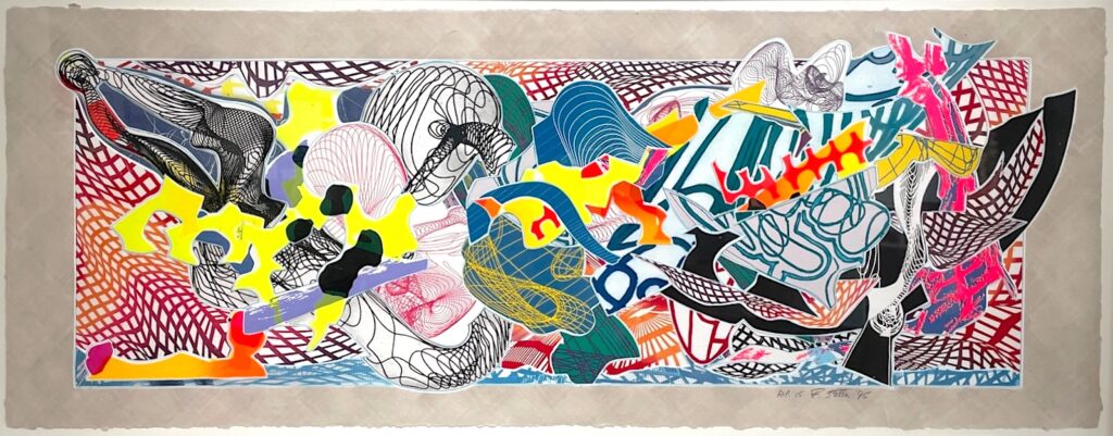
Despairia (1995), Frank Stella, Michael Lisi/Contemporary Art
The Workshop Became a Laboratory
None of this was possible with a conventional print shop’s existing tools, which meant the tools had to change too. Tyler Graphics, under Stella’s relentless and often impractical demands, started inventing new fabrication methods on the fly: laser-cut woodblocks that could carve contours no hand-tool could manage; hand-torn and hand-cast paper pulp built up in layers like miniature sculpture; custom machine-cut metal plates engineered specifically for embossing and three-dimensional relief rather than conventional ink transfer.
Kenneth Tyler himself was no stranger to pushing artists toward technical extremes – he’d already helped Rauschenberg and Johns stretch the boundaries of editioned printmaking in earlier decades. But Stella’s demands pushed the workshop further than perhaps any artist before him, requiring industrial design thinking, custom machinery, and an almost engineering-grade level of problem-solving for every new series. The print workshop, traditionally a place of refined, repeatable craft passed down through apprenticeship, became something closer to an experimental fabrication studio – equal parts atelier, sculpture foundry, and machine shop.
This had ripple effects well beyond Stella’s own work. Techniques developed under the pressure of his ambitions – new embossing methods, new approaches to laminating and shaping handmade paper, new hybrid plate-cutting processes – entered the working vocabulary of contemporary print workshops more broadly, available for other artists to borrow, adapt, and build on long after Stella moved on to his next project.
The Final Heresy: Killing the Identical Multiple
Perhaps the deepest tradition Stella violated wasn’t technical at all – it was philosophical. The entire economic and artistic logic of printmaking rests on the concept of the multiple: edition number 12 of 50 should be, in all meaningful respects, identical to edition number 38 of 50. That sameness is the medium’s whole social contract, the thing that distinguishes a print from a one-of-a-kind drawing or painting, and the thing that has historically made prints accessible to collectors who could never afford a unique canvas. Buy print number 12, and you’re buying confidence that your object matches every other object in the run.
Stella broke that contract, quietly but unmistakably. With hand-colouring applied after the press run, collage elements added individually, and deliberately varied states introduced across a single edition, individual impressions of the “same” print could end up differing meaningfully from one another – not through printing error, but by design. Each impression could become its own unique object, no two quite alike, hovering in the undefined territory between print, painting, and sculpture. The promise of uniform repeatability that had defined the medium since Dürer’s sixteenth-century workshop no longer fully applied.
A Legacy That Outgrew the Print Rack
The shockwaves from this didn’t stay contained to Stella’s own portfolio. Contemporary printmaking workshops now routinely treat embossing, relief, hand-fabrication, and mixed-technique layering as standard parts of an expanded printmaking vocabulary – options on the table rather than transgressions against it. Younger artists working in print today inherit, often without realising it, a much wider definition of what counts as a print than existed before Stella got his hands on a press. Museums, too, had to adjust: curators cataloguing Stella’s later print work have had to grapple, piece by piece, with whether a given object belongs in the prints department, the sculpture department, or somewhere that doesn’t quite have a name yet.
Why It Mattered
None of this was technique for technique’s sake. Stella was chasing something specific: he wanted prints to carry the same physical presence, the same painterly energy, and the same sculptural weight as the rest of his work. The flat, modest, endlessly repeatable print of art history simply couldn’t hold what he was trying to put into it – so he rebuilt the medium, piece by piece, until it could.
By the time he finished, “print” had stopped meaning “flat marks on paper, identically repeated.” It had come to mean something far stranger and far more interesting: a physical object, built from any combination of techniques the artist required, at any scale the image demanded, with no obligation to look the same twice.
Five hundred years of printmaking tradition said paper should lie down and stay flat. Frank Stella looked at that tradition, picked up the rulebook, and folded it into a relief sculpture.