
The Mop, the Stone, and the Gesture: The Accidental Printmaking Career of Willem de Kooning
Willem de Kooning made his first lithograph with a cleaning mop. Not a brush, not a lithographic crayon, not any tool remotely associated with fine printmaking – an actual mop, slathered across two lithographic stones nearly four feet high, in under an hour, almost on a dare. That single, reckless encounter tells you nearly everything you need to know about how one of Abstract Expressionism’s most gestural painters approached the disciplined, technical world of the print studio: he brought the chaos of the canvas with him, and refused to leave it at the door.
A Whim, Not a Plan
De Kooning wasn’t chasing printmaking as a career move. In 1960, the New York-based painter traveled to the Bay Area and visited the newly opened print studios at the University of California, Berkeley, where he discovered two oversized lithographic stones and a standard cleaning mop, and in less than an hour created two explosive images titled Waves I and Waves II. There was no plan, no careful study of lithographic craft beforehand – just an artist encountering an unfamiliar surface and immediately treating it the way he treated a canvas: as something to attack with whatever tool happened to produce the right kind of mark.
That improvisational spirit had roots going back even further. De Kooning had actually experimented with printmaking as early as 1943, nearly two decades before Waves I and Waves II, but it was that 1960 California visit that produced the works now considered prime examples of Abstract Expressionist printmaking – proof that his print career, unlike a painter methodically building a print portfolio alongside gallery shows, unfolded in scattered, high-intensity bursts triggered by circumstance rather than ambition.
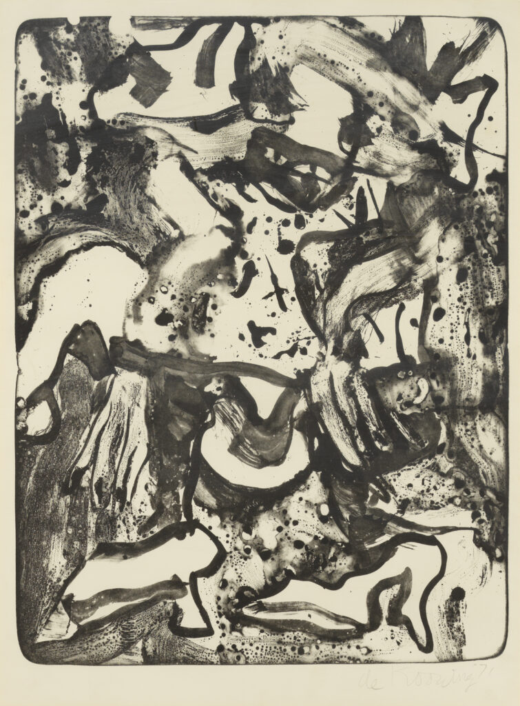
Minnie Mouse (1971)
Willem De Kooning
Susan Sheehan Gallery
Paper Before Plate: Why Immediacy Mattered
To understand why de Kooning took to lithography’s raw physicality so readily, it helps to look at what he was already doing on paper. He was equally comfortable working on canvas and paper, and paper in fact allowed for an immediacy that appealed to him directly. During a stay in Italy from September 1959 to January 1960 – just months before the Berkeley visit – he produced a large body of experimental black-and-white works on paper, sometimes called the “Rome” drawings, that pushed his mark-making toward exactly the kind of loose, fast, exploratory territory lithography would soon reward.
Seen in that light, the mop-on-stone episode wasn’t really an aberration. It was a continuation of an instinct de Kooning had already been cultivating on paper – the idea that a surface could register the full speed and weight of a gesture, without the slower buildup and revision that oil painting on canvas usually demanded.
The Most Generative Year: Ink, Gesture, and a Master Printer
If 1960 was an accident, the early 1970s were where de Kooning’s printmaking practice became genuinely serious. A 1970 trip to Japan inspired compositions reminiscent of Japanese calligraphy and Sumi ink painting, and upon his return he began what would become his most generative year in printmaking, collaborating with master printmaker Irwin Hollander to create twenty-four black-and-white lithographs that read like dripped and splashed ink. The U.S. State Department’s account of this period notes that his exposure to Japanese art and design left his lithographs reflecting the influence of Japanese ink drawing and calligraphy, many showing a newly gained sense of open space that carried over into his paintings of the same period.
That last detail matters enormously. This wasn’t printmaking trailing behind the paintings, translating an already-settled visual idea into a multiple. The open, airy compositional sense de Kooning found at the lithographic stone actually fed back into his canvases – a rare case of the print studio functioning as the place where a major shift in his painting vocabulary was worked out first.
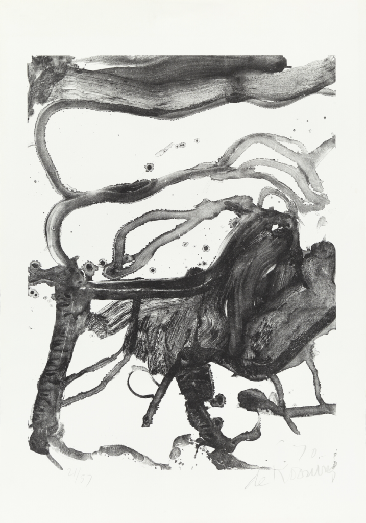
High School Desk (1970)
Willem De Kooning
Mary Ryan Gallery
Tusche and the Grease-Pencil Paintbrush
The specific technical hook that let lithography feel like painting rather than a foreign discipline was tusche – a greasy medium applied to the lithographic stone with a brush or pen, capable of producing marks that can resemble the act of painting itself. As art historian Jennifer Field has put it, lithography allowed de Kooning to integrate the spontaneity of the Abstract Expressionist gesture with the technical process of printmaking, and the relationship between the two media proved genuinely reciprocal: his use of tusche’s fluidity in lithography ran analogous to his gestural handling of oil paint, and the two ways of working came to mutually inform each other rather than sitting in separate compartments of his practice.
That reciprocity is visible in late works like the 1986 suite Quatre Lithographies, where sinuous ribbons of bold primary color unravel across the composition with a fluidity of line that epitomizes the sublime lyricism running through both his painting and his printmaking by that point in his career. By his eighties, the two media weren’t distinguishable in sensibility at all – only in the mechanics of how the mark got onto the surface.
Building Surface the Way He Built a Canvas
De Kooning’s print technique extended his painterly habits in more literal ways too. He was known to layer ink and scrape the surface of his prints, leaving traces in the finished work that experts can still use to identify his hand today. That’s essentially the printmaking equivalent of the way de Kooning famously built up and scraped down his oil paintings – adding, removing, reworking a surface until it accumulated a physical history of revision. A lithographic stone, treated this way, stopped behaving like a flat reproduction template and started behaving like a canvas that happened to be made of limestone.
His engagement with scale carried the same painterly logic. Those nearly four-foot-high lithographic stones he worked on in the 1960s weren’t a standard, modest printmaking format – they were closer to the scale of an easel painting, giving his whole body room to move the way it would in front of a large canvas. De Kooning didn’t shrink his gesture to fit the conventions of the print studio. He looked for print surfaces large enough to fit the gesture he already had.
A Career of Return Visits, Not a Steady Practice
Unlike an artist such as Pissarro or Kusama, who worked printmaking into a decades-long, continuous discipline, de Kooning’s print career reads more like a series of intense return visits at pivotal moments – 1943, 1960, the early 1970s, again in the 1980s – each one triggered by a specific encounter or shift in his broader practice rather than an ongoing studio habit. Throughout his career he collaborated with several renowned print studios and publishing houses, including Hirschl & Adler Galleries and the Hollander Workshop in New York, partnerships that produced some of his most coveted print series, among them The Preacher (1971) and Valentine (1971).
That episodic pattern makes his printmaking output harder to catalog cleanly than that of more methodical painter-printmakers — there is, notably, still no single comprehensive catalogue raisonné for his prints, with his body of graphic work remaining an area of active scholarship even decades after his death. But the episodic quality is also exactly what kept the work feeling urgent rather than routine: every return to the stone came loaded with whatever de Kooning was working through in paint at that exact moment, rather than settling into a predictable, ongoing sideline.
His Influence: Proving the Gesture Could Survive the Stone
De Kooning’s printmaking legacy sits at an interesting angle to his overall reputation. He wasn’t a prolific print artist chasing a parallel career the way Thiebaud or Kusama were – his contribution was narrower and, in some ways, more radical: proving that the full, unedited violence and speed of Abstract Expressionist gesture could survive translation onto a technical, historically disciplined medium without being tamed by it. Waves I and Waves II stand as genuine landmarks of Abstract Expressionist printmaking precisely because they refused to compromise with lithography’s traditions – no careful crayon work, no patient tonal buildup, just a mop and an hour and total commitment to the mark.
That example mattered for the generation of printmakers and workshops that followed, who increasingly understood that a print studio could accommodate genuinely improvisational, painterly working methods rather than demanding an artist slow down and adapt to the medium’s own conventions. De Kooning’s late lithographs, built from tusche handled with the same fluidity as his oil paint, extended that argument across four decades – showing that painting and printmaking, for an artist willing to let each discipline bleed into the other, didn’t have to be separate languages at all.
His Influence: Proving the Gesture Could Survive the Stone
De Kooning never treated the print studio as a place to slow down or discipline his hand. From the mop-and-stone improvisation of 1960 to the ink-drenched, calligraphy-inspired lithographs of the 1970s, he brought the same raw, physical urgency to lithographic limestone that he brought to canvas – proving, almost by accident, that the gesture didn’t need to change shape just because the surface did.