
Colour You Cannot Mix With a Brush: Josef Albers and the Logic of the Screen
Josef Albers spent his career proving that colour is never what it seems – that a single grey square can look warm or cool, advancing or receding, entirely depending on what surrounds it. That’s a claim about perception, but it’s also, less obviously, a claim about material. And Albers understood something crucial that many painters miss: the specific chemistry of a pigment matters as much as its position on the colour wheel. Painting couldn’t fully test that claim. Printmaking could. Ink pigments behave differently than paint pigments, and Albers spent the back half of his career treating that difference not as a limitation, but as an entirely new laboratory.
A Bauhaus Habit That Never Left Him
Albers’s relationship to printmaking traces back to his formative years at the Bauhaus, where he was exposed to the rich history and techniques of the medium and to the institution’s founding belief in the unity of art and craftsmanship – the idea that a fine artist should also be a technically literate maker, comfortable getting hands dirty with a specific process rather than simply directing its outcome. That ethos followed him across the Atlantic when he and his wife Anni fled Nazi Germany in 1933, and it shaped how seriously he treated printmaking once he was established in the United States, first at Black Mountain College and then at Yale.
He never treated it as a minor sideline. By the end of his life in 1976, Albers’s complete graphic oeuvre comprised some 350 editions, made using lithography, silkscreen, inkless intaglio, and embossing a body of work substantial enough that a dedicated retrospective, “The Sum of the Parts,” has been devoted solely to surveying his complete print portfolios. As that exhibition’s own framing puts it, in printmaking Albers found the perfect vehicle with which to realize the full array of his imagery and develop his theoretical approach to colour.
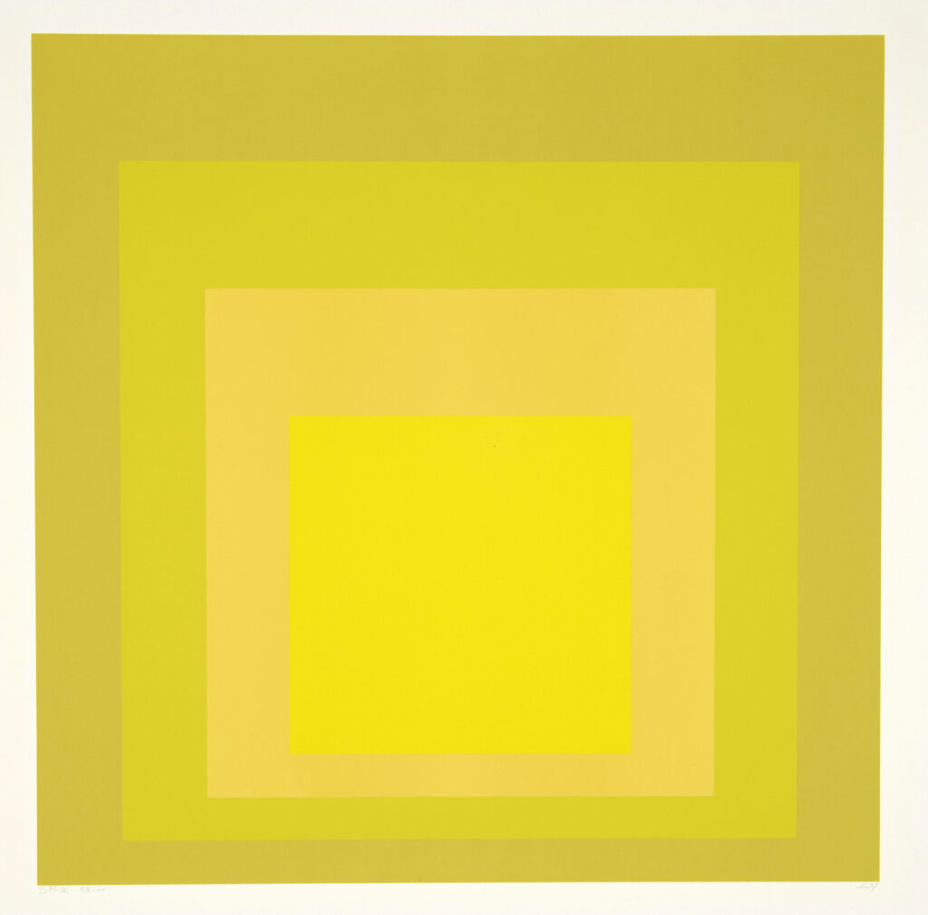
Sp II (1967)
Josef Albers
Sims Reed Gallery
Why Ink Isn’t Paint: A Scientist’s Argument for the Print Studio
The technical reason printmaking mattered so much to Albers is worth sitting with, because it’s unusually precise for an artist’s stated rationale. Discussing what was possible in translating the subtlety of painted colour into silkscreen printing and colour photography, Albers affirmed that yellow cannot be photographed successfully across all its gradations, and that reds exist in printers’ inks that elude the manufacturer of paint entirely. That’s not an aesthetic preference. It’s closer to a chemist’s observation: certain colours, certain intensities, certain relationships between hues simply exist in printing ink that don’t exist – can’t exist – in oil or acrylic paint.
For an artist whose entire life’s project was mapping how colour behaves and deceives, that meant printmaking wasn’t a secondary translation of his painting practice. It was access to raw material his paintings physically couldn’t contain. A red only available in printer’s ink was a red he could put to work nowhere else.
Homage to the Square, Rebuilt for the Screen
Albers’s most famous series, Homage to the Square, began as a painting project in the 1950s and became, over the following decades, one of his most sustained print subjects as well – carried into editions through the silkscreen process, a technique that allows for precise and consistent colour application and let him meticulously control the relationships between colours and geometric forms across an edition. That precision mattered enormously for a series built entirely around exact, repeatable color relationships: a slight inconsistency between screen pulls could undermine the entire perceptual experiment a given composition was designed to produce.
Crucially, moving Homage to the Square into print wasn’t simply a matter of reproducing an existing painted image. Silkscreen gave Albers total control over flat, uniform fields of colour – no visible brushwork, no textural variation to distract from the pure optical interaction between adjacent hues. In some ways, the screen print realized the theoretical ambition of the series even more completely than the paintings did, stripping away the last trace of the artist’s hand so that only the color relationships themselves remained to be studied.
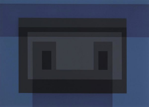
Variant VII, From 10 Variants (1966)
Josef Albers
Gregg Shienbaum Fine Art
Formulation: Articulation — Revisiting a Career Through the Screen
Nowhere is Albers’s print practice more revealing than in Formulation: Articulation, a monumental portfolio of 127 silkscreen prints completed in 1972, four years before his death, when he was already in his eighties. The project was far from a simple survey of greatest hits. While many of the images featured in the portfolio derive from earlier examples of Albers’s work across a range of media, each folder in the set was considered a unique work in its own right – Albers reimagining compositions from earlier periods using color relationships that pigments unavailable to him at the time of their original conception now made possible.
That’s a remarkable idea: revisiting decades-old paintings and drawings not out of nostalgia, but because new printing inks had opened up color combinations that simply hadn’t existed when the original works were made. Working closely with Norman Ives and Sewell Sillman on production, Albers applied a level of rigor to the portfolio comparable to what he brought to his paintings, treating the silkscreen studio with the same exacting standards he’d have demanded of an oil canvas. The result, as one gallery has put it, demonstrated that printmaking could function not merely as a secondary or reproductive format but as a site of independent investigation – whether the prints are considered individually or viewed collectively as an evolving body of research.
Texture Where You’d Least Expect It
For an artist so associated with flat, hard-edged colour, Albers’s interest in the physical surface of a print is easy to overlook. He was known for his interest in texture and surface qualities, exploring embossing and de-bossing techniques within his prints to create tactile, visually engaging surfaces alongside the colour work – a reminder that even within his most rigorously planar compositions, Albers hadn’t entirely abandoned the physicality that shaped his earlier Bauhaus training in materials like sandblasted glass. Inkless intaglio, one of the techniques used across his print portfolios, pushed that interest furthest of all: an embossed image with no ink at all, where the entire visual event depends purely on how light falls across a raised or recessed surface.
A Teaching Manual Disguised as a Print Portfolio
Albers’s relationship to printmaking was inseparable from his identity as an educator – arguably one of the most influential art teachers of the twentieth century, first at Black Mountain College and then as head of Yale’s Department of Art. That teaching impulse produced one of his most significant print projects directly: Interaction of Color, a 1963 portfolio of his paintings translated into silkscreen prints, accompanied by his own written texts and conceived explicitly as a teaching manual rather than simply a fine-art edition. The book-and-portfolio hybrid became one of the most influential colour theory texts of the century, still used in classrooms today – proof that for Albers, a print wasn’t only a finished art object, it could double as a pedagogical instrument precisely because the silkscreen process could reproduce his carefully calibrated color relationships with a consistency and accessibility no unique painting ever could.
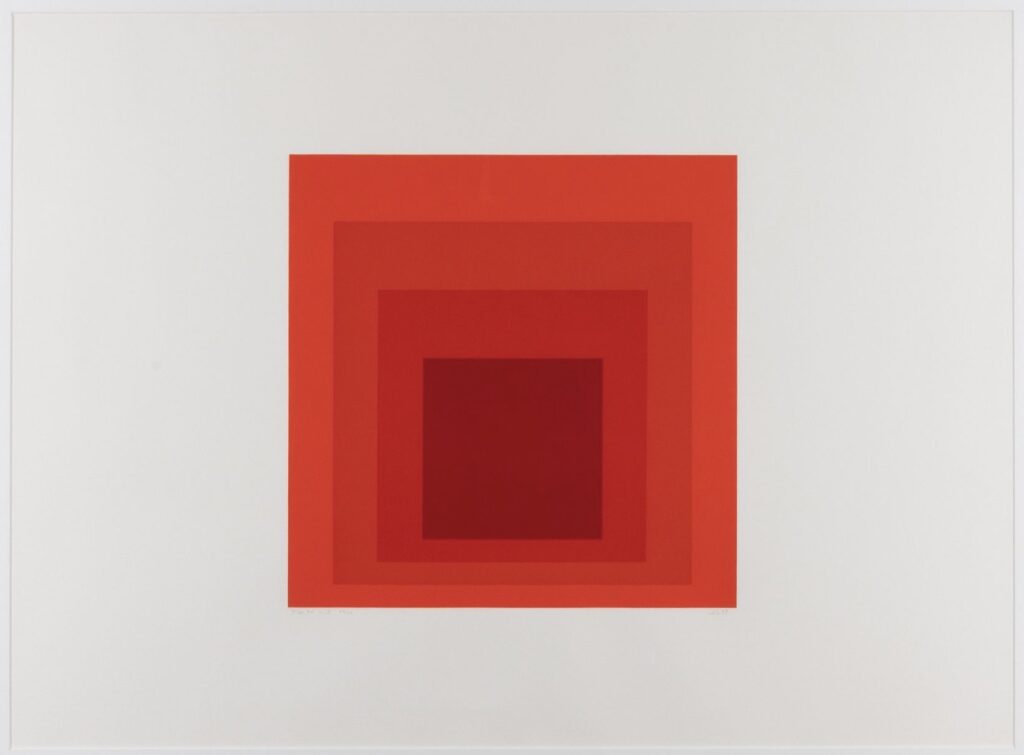
Jhm-i (1973)
Josef Albers
Robert Fontaine Gallery
Serial by Nature: Printmaking as Systematic Inquiry
Across every print series, Albers approached the medium the way he approached everything else: as a controlled experiment run across variations. Similar to his approach in painting, Albers often explored serial and repetitive compositions in his printmaking, systematically revisiting a single subject and using printmaking techniques specifically to experiment with different colour combinations and their effects on perception. The nested squares of Homage to the Square, repeated across dozens of prints with only the palette shifting, function almost like a controlled scientific trial – same geometric structure, same proportions, different variables tested in the color relationships alone.
That serial discipline is what let Albers turn printmaking into genuine research rather than simple production. Each new print in a series wasn’t a fresh creative gesture so much as the next data point in an ongoing investigation into how color deceives, advances, recedes, and transforms depending entirely on its neighbors.
His Influence: Making the Print a Site of Theory
Albers’s legacy in printmaking is bound up with his broader legacy as perhaps the most systematic color theorist of the twentieth century, and his choice of medium mattered enormously to how that theory reached later generations. By treating silkscreen’s flat, precise, repeatable colour as a genuine research tool rather than a compromise on painting, he helped establish printmaking as a legitimate site for serious perceptual and theoretical investigation – not merely a way to distribute an image more widely, but a technically distinct medium capable of producing colors and relationships unavailable anywhere else.
That argument shaped how later artists working in hard-edge abstraction, Op Art, and colour-field painting thought about the relationship between painting and print. Albers demonstrated that a print series could function as a laboratory notebook made public – each edition a documented, reproducible experiment in perception that any viewer could study as closely as a student poring over Interaction of Color in a classroom. Few artists have made so explicit, or so convincingly, the case that a medium’s specific material properties should shape not just how an idea gets reproduced, but what idea becomes possible to pursue at all.
The Takeaway
For Josef Albers, the print studio wasn’t a place to reproduce paintings – it was a place to access colours his paintings could never physically contain, and to run experiments in perception with a precision and repeatability no unique canvas could match. From the exacting silkscreens of Homage to the Square to the career-spanning reinvention of Formulation: Articulation, Albers treated every edition as another controlled trial in the same lifelong question: what does color actually do, and how far can ink push it beyond what paint ever could?